Designing an app to transform how people tracked and managed their favorite shows by bringing every streaming platform into one organized, all-in-one experience.
Streamline, a Cleveland-based app startup, set out to solve a growing problem: keeping up with shows spread across countless streaming platforms. As an avid streamer myself, I immediately understood the need for one central place to discover, track, and manage everything in one app. I applied my product design, UX, and research expertise to help shape Streamline into a reliable, everyday tool for staying current on what to watch and when.
Streamline was built to solve a real frustration: content scattered across too many platforms. The initial product lacked the clarity and structure needed to fully support that mission. Users struggled to organize their viewing habits, track upcoming episodes, and confidently know what was available to them at any given time. Creating a seamless, all-in-one streaming hub required strong research, thoughtful prioritization, and intentional design.
“A strong emphasis on product design with a heavy undercurrent of user research tactics was in order. The first step was learning what users needed out of Streamline. We started with Streamline’s base feature set of Home, Discovery, Community and Schedule and refined the designs from there.”
At this startup, I was singlehandedly tasked with the end-to-end UX and product design for Streamline 2.0, driving the experience from early research through final UI. I conducted user interviews and prototype testing, designed and iterated on wireframes and high-fidelity screens in Figma, and continuously designed and refined the product features based on real user feedback. I partnered closely with stakeholders to align vision, validate requirements, and deliver a cohesive, production-ready experience.
For Streamline to succeed, we needed to clearly understand how users discovered, tracked, and kept up with their favorite content.
First, I conducted a UX evaluation on Streamline 1.0 and documented key usability and product gaps.
Second, I designed a prototype and concept-tested new ideas centered around discovery, scheduling, and show tracking.
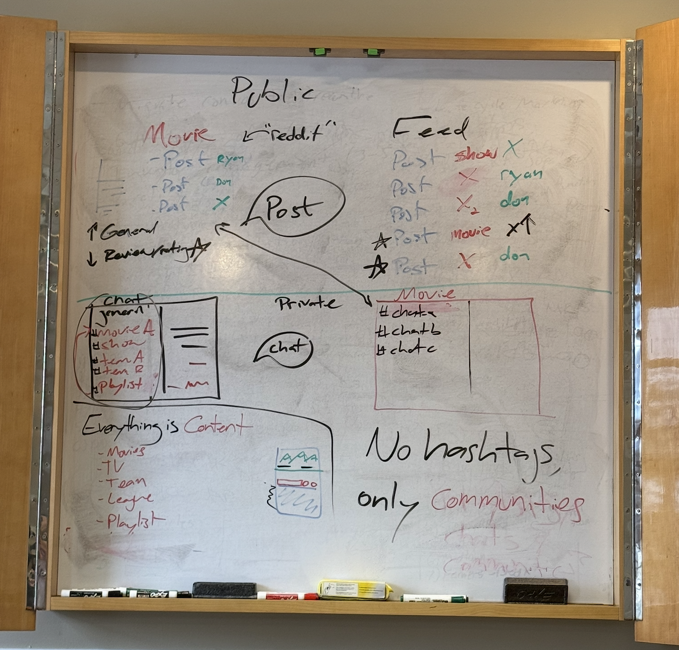
Third, the team workshopped and mapped out the full experience for Streamline 2.0 together.

Research quickly revealed that users didn’t want another content feed. They wanted clarity, organization, and reliability. The prototype allowed users to experience the scheduling and tracking concepts firsthand, validating key assumptions while exposing friction points. The team workshop aligned everyone on simplifying the experience around a single core goal: never missing a show.
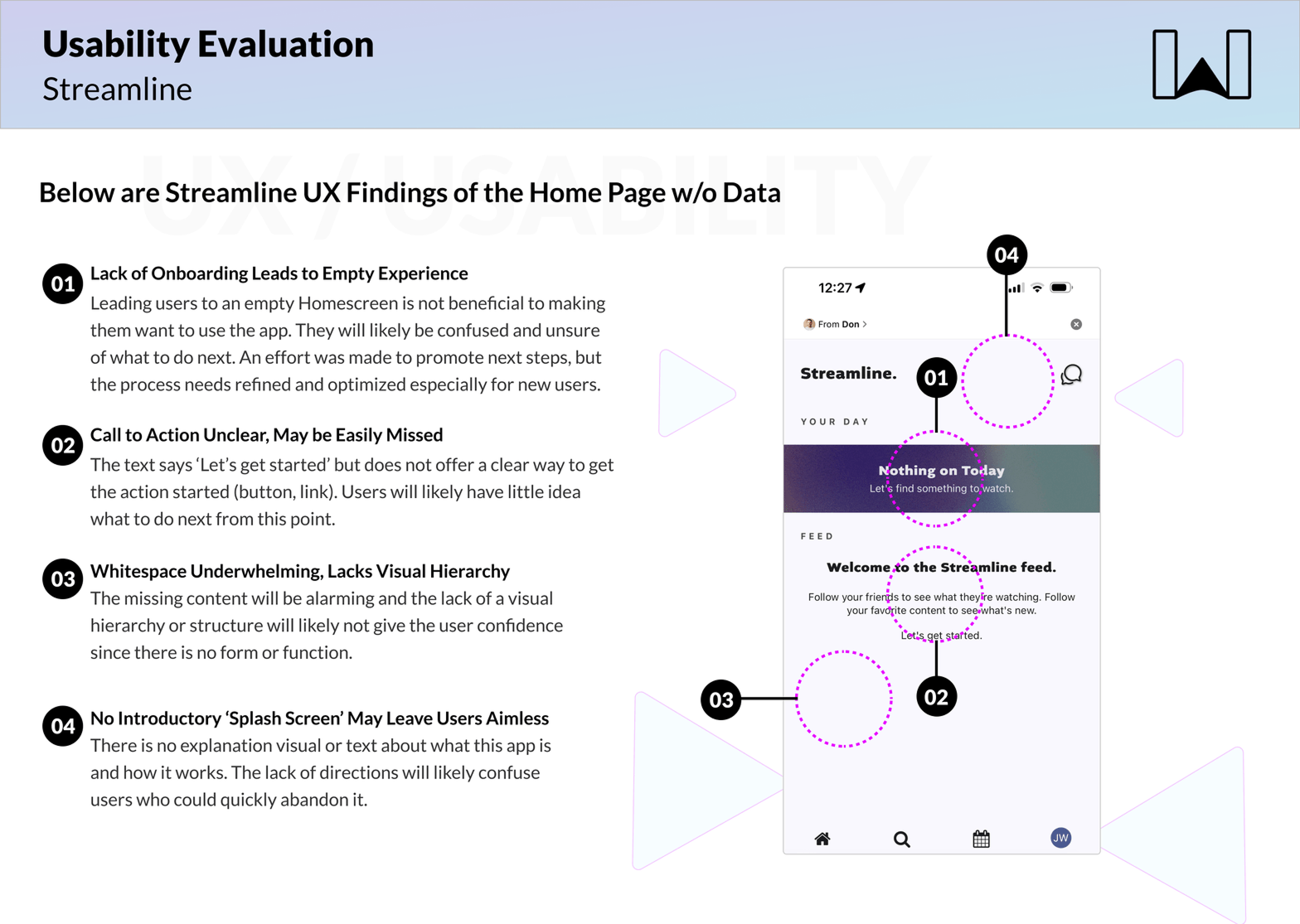
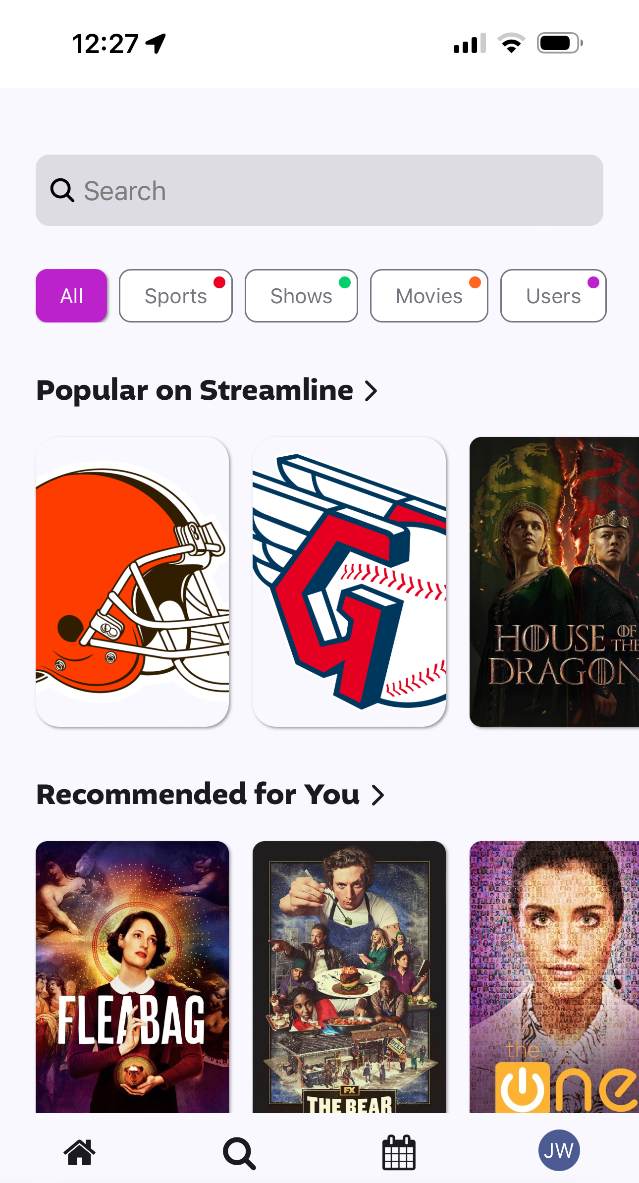
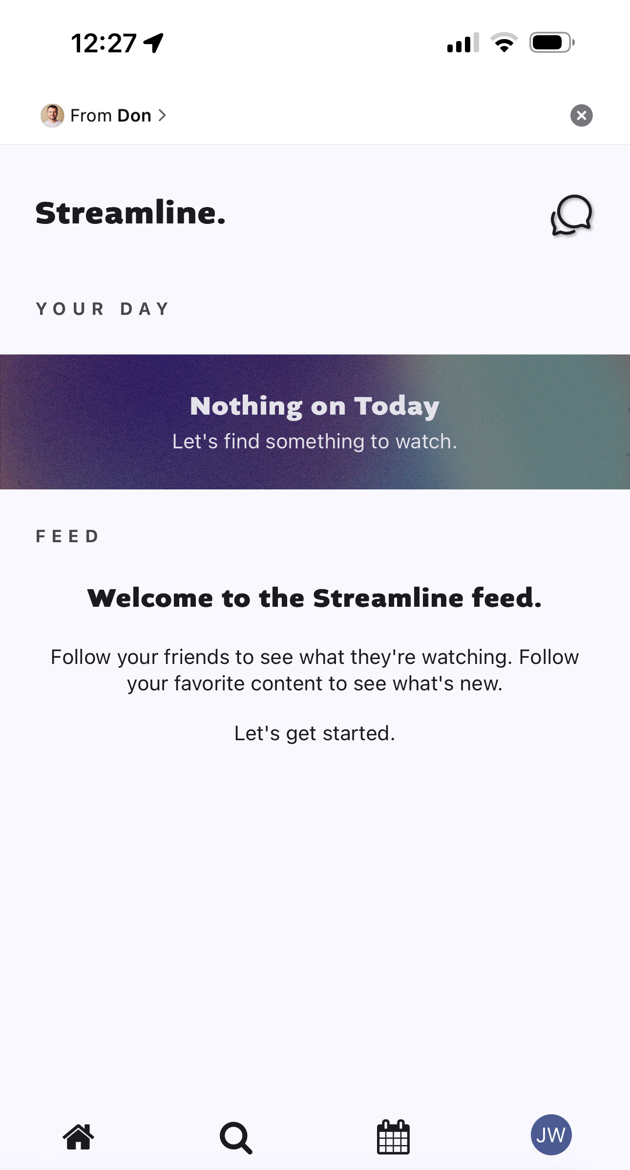
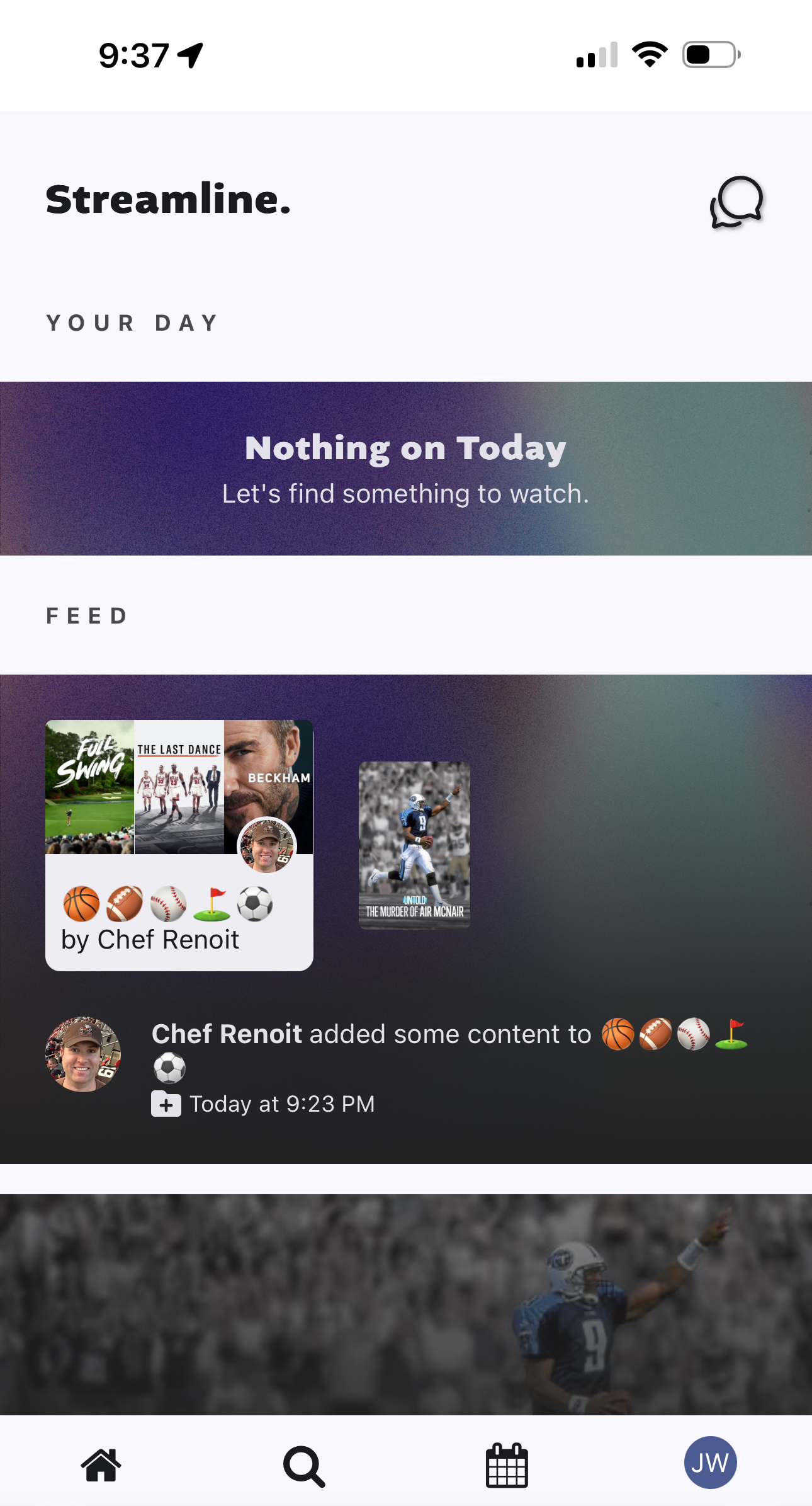
In discovery, it was found that the Homepage lacked true interest or panache for hooking users. There was a simple search bar with filters and some recommendations for but the app was directionless in terms of how to use it and had a lot of inconsistencies.
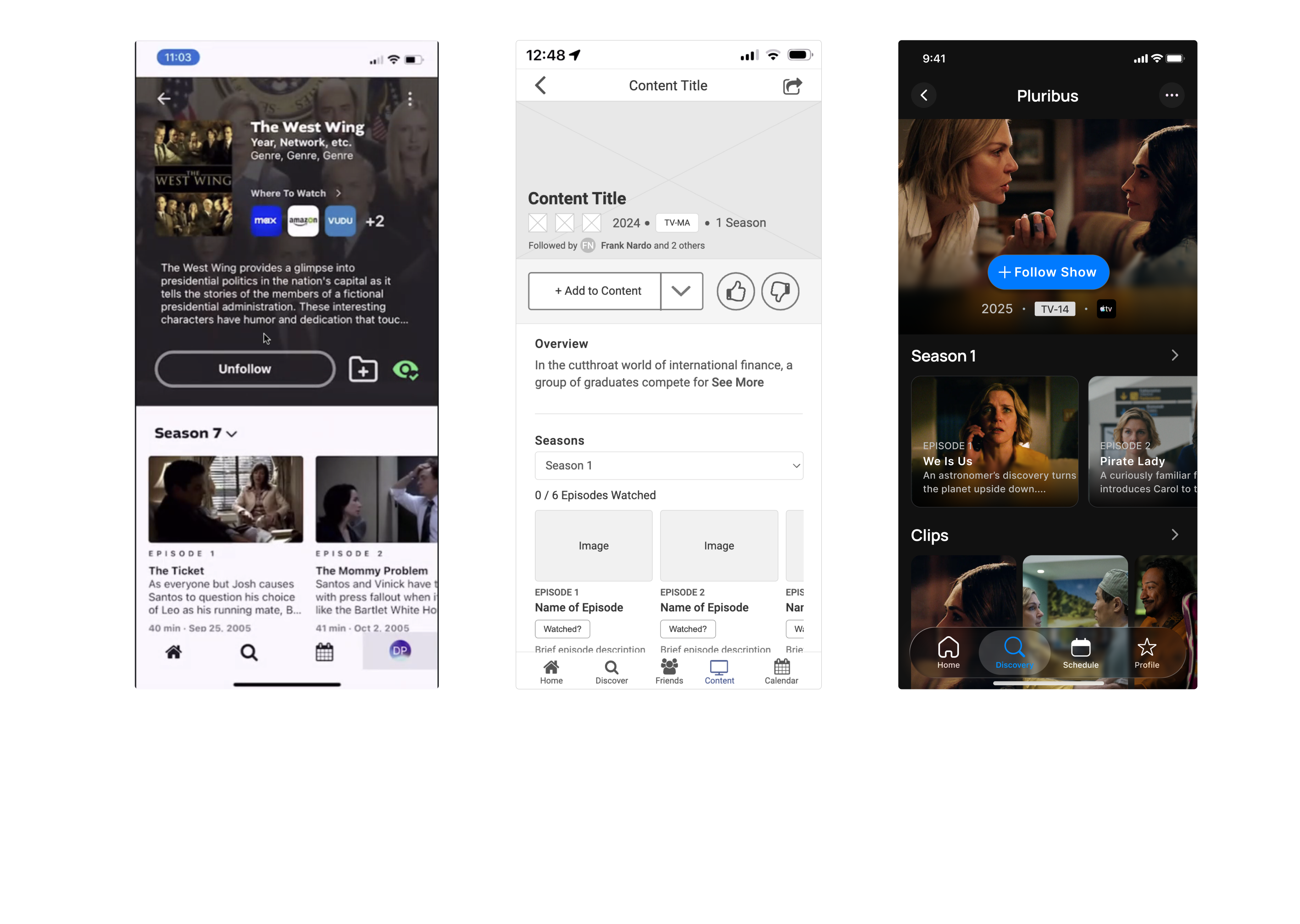
In discovery, it was found that the content pages lacked a tight visual hierarchy and had too many actions, buttons and contained unclear iconography.

In discovery, it was found that the lack of onboarding was hindering the user experience. The reason for this was because users would enter into an empty application and be confused as to it's purpose.
In discovery, it was found that basic UX principles had not been truly considered during the initial design. There were issues at a product level, an information architecture level and at a screen level. This combination of issues made the app very unintuitive for users and would all need to be fixed.
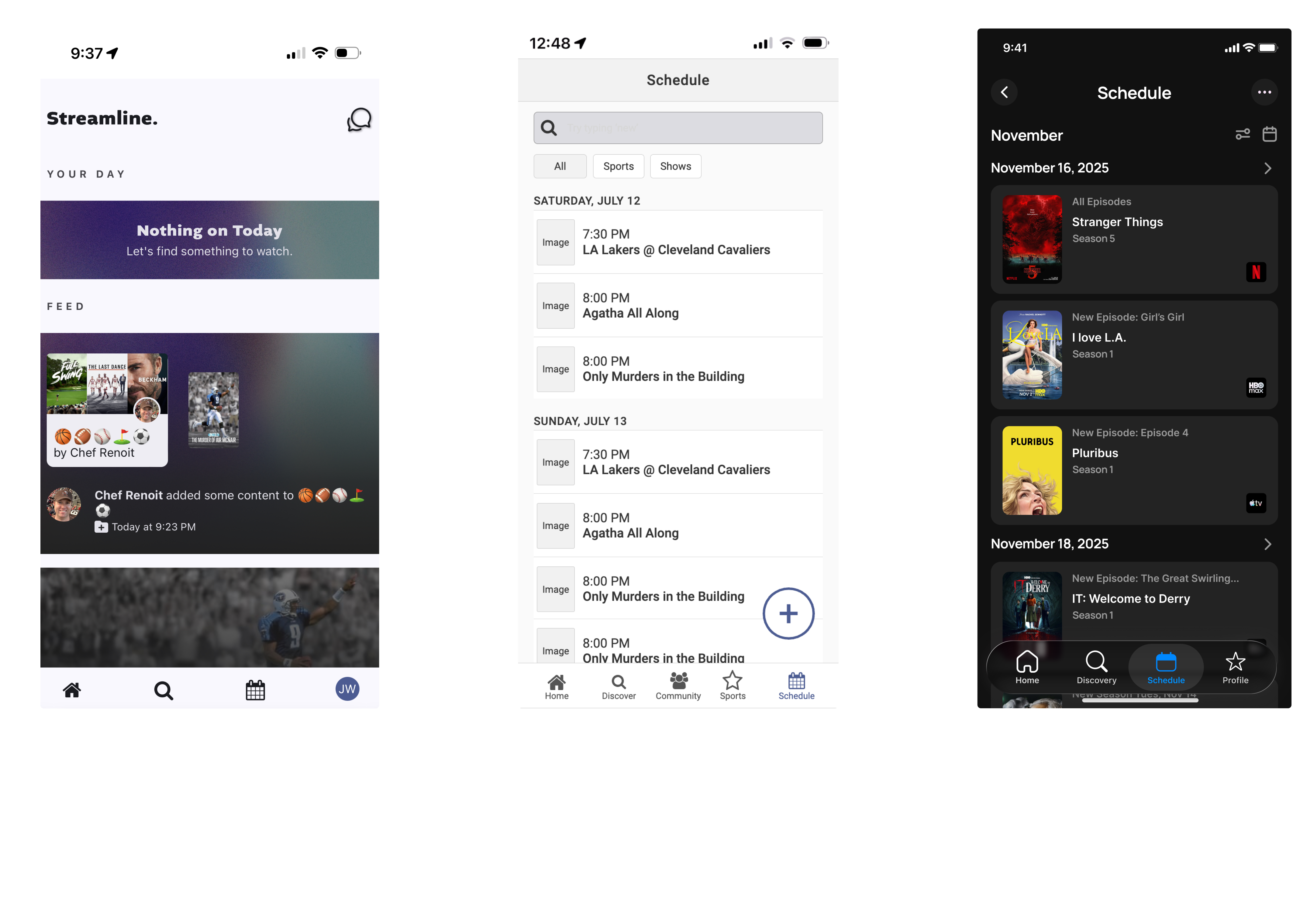
Streamline 2.0 took shape through rapid experimentation, tight collaboration, and constant iteration. Ideas moved quickly from wireframes to validated UI as the product evolved, with the Home experience, individual Show pages, and the Schedule all redesigned from wireframe to UI Each of these core areas was refined through testing and best-in-class interaction design to optimize real-world viewing workflows.
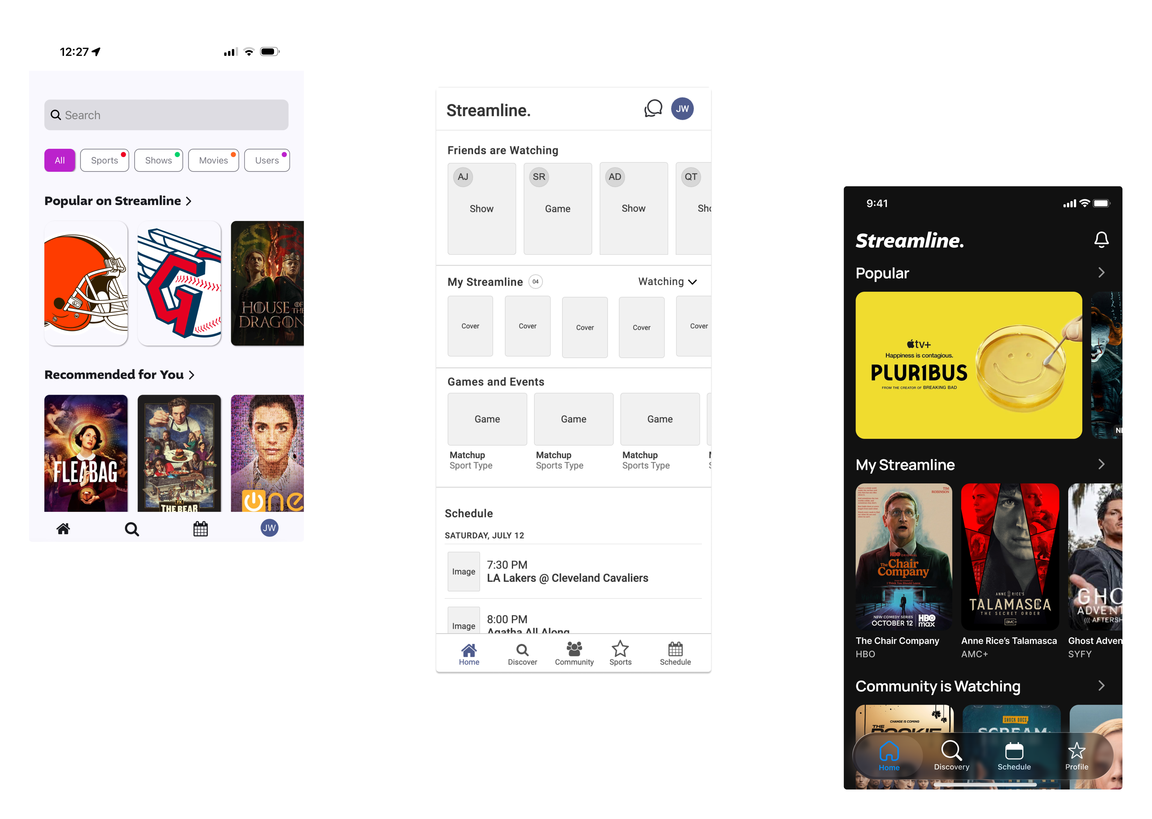
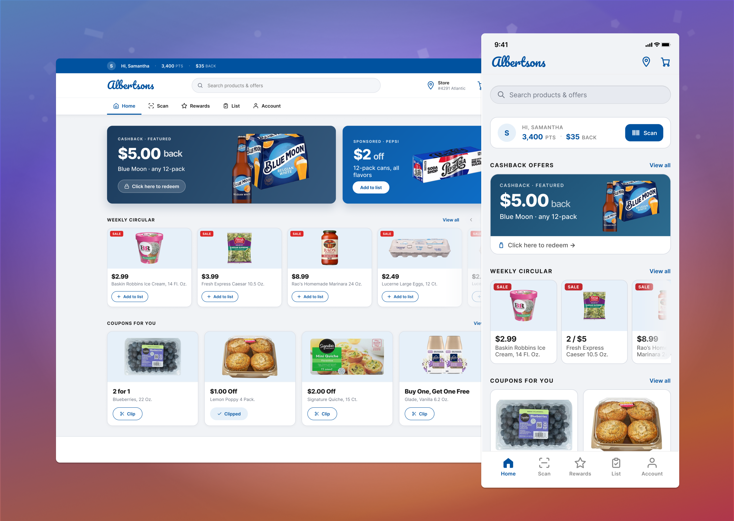
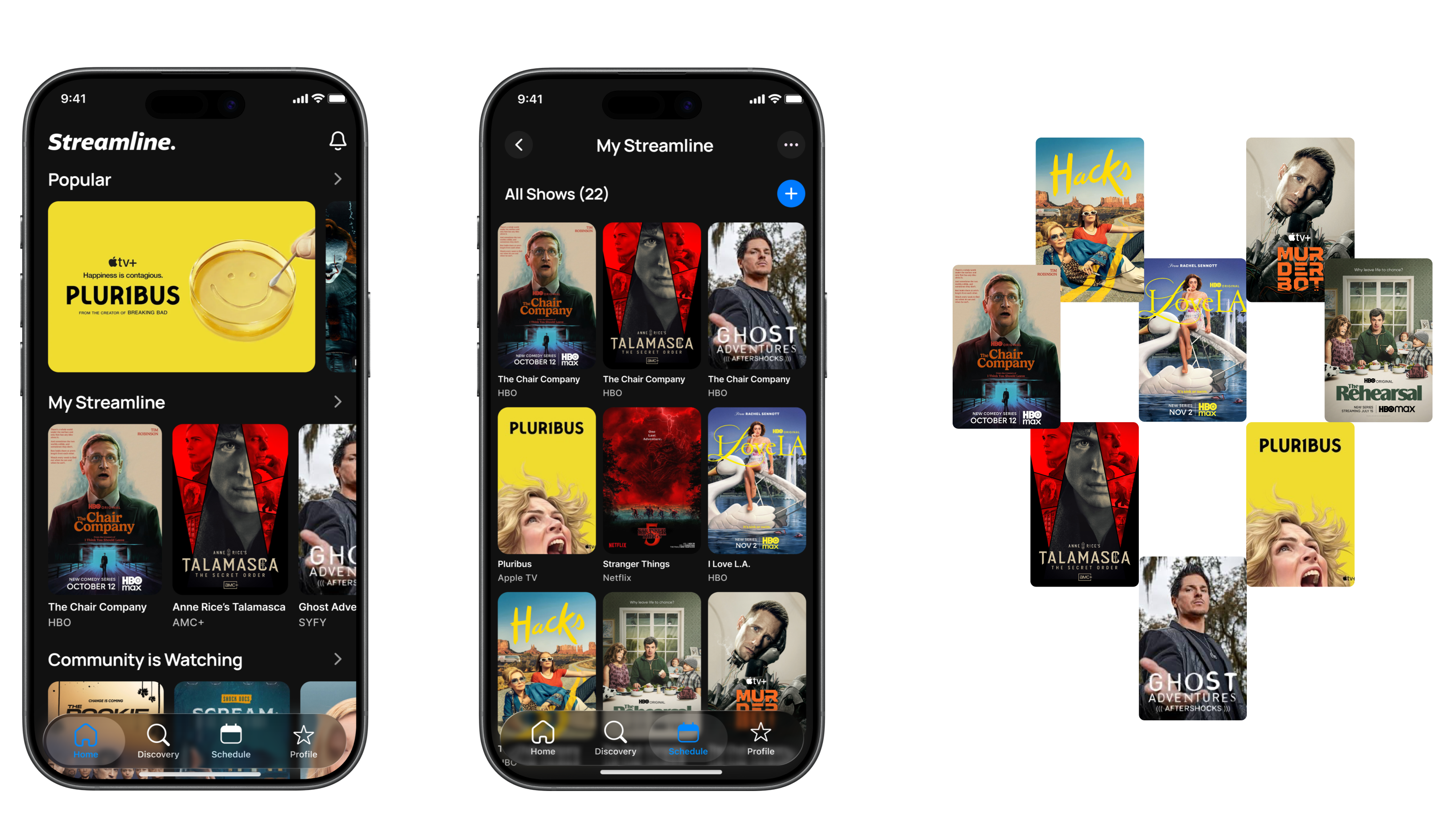
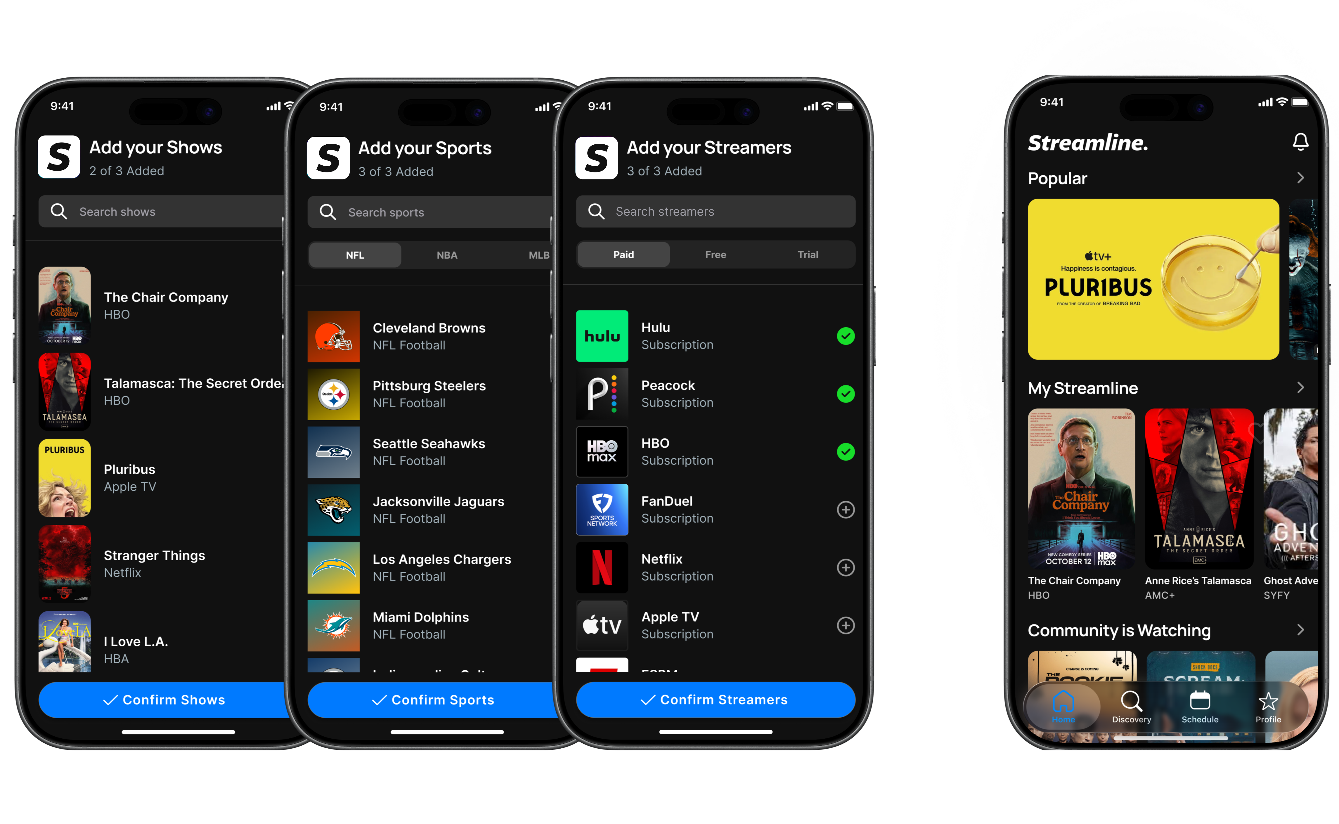
Streamline 2.0 was rebuilt through collaboration and iteration to deliver a more cohesive and intuitive product experience. My Streamline centralized saved shows, automatic tracking kept content up to date, and the Schedule with real-time notifications ensured users never missed a release. A guided onboarding flow made setup fast, turning a multi-app problem into one seamless streaming hub.
My Streamline gave users a single, centralized place to save and manage all of their shows across platforms. It tested extremely well and replaced the scattered notes, screenshots, and reminders users previously relied on.
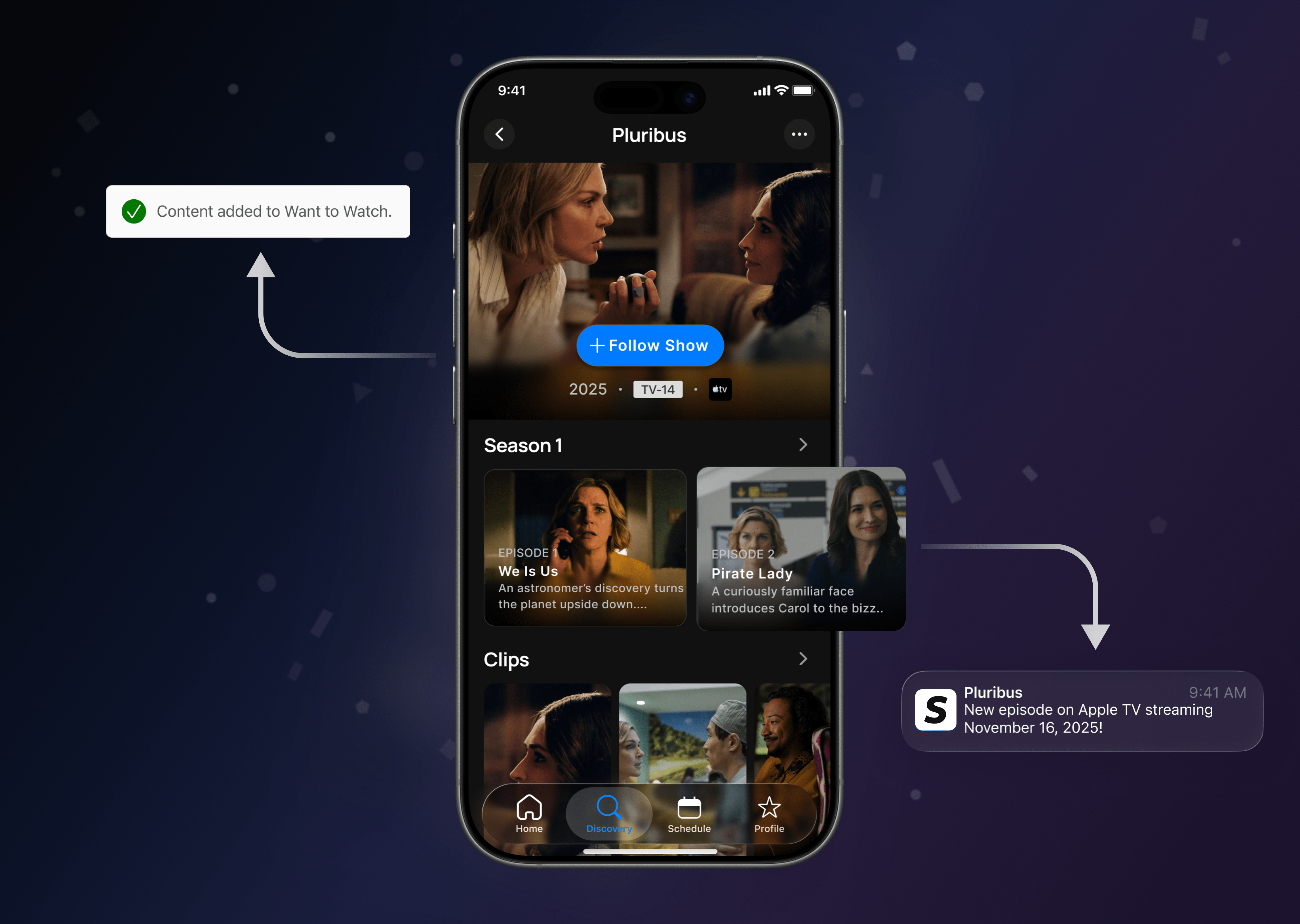
Users could choose exactly how they wanted to track each show: adding it to My Streamline, placing it on their schedule, and enabling notifications for new episodes. This flexibility ensured users stayed organized without missing anything.
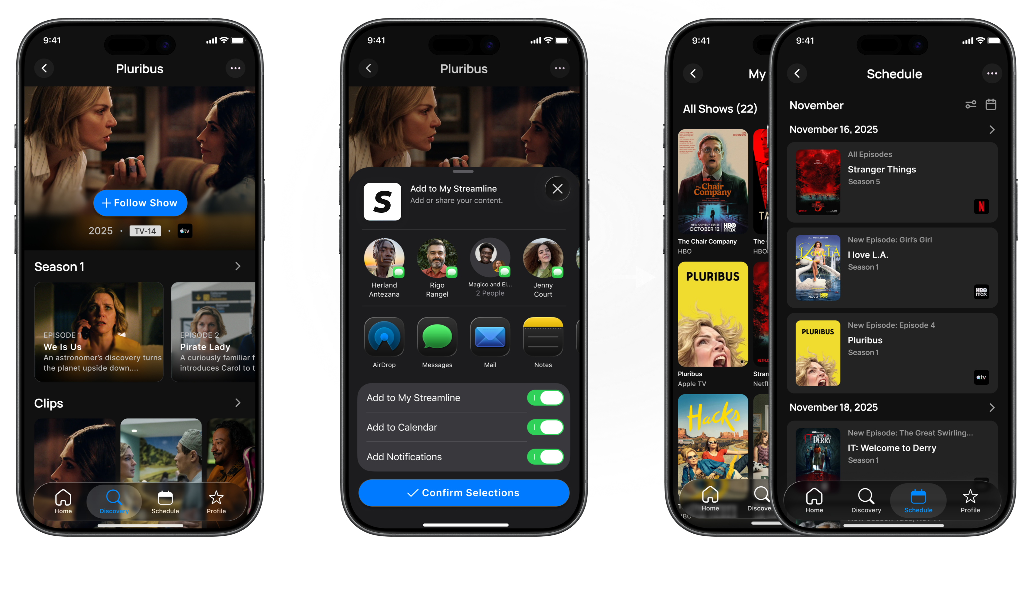
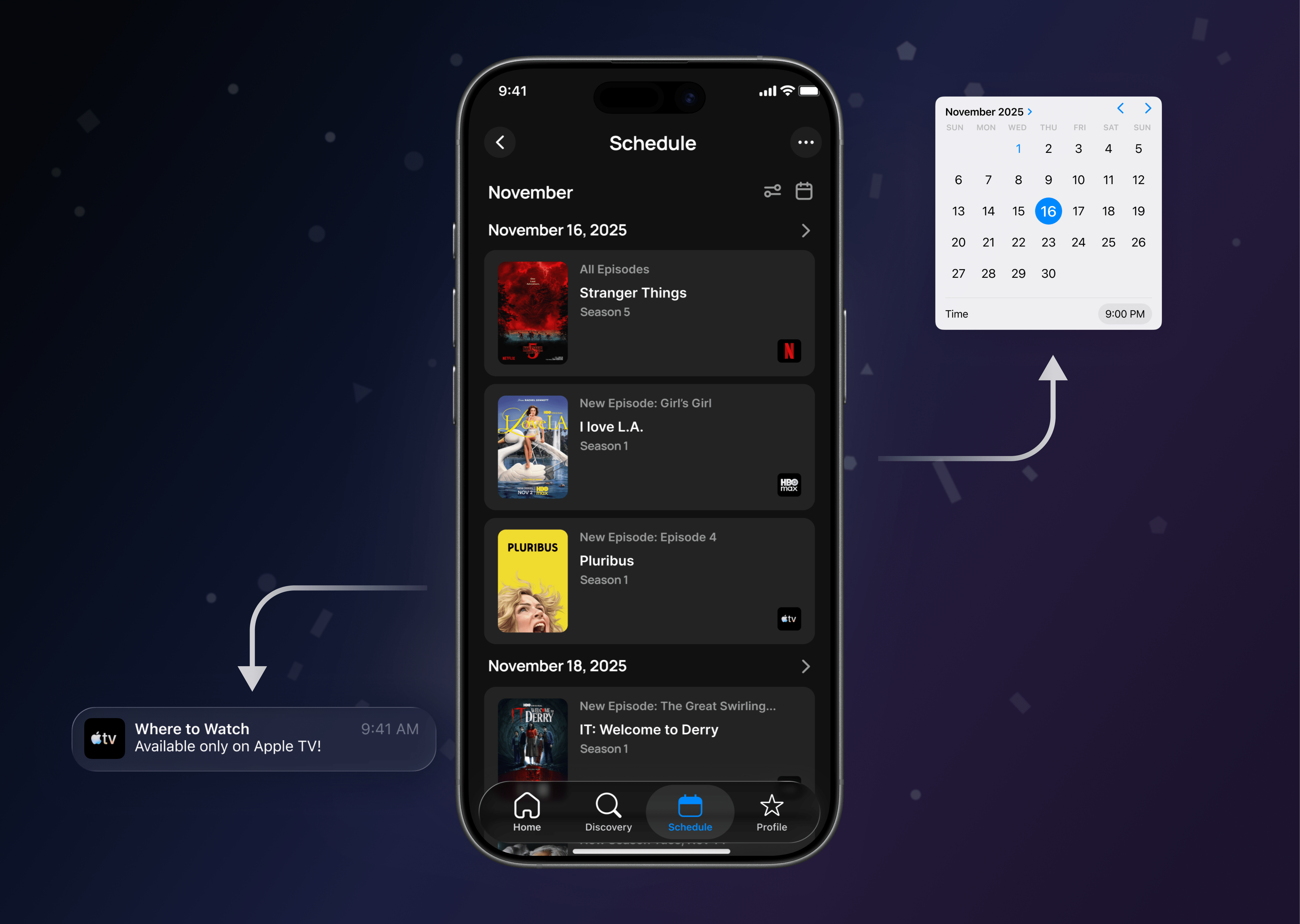
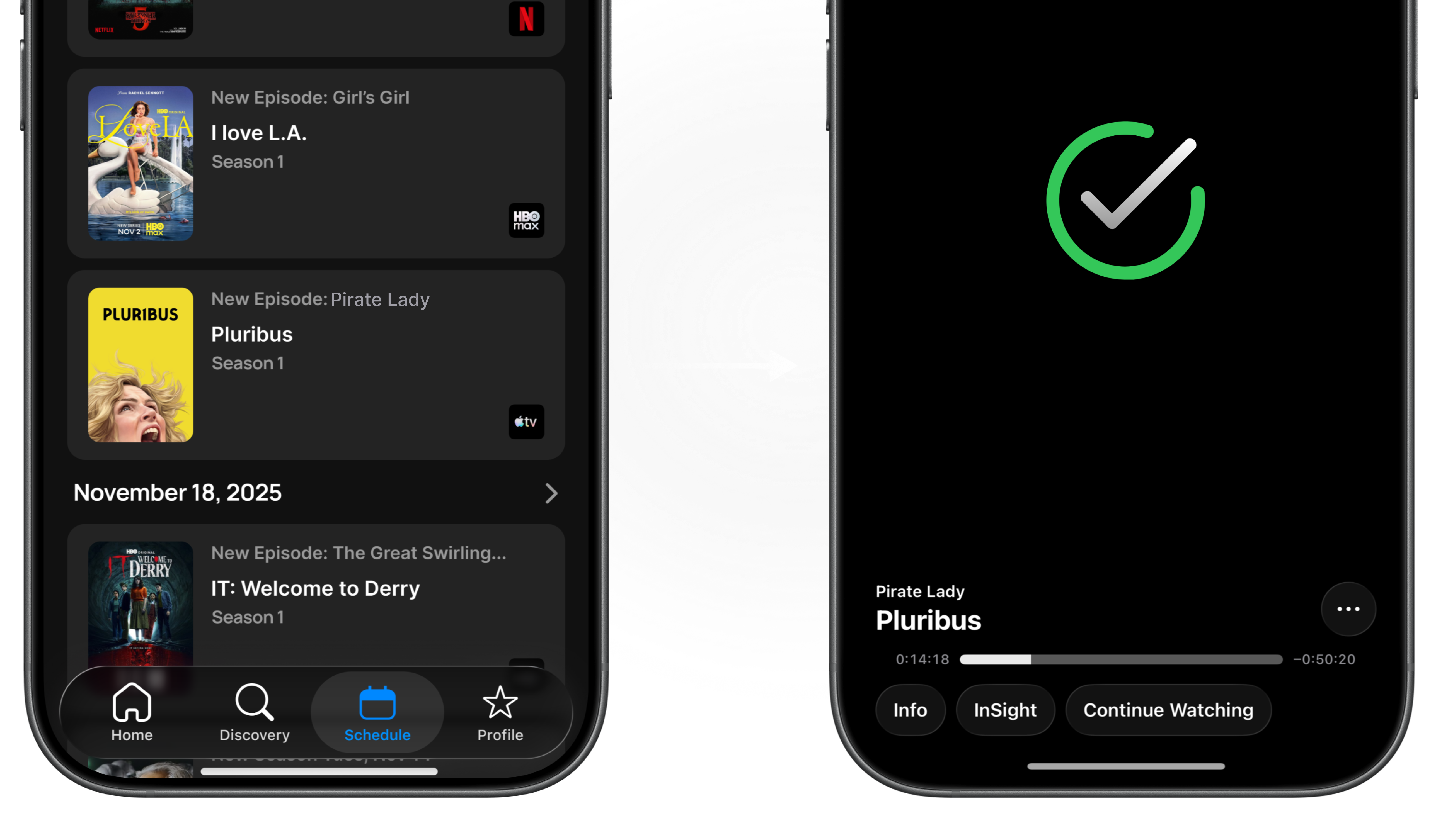
The Schedule feature gave users a clear, centralized view of when their saved shows were airing across all streaming platforms. With automatic updates and notifications, users could plan what to watch and stay up to date without manually checking multiple apps.
A guided onboarding flow helped new users quickly connect their streaming services, select favorite shows, and set up notifications and scheduling preferences. This ensured users immediately understood how to use Streamline and could start tracking content within minutes.
Streamline is ambitious and uses a host of data and functionality to be a workhorse for streaming enthusiasts. In a day and age when there are a million sources of content apps like Streamline can really help people to organize their streaming schedule. I was able to help the team get to Streamline 2.0 which has set the stage for more advanced features and refinements.