Applying end-to-end UX expertise to turn Camping World’s conceptual sales app into a real, usable product.
Camping World is a leader in the RV retail space with a passionate team of Sales Associates in showrooms across the country. As Lead UX Designer on the IT team, I was tasked with defining and designing an iOS sales app that transformed Salesforce’s powerful but cumbersome capabilities into a streamlined, mobile experience. The goal: give Sales Associates a tool built around how they work, not how Salesforce works.
Sales Associates relied on Salesforce to track leads, manage inventory, and update customer records, but the experience was slow and confusing. Too many screens, buried data, and repetitive navigation slowed down everyday tasks and pulled reps away from what mattered most: selling and connecting with customers.
“We took Salesforce’s data and AI foundations and reimagined them in a usable, task-focused iOS app. Our aim was to deliver a simple, modern interface that empowered Sales Associates to track performance, explore inventory, and communicate with customers quickly and confidently.”
I served as Lead UX Designer on a team of 6 (mostly engineers) for this mobile sales app project, owning the full design process from discovery through delivery. I conducted in-person user research, translated insights into wireframes and high-fidelity designs, and led stakeholder alignment through workshops and iterative prototyping. I partnered closely with product and engineering to ensure the final app solved real sales friction and delivered a usable, scalable solution built around how Sales Associates actually work.
To ground the redesign in real user needs, I traveled to five Camping World locations and conducted 20+ in-depth interviews with Sales Associates. These sessions uncovered pain points, workflow habits, and the limitations of Salesforce in daily use. We paired this qualitative research with hands-on observation and early prototyping to validate assumptions and uncover opportunities for simplification and efficiency.

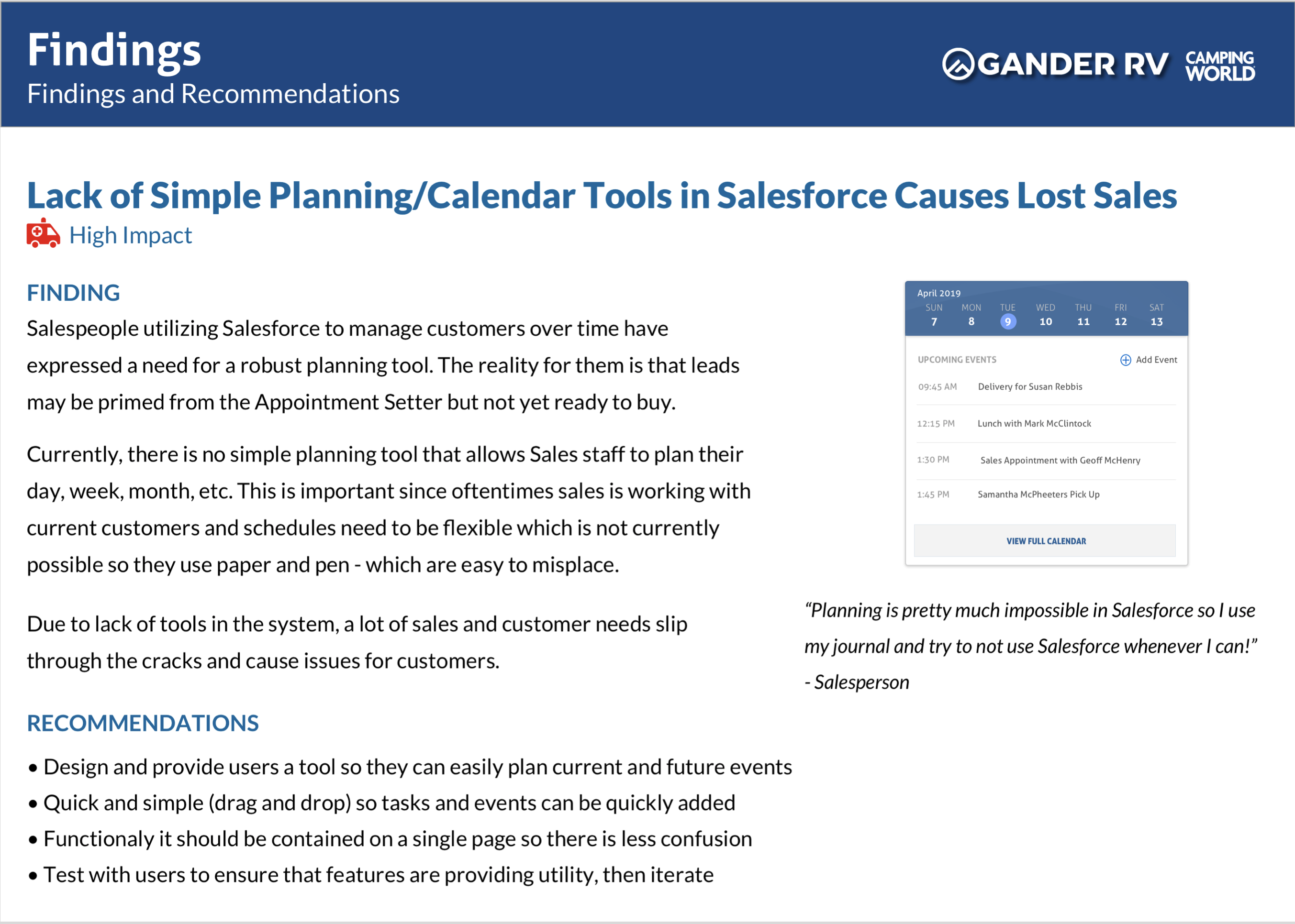
For Sales Associates, nothing was worse than using Salesforce to manage their work. It was slow, clunky and duplicative. In a word, the Sales Associates I worked with felt it was the bane of their existence which was being forced upon them. They described it as slow, duplicative, and difficult to navigate, especially when they needed information fast.
In research, I learned that Salesforce was not optimized for Sales Associates. They were clear that digging for and adding Customer information was a timesuck and they often were unclear how to follow up.

In research, I learned that Salesforce was a great CRM for trained users, but it was very challenging for a busy and uninterested Sales team.

In research, I learned that there are too many different types of Salesforce 'objects' and this made searching difficult due to duplicate information and information types.

In research, I learned that users did not trust the system because it would never be 'in-sync' with the backend system. As a result, they did not trust the data and felt their pen and paper was more effective.

The UX design strategy focused on reducing cognitive load and unifying key sales functions into a single streamlined app experience. Rather than replicate Salesforce’s interface, we distilled its strength into a task-first mobile tool. Interactive prototypes, frequent testing sessions, and iterative refinement ensured that each new screen and interaction matched how Sales Associates actually think and work.
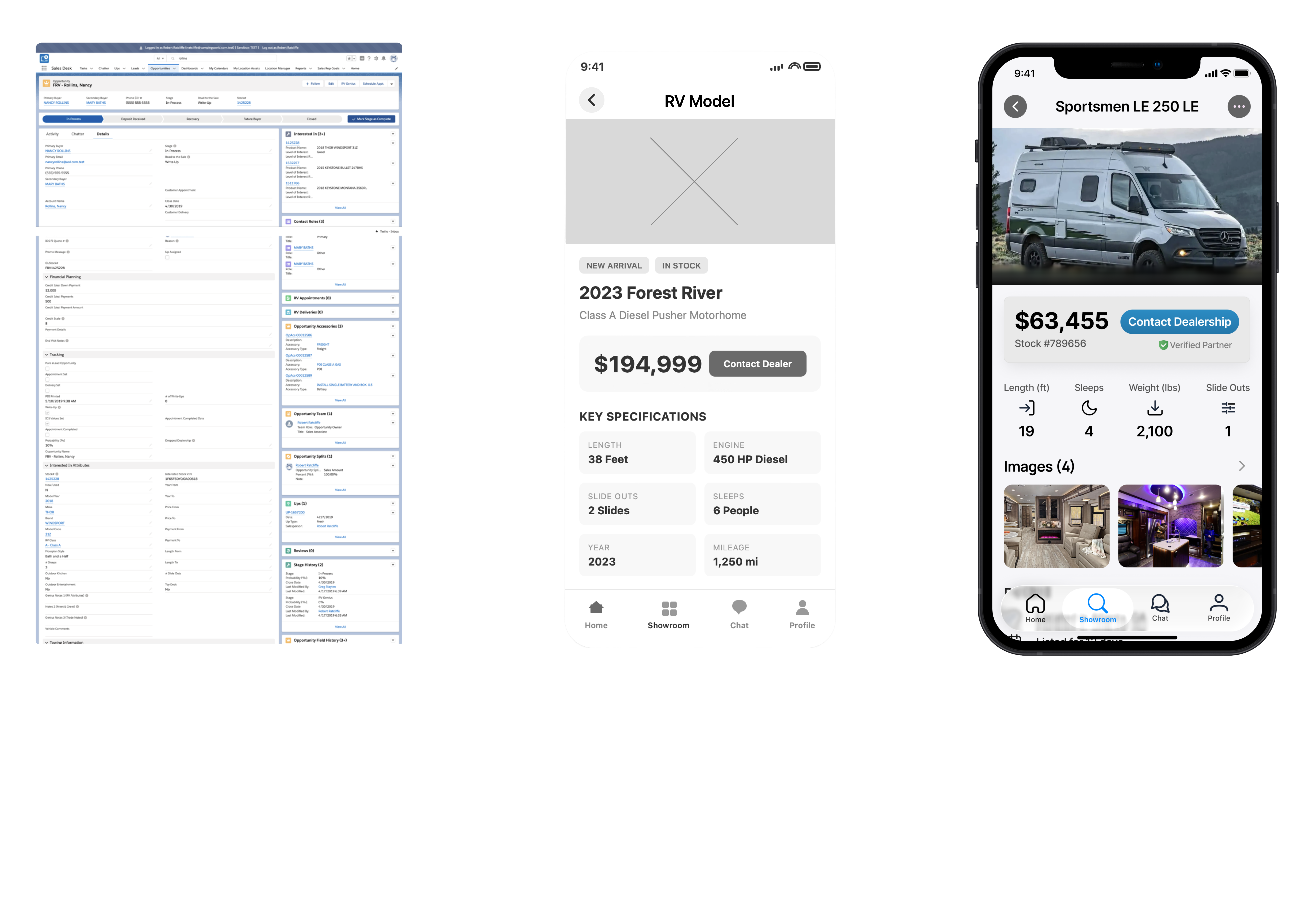
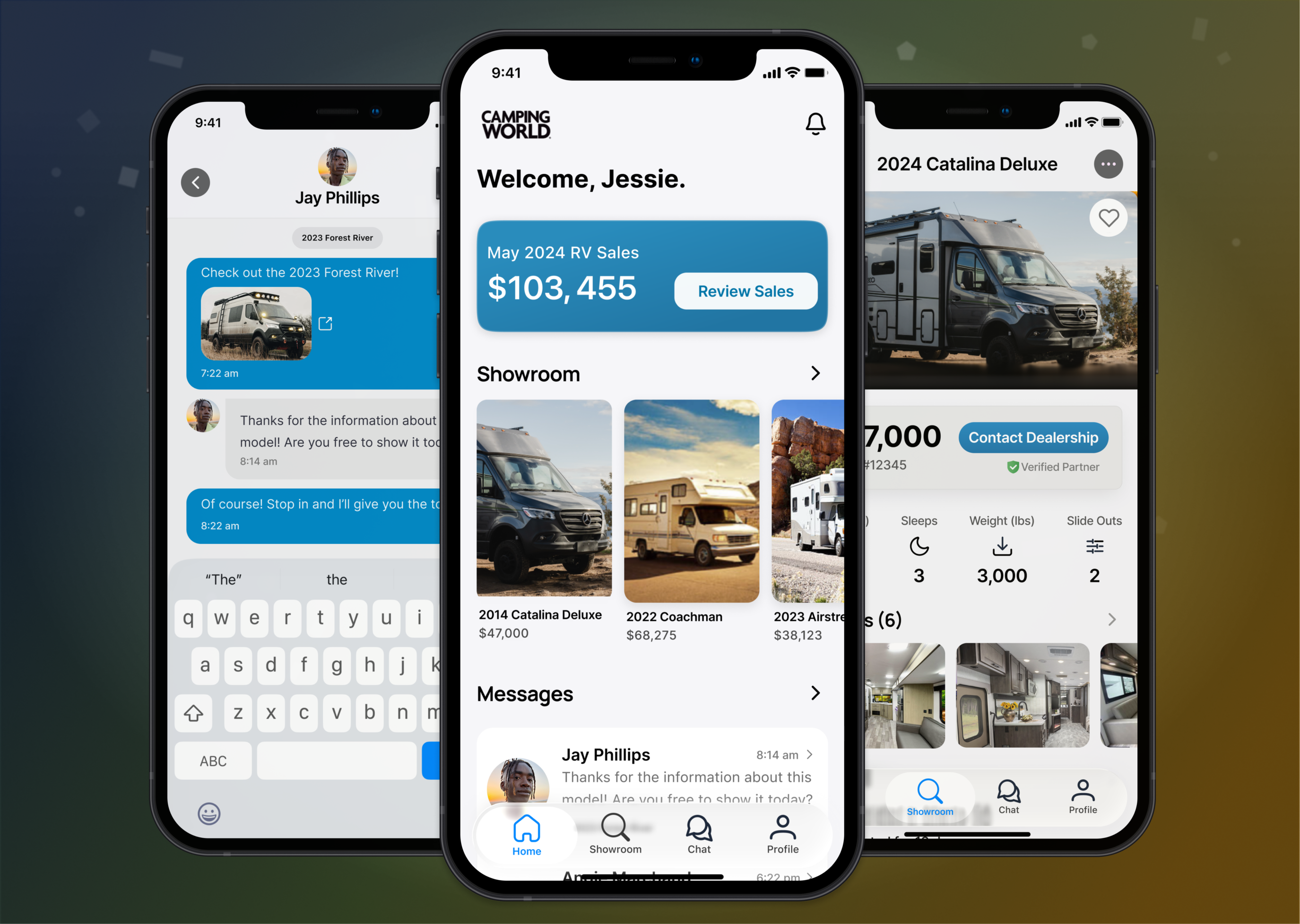
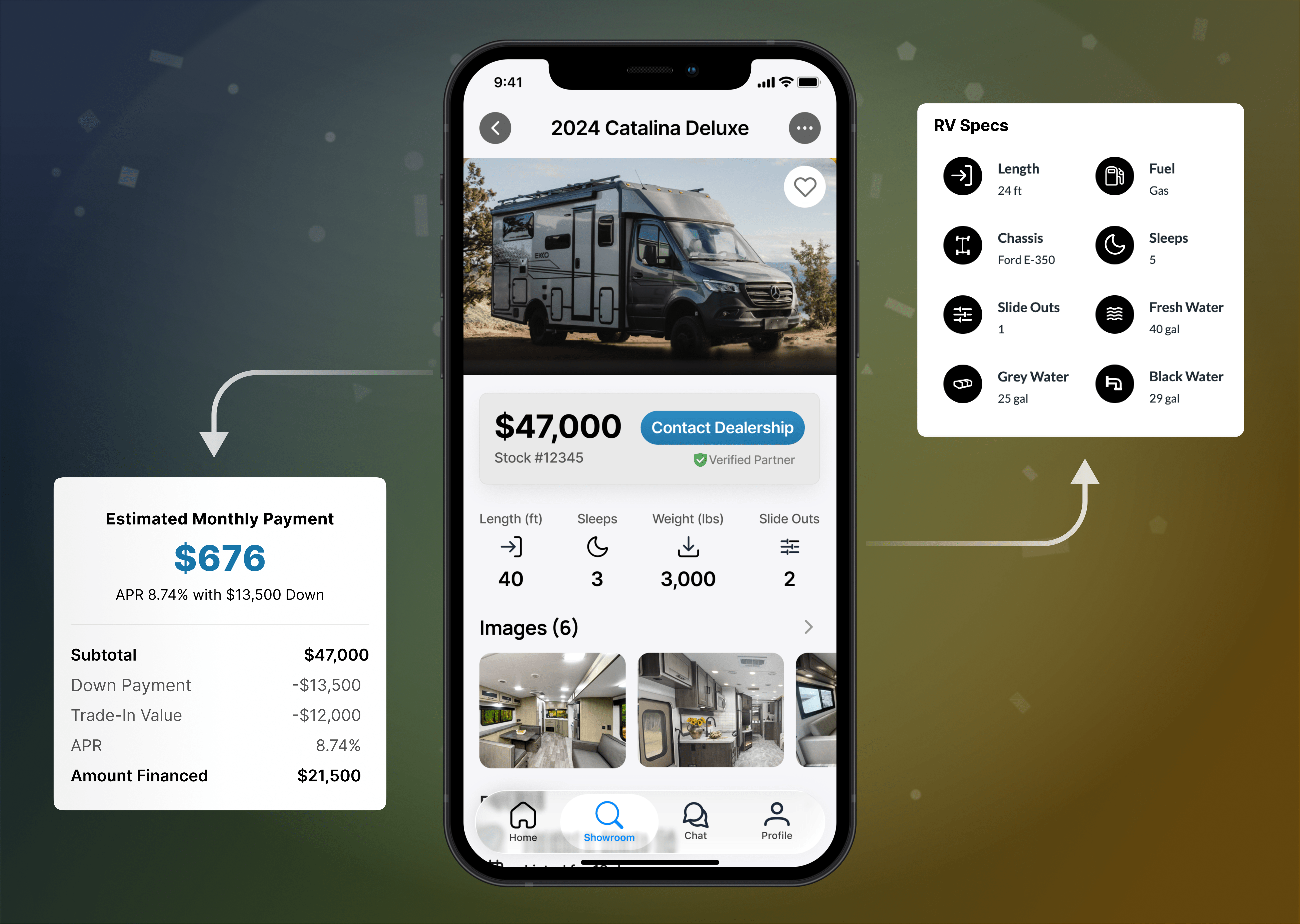
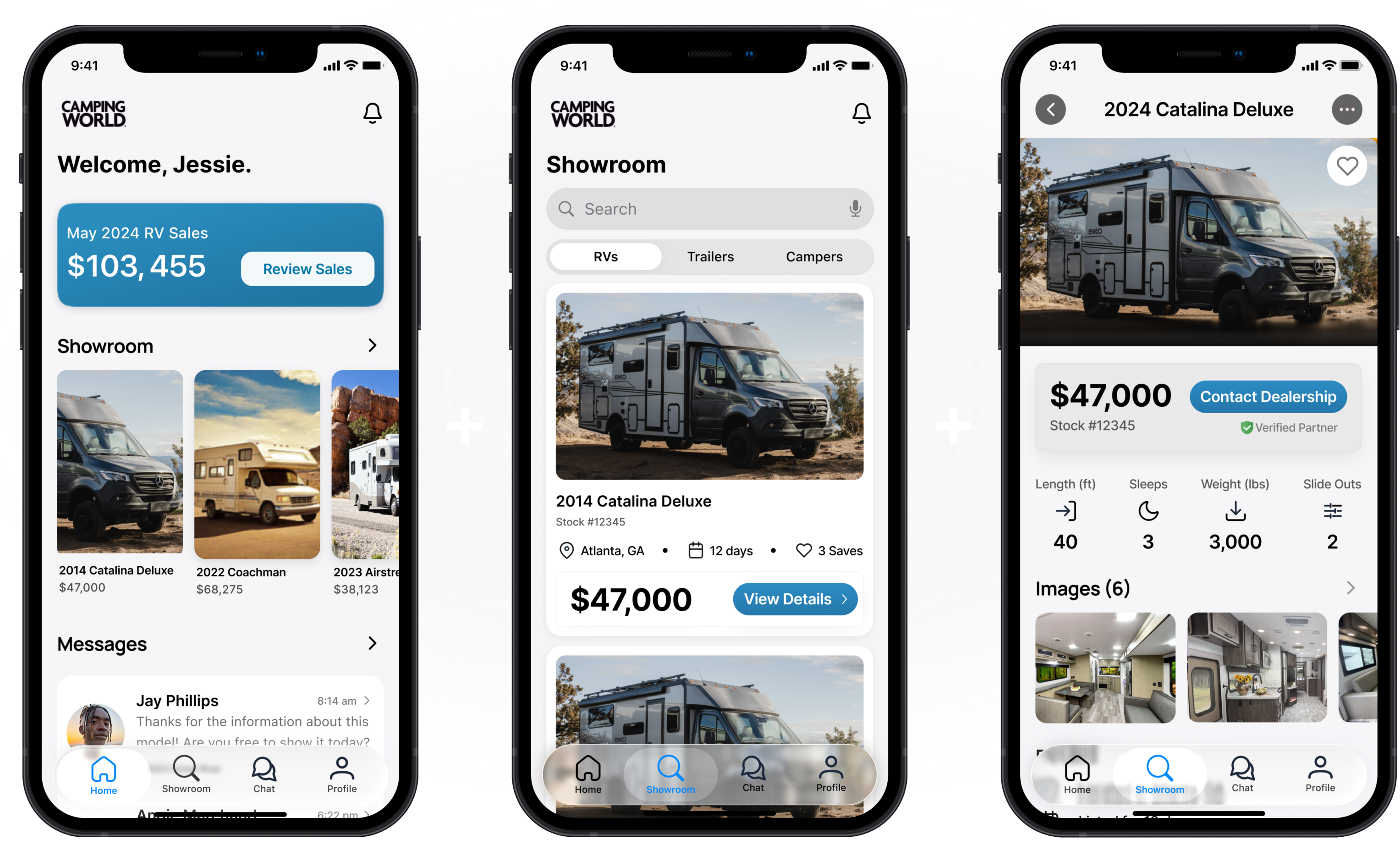
Instead of forcing Sales Associates to navigate complex CRM screens, we designed an iOS app with intuitive navigation across the core areas they used most: Home, Showroom, Chat, and Profile. Each screen presented rich Salesforce data in a way that felt fast, contextual, and easy to act on.
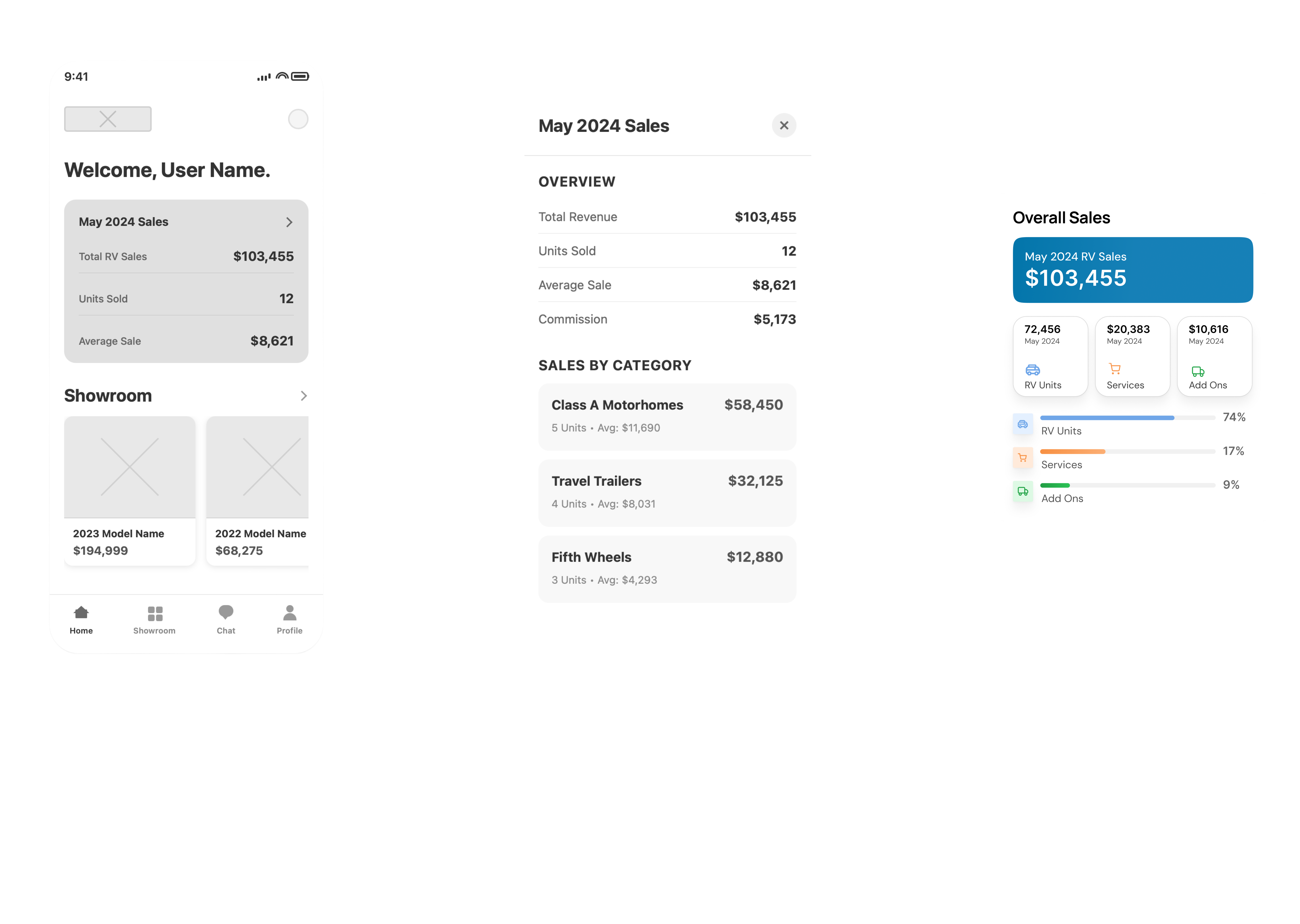
Salesforce’s fragmented data was consolidated into a single, intuitive mobile experience built specifically for Sales Associates. Critical sales, RV inventory, and customer information was surfaced in one place, eliminating the need to bounce between screens and systems. The result was a faster, more focused workflow that aligned with how sales teams actually work on the floor.
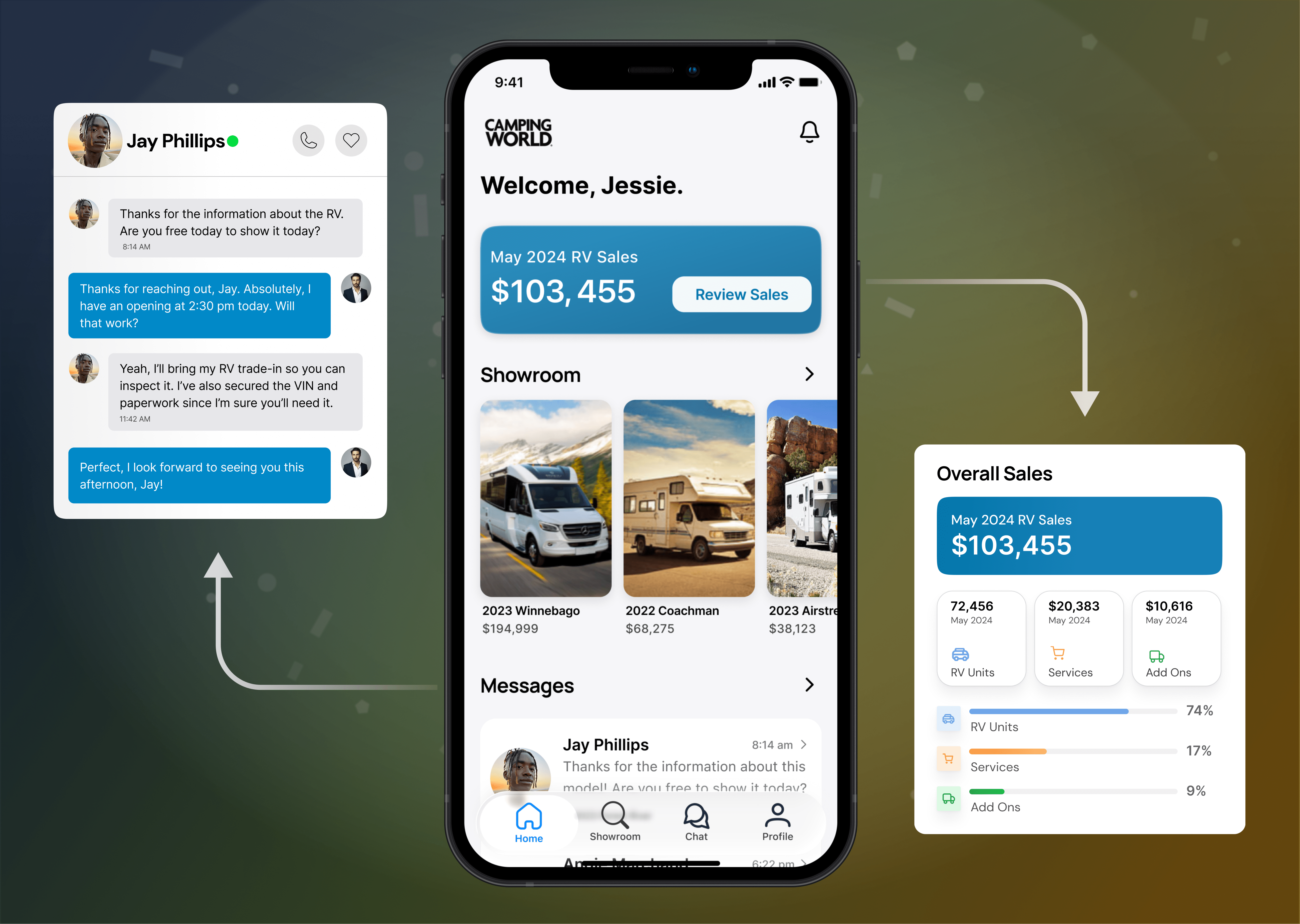
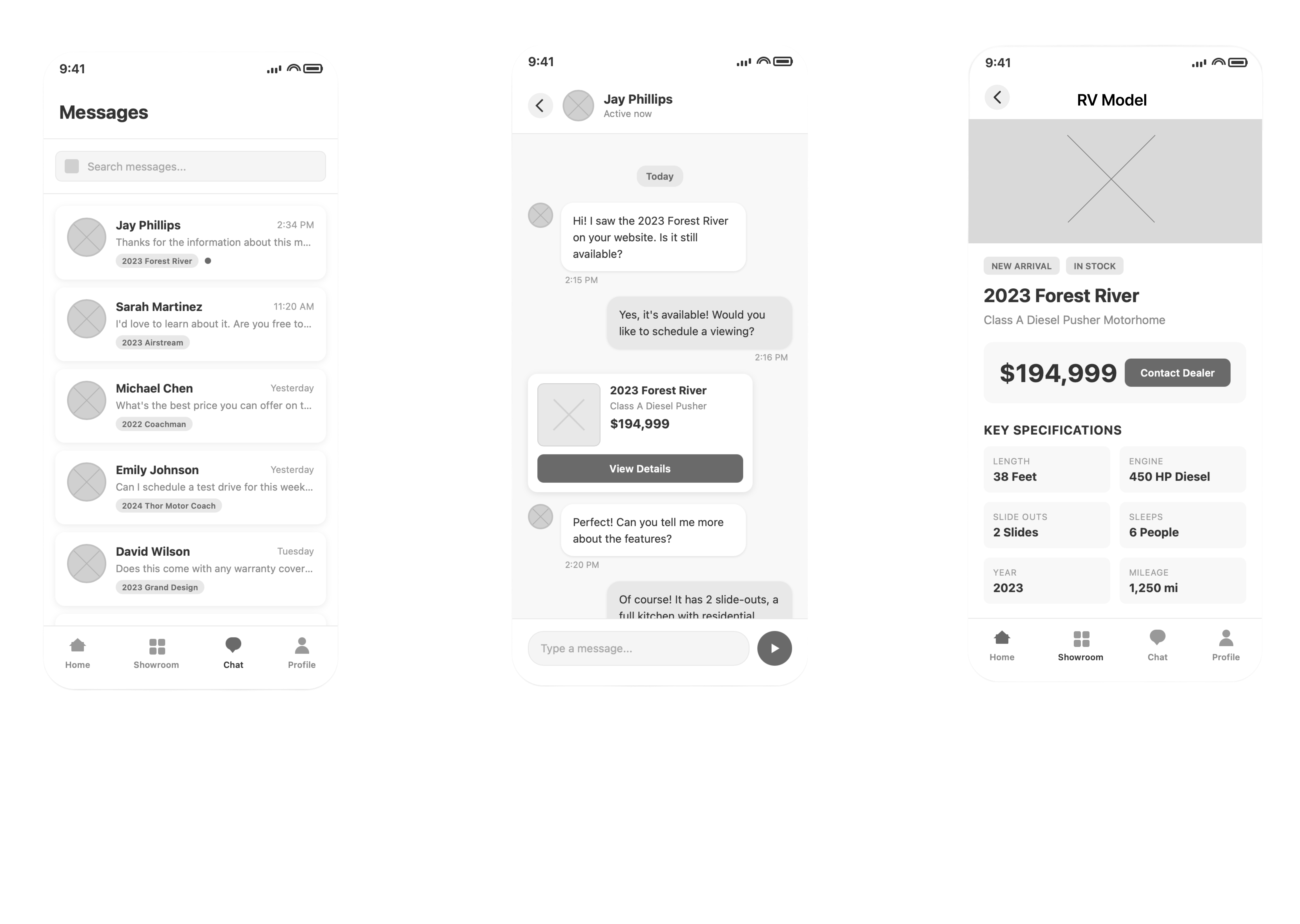
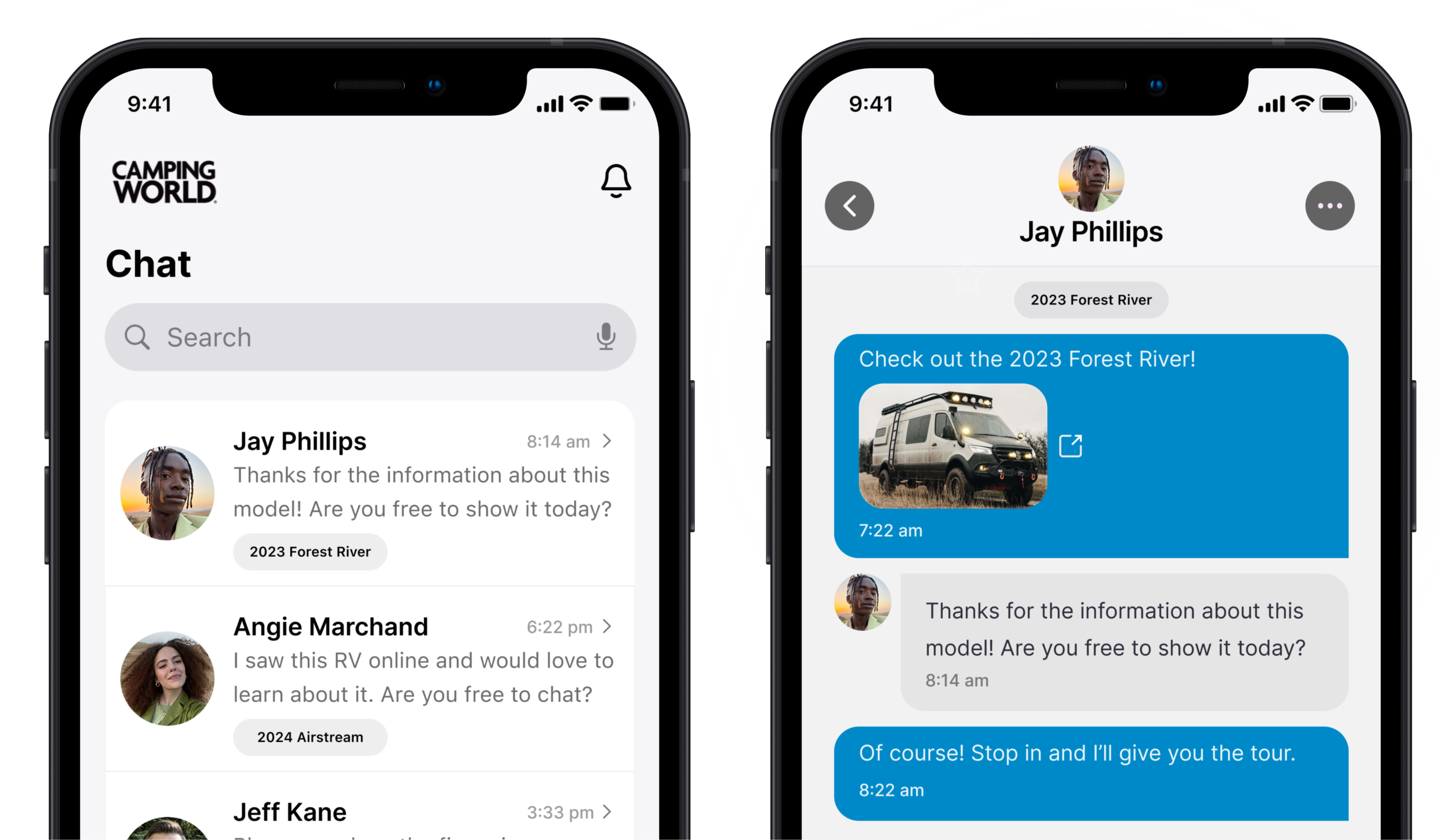
The app streamlined customer communication so Sales Associates could answer questions and resolve issues in fewer than four steps. Conversations, context, and customer details were all accessible in one place, removing delays caused by switching tools. This faster, more responsive experience improved customer confidence and kept sales conversations moving forward.
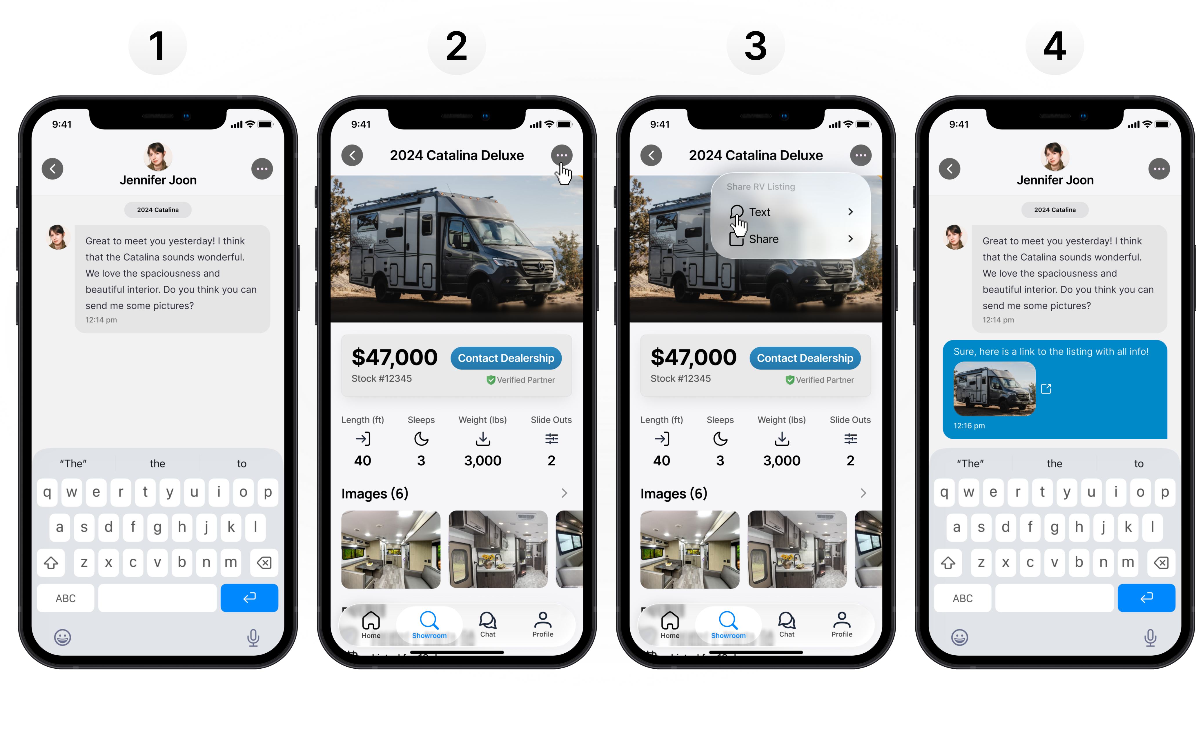
Customer chat was redesigned to be fast, contextual, and easy to use on the sales floor. Sales Associates could view conversation history, customer details, and related RV information in one place, reducing friction and guesswork. This made it possible to answer questions, follow up, and resolve issues in just a few taps.
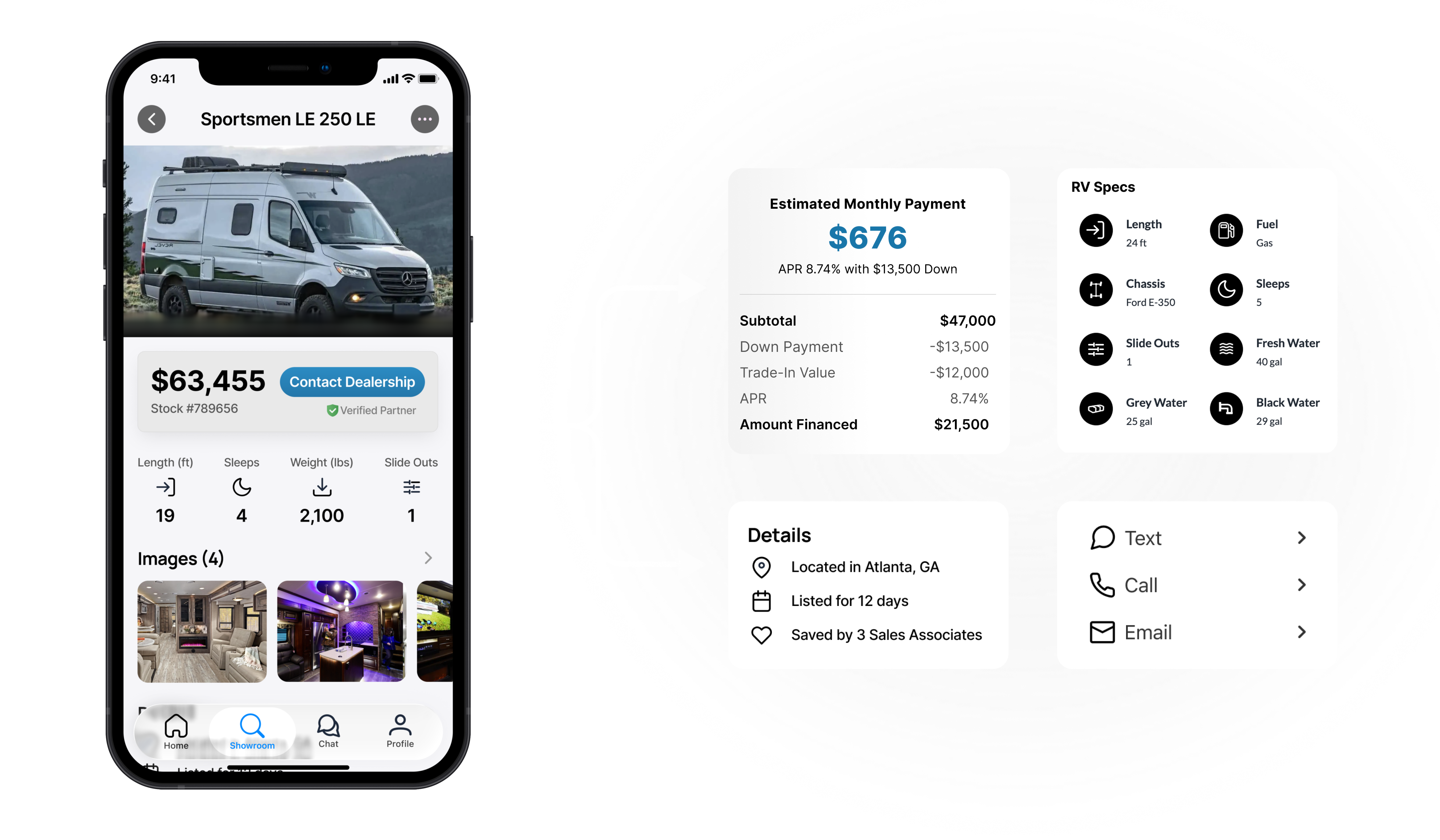
The app brought essential sales tools together in one place, including estimated monthly payments, detailed RV specs, and location-specific inventory. Sales Associates could access everything they needed while staying in the flow of customer conversations. With communication tools baked directly into the experience, selling became faster, more informed, and more seamless.
Measurable results and figures accomplished what I set out to do: make Sales Associates' lives easier. Below are a few examples of efficiencies that were created as a result of the new Camping World app.