Redesigned a legacy ordering platform from the ground up, applying product, interaction, and UX design skills to deliver a modern, customizable, feature-rich solution.
This project focused on the redesign of a fully customizable e-commerce platform used by over 200 clients, including Ford, Best Buy, Wendy’s, and Elevance. Because the platform served many different industries and workflows, the user experience had become inconsistent, outdated, and difficult to navigate.
The platform had not been redesigned since the 1990s and lacked modern usability and accessibility standards. Because it supported deep functionality and client-specific customization, the project was also significantly more complex than traditional eCommerce design work. Over time, feature additions layered on top of one another resulted in confusing navigation, inconsistent behavior, and high user friction throughout the ordering process.
“The entire website and ordering platform was redesigned and rebranded from the ground up. This included the ordering, customization, and checkout experiences. The redesign was completed with user input infusing each step of design.”
I started as a Lead UX contractor on this project and they liked my work so they hired me full-time as Head of UX. For the redesign I led a team of four UXers, owning the end-to-end UX and product design. I guided the experience from user research through final UI, building a fully interactive prototype of 50+ screens that represented the entire system using Figma, Axure and Sketch as primary design tools. Throughout the project, I partnered closely with stakeholders, product, and engineering to deliver a solution that improved clarity, efficiency, and long-term usability.
Because the platform served a large client base, multiple research methods were used to ensure design decisions were based on real user needs.
First, A full heuristic evaluation was completed to identify usability issues across the legacy system.
Second, internal and external user research helped uncover workflow patterns, pain points, and business goals.
Third, prototype concept validation sessions confirmed usability and feature effectiveness before final design execution.

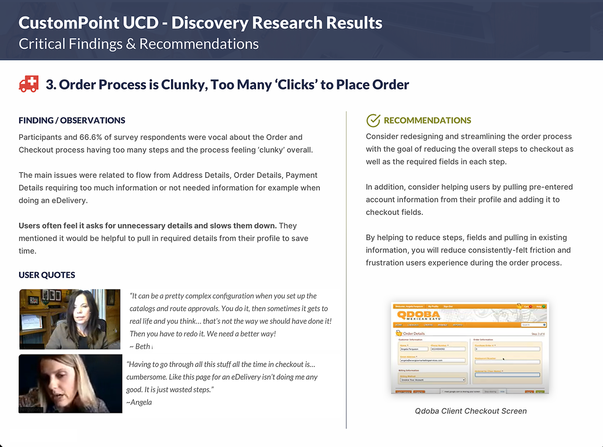
Across 30+ interviews and testing sessions, clear usability patterns quickly emerged. No matter the client or industry, users were running into the same friction points throughout the ordering experience. These findings became the foundation for all major design decisions that followed.
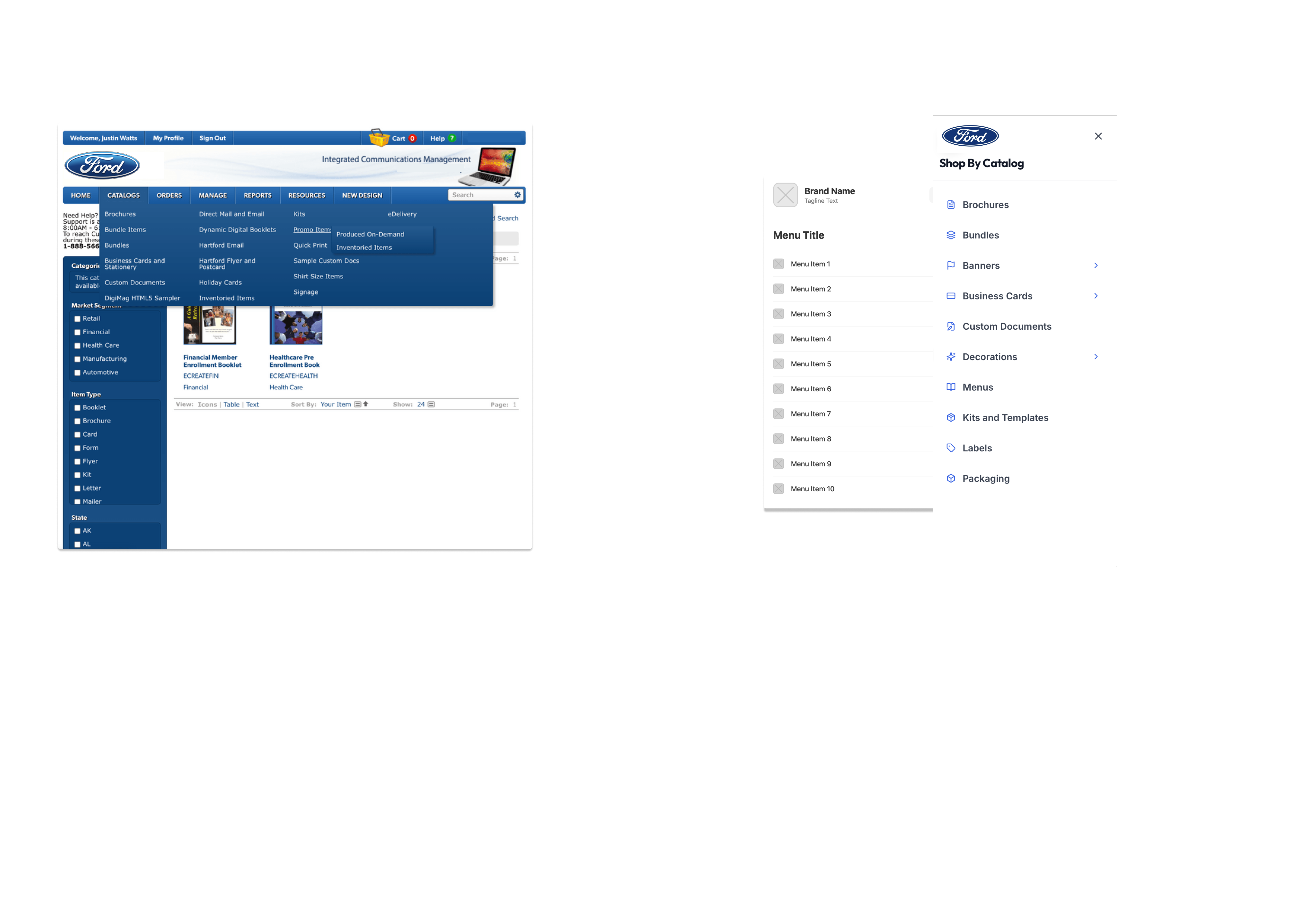
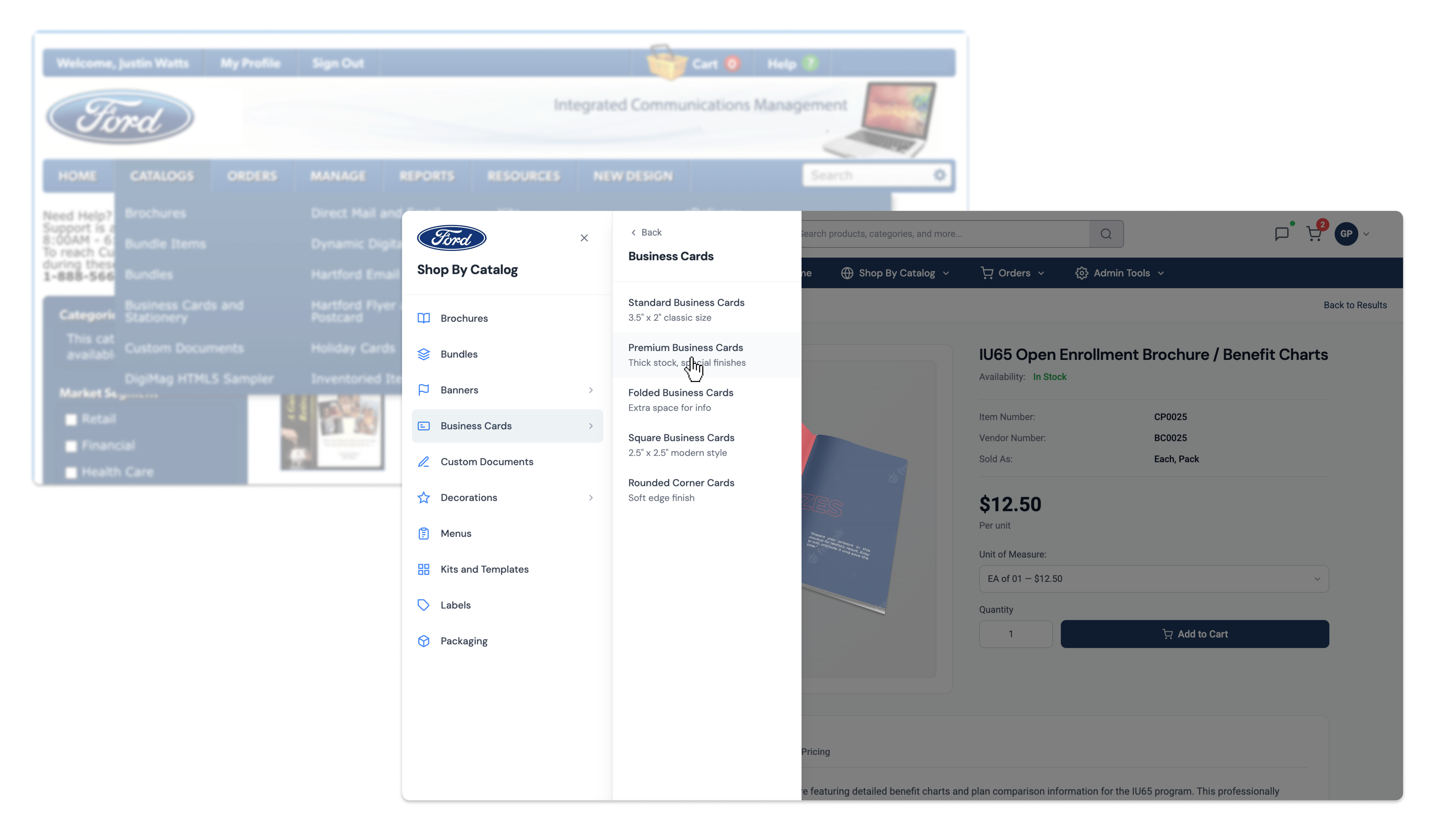
The old mega-menu was cluttered and difficult to manage due to highly customized catalogs. Users often felt overwhelmed and had trouble moving between product categories.

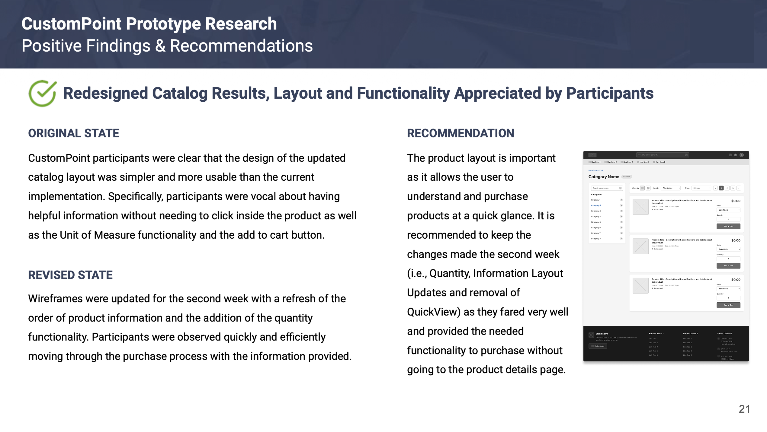
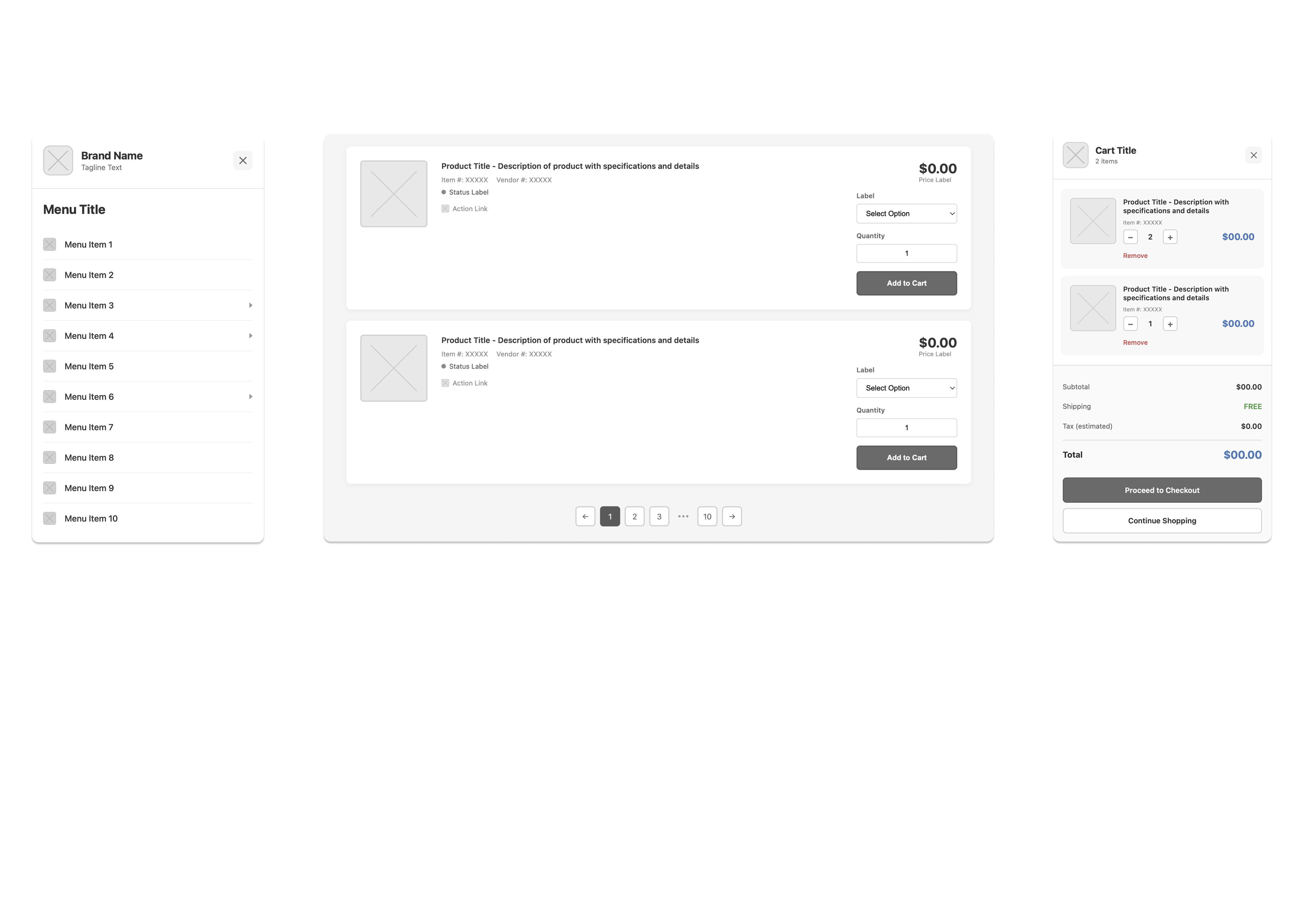
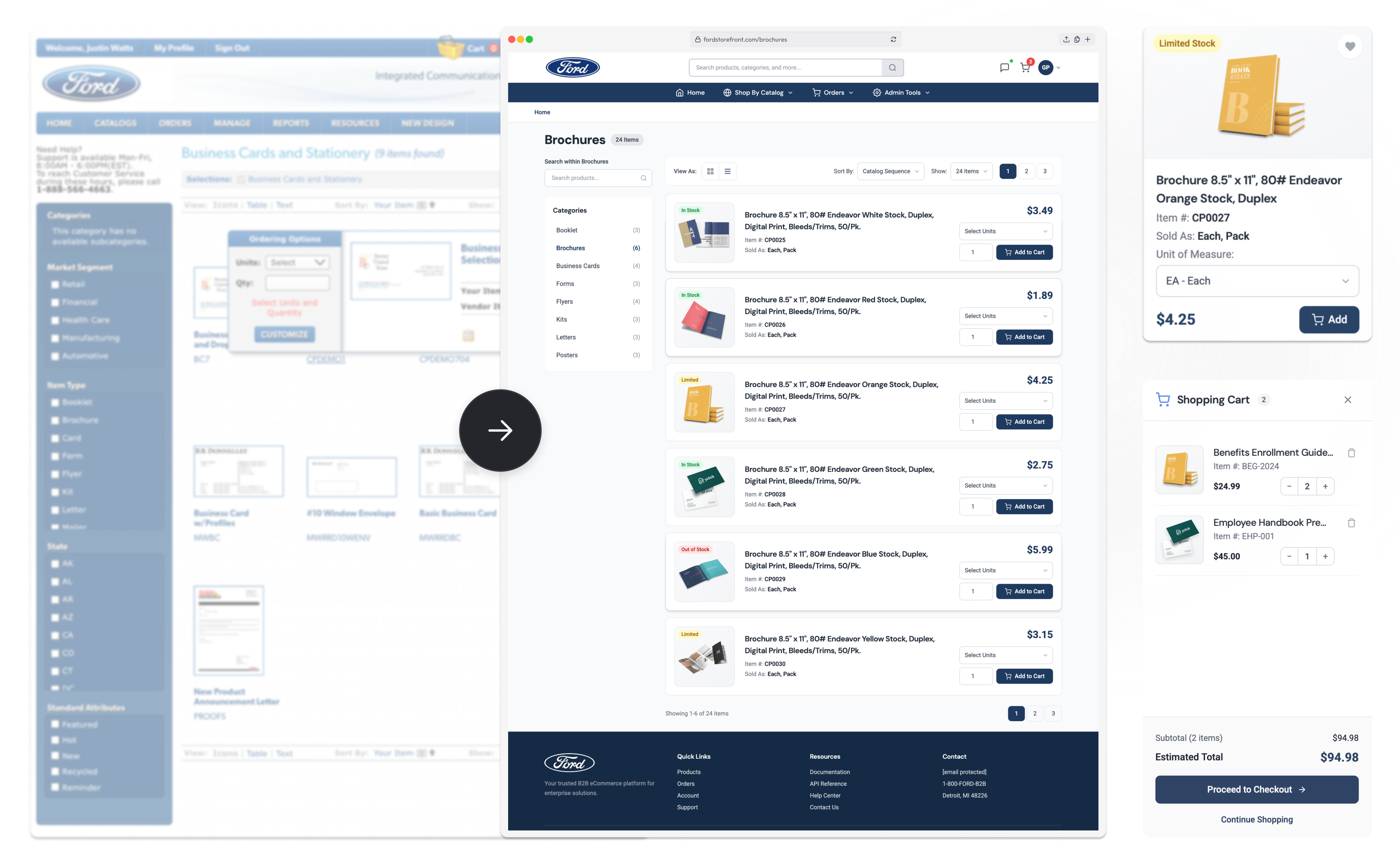
Users struggled to browse and purchase products efficiently. Many had to drill multiple layers deep into product pages just to add items to their cart. Modals and configuration steps created unnecessary friction.

Product discovery was slow due to poor information architecture and unclear hierarchy. Users frequently relied on workarounds to locate common items.

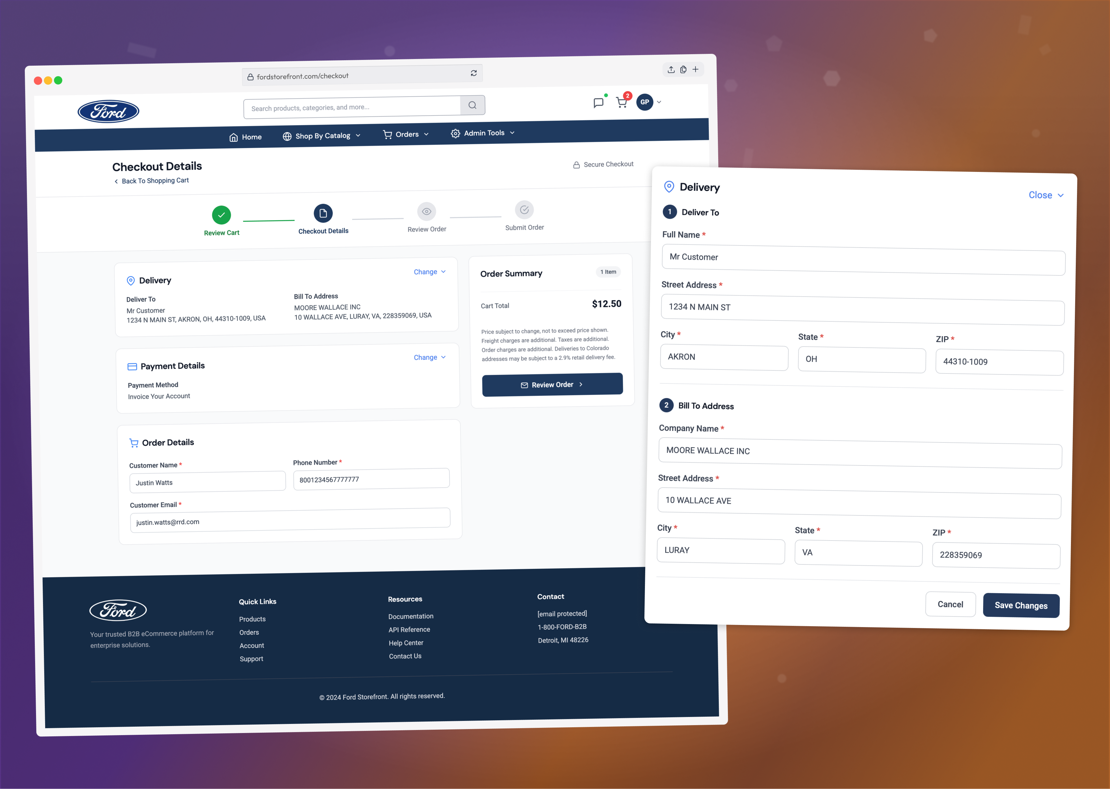
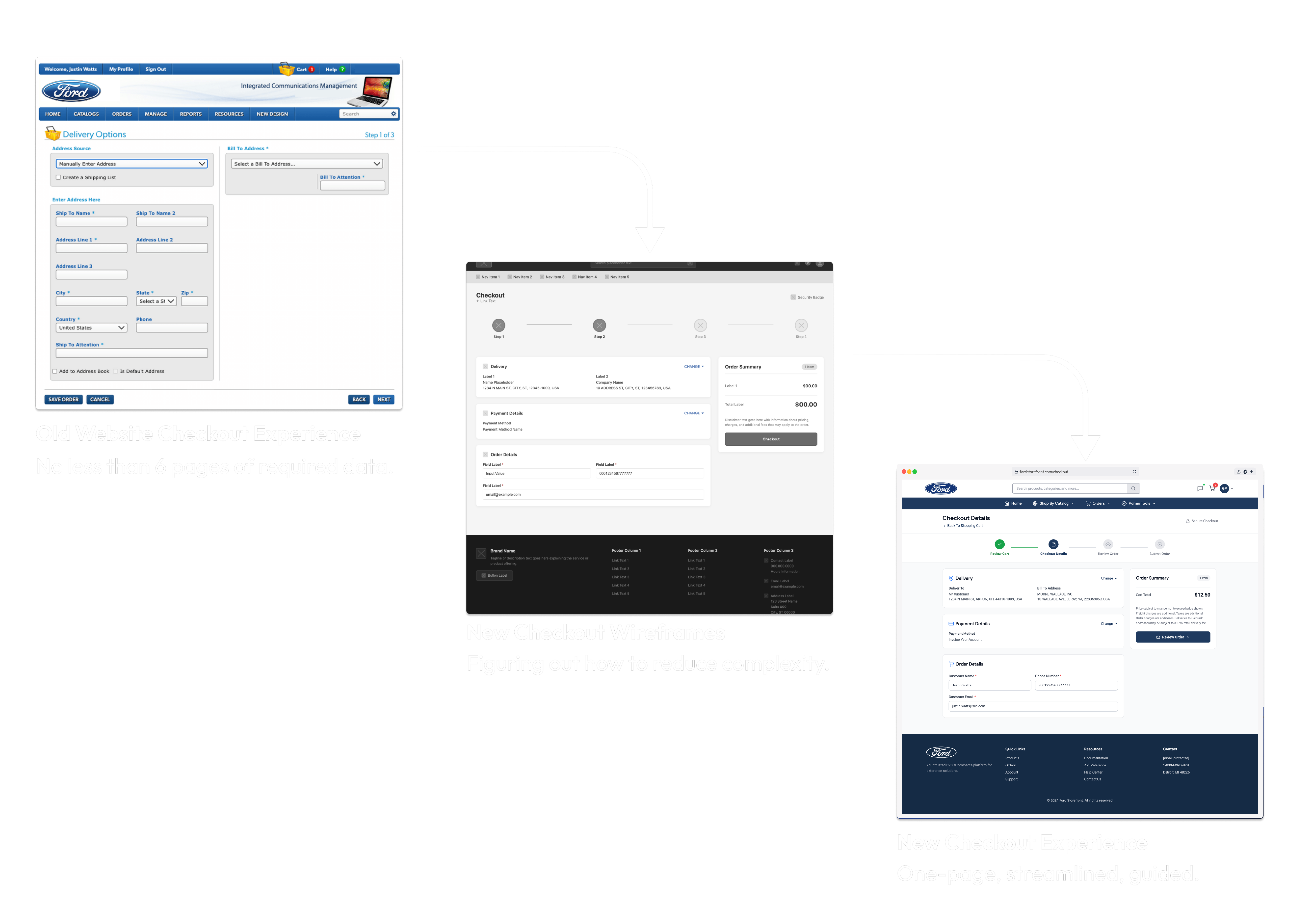
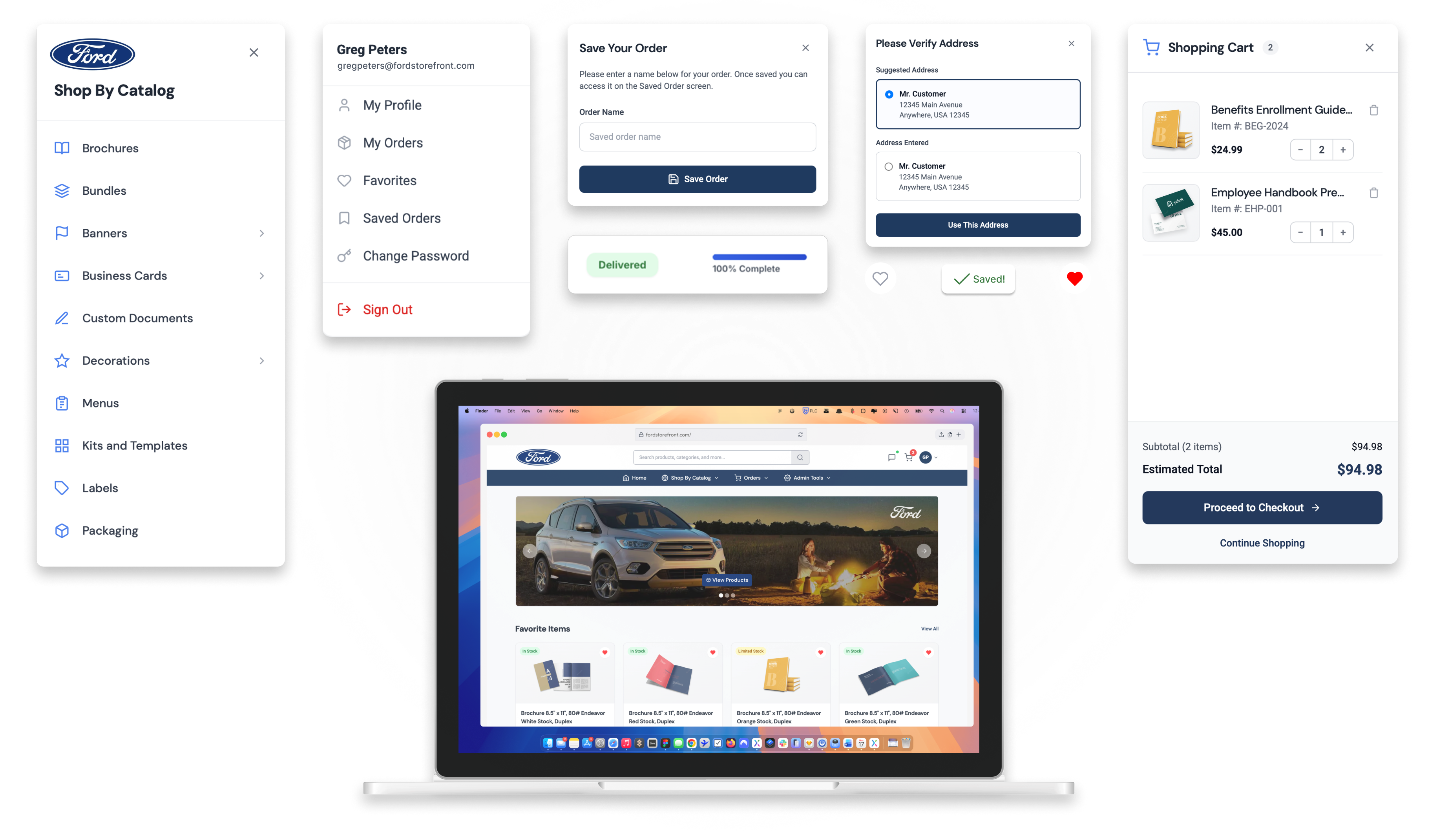
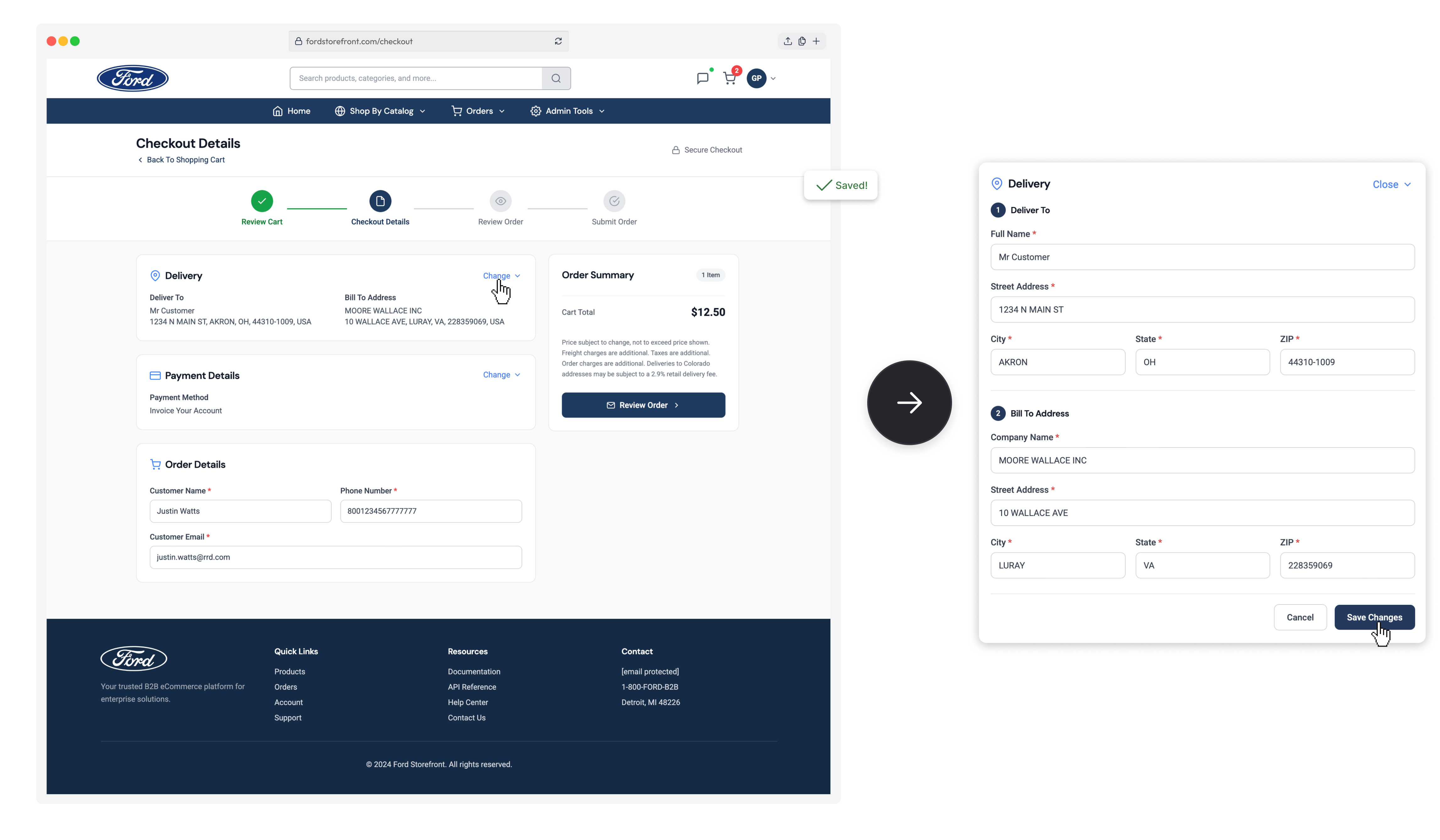
The multi-step checkout process was lengthy and unintuitive. Users were required to navigate several screens to complete simple purchases, increasing abandonment and frustration.

A fully functional end-to-end prototype was developed to represent all major workflows across the platform. Low- and high-fidelity designs were tested through multiple rounds of usability testing. Feedback was continuously incorporated to refine navigation, product configuration, and checkout behavior. Once core flows were validated, the final UI and supporting design system were built.
The platform is complex and needed a lot of design nuance to implement correctly. I worked directly with Stakeholders, Product and Engineers to ensure the intended UX carried through. Below are a handful of features which show some of the drastic improvements over the old site.
A fully modernized design system was created to unify the evolving site, documenting every UI element—colors, typography, branding, and interactions.
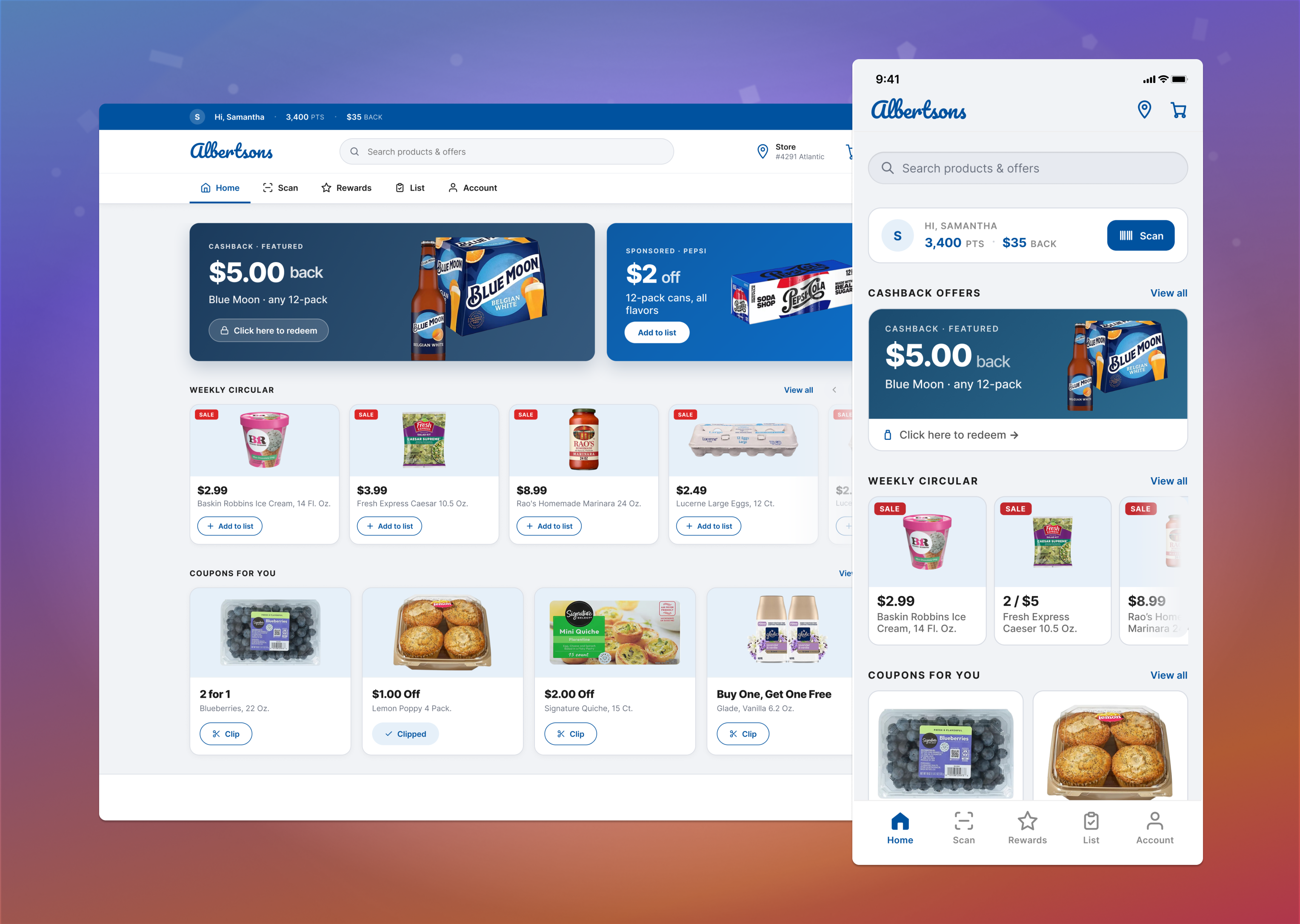
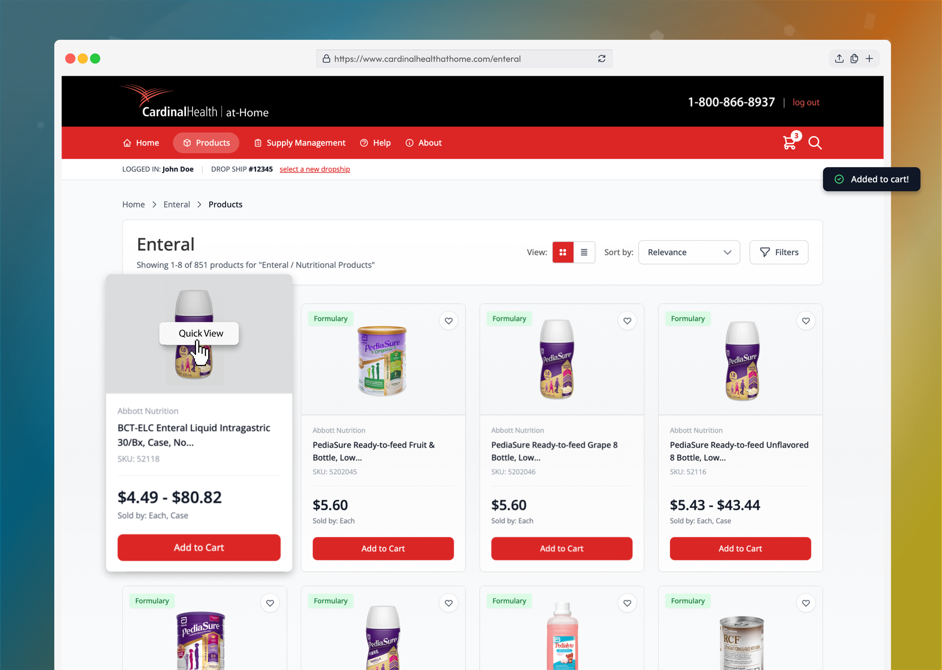
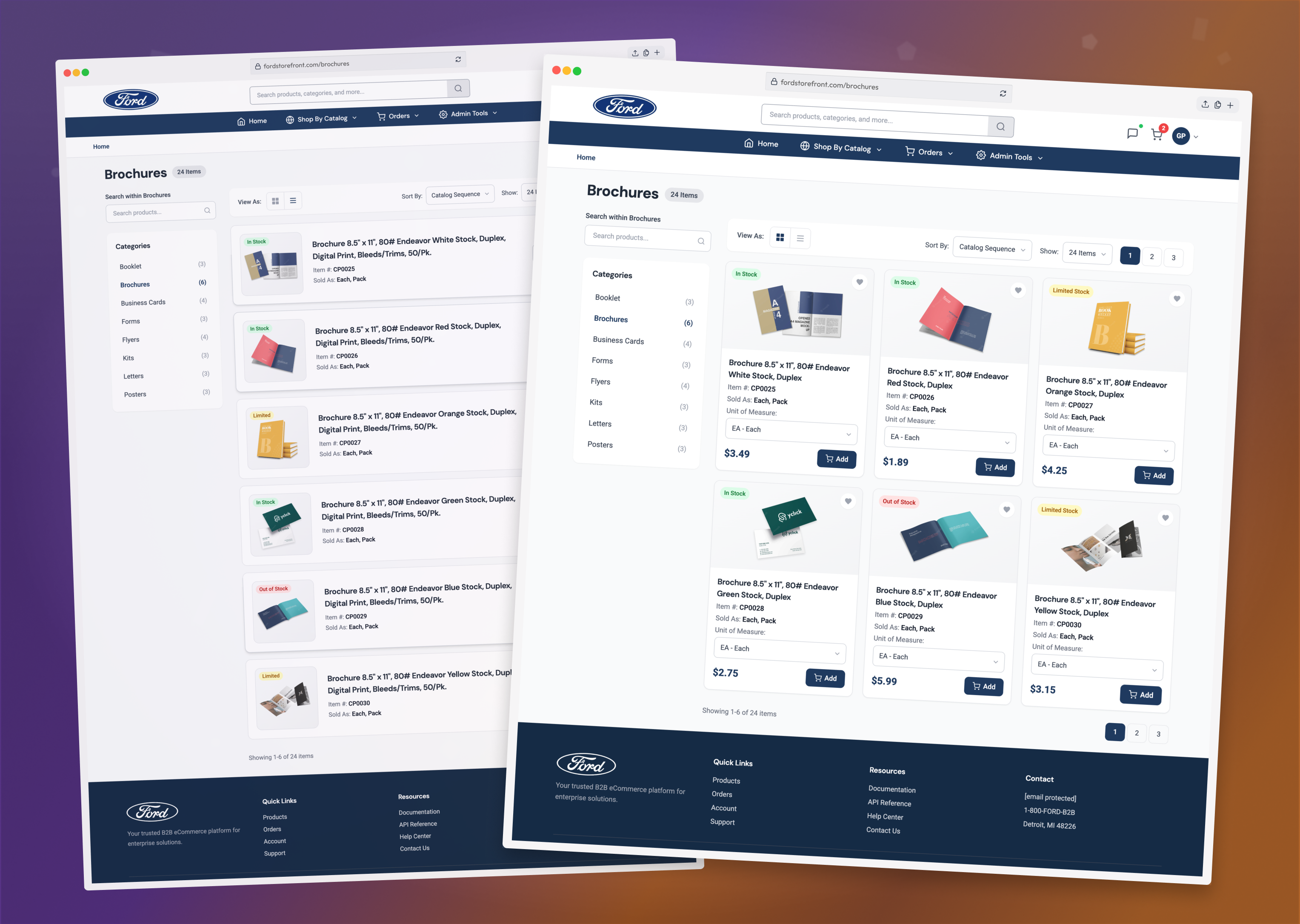
The Product Catalog was redesigned from the ground up, surfacing Add to Cart and Unit of Measure selectors while streamlining navigation and improving wayfinding to eliminate the need for drilling into product details.
The previously complex multi-page checkout was transformed into a simplified, Amazon-style one-page flow by pre-filling information and breaking the process into clear, manageable components—an approach users have loved.
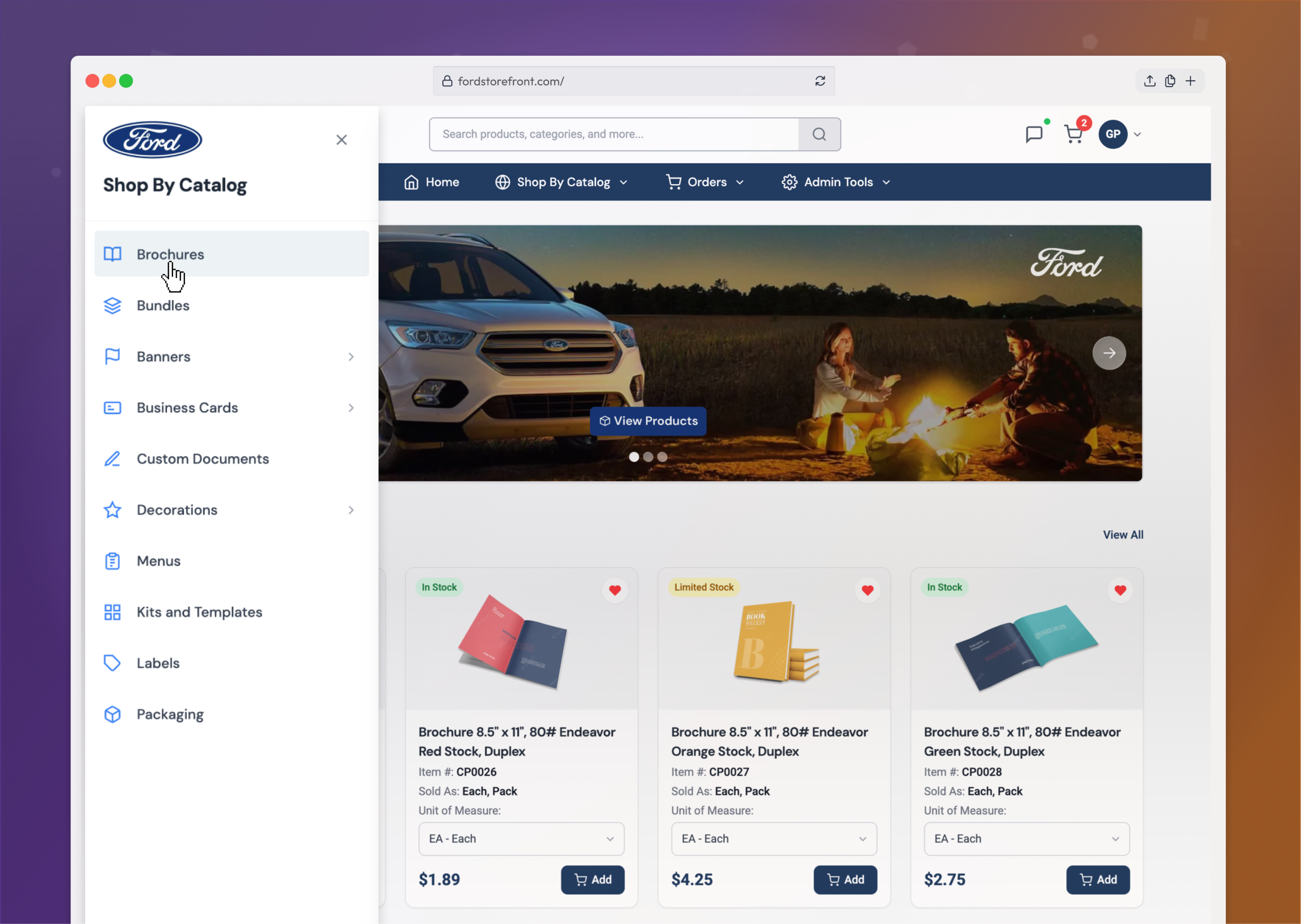
Redesigned the catalog navigation system to replace a legacy, finicky mega menu menu with a progressive, panel-based system that makes it much easier to browse categories and drill into products without losing context.
Measurable results and figures trended very positively throughout the project. Below are a few examples of efficiencies that were created as a result of the newly designed website.
96% System Usability Scale (SUS) score with new UX.
16% Faster rate of purchase checkout compared to old system.
23% Reduction in time to in find items via the new navigation menu.
+2 More items purchased per each order with the new system.