Full-scale redesign to modernize a B2B ordering platform used by medical staff to place critical medical supply orders with speed and accuracy. The experience was rebuilt to reduce friction, streamline daily workflows, and support the fast-paced demands of clinical environments.
Cardinal Health, a major supplier of medical products, set out to redesign its legacy B2B purchasing platform used daily by nurses and clinical staff. The site was built on outdated technology and had not been refreshed in years. The core objective of this redesign was to introduce Unit of Measure (UOM) product selection while simultaneously modernizing the visual design and overall usability for long-term scalability.
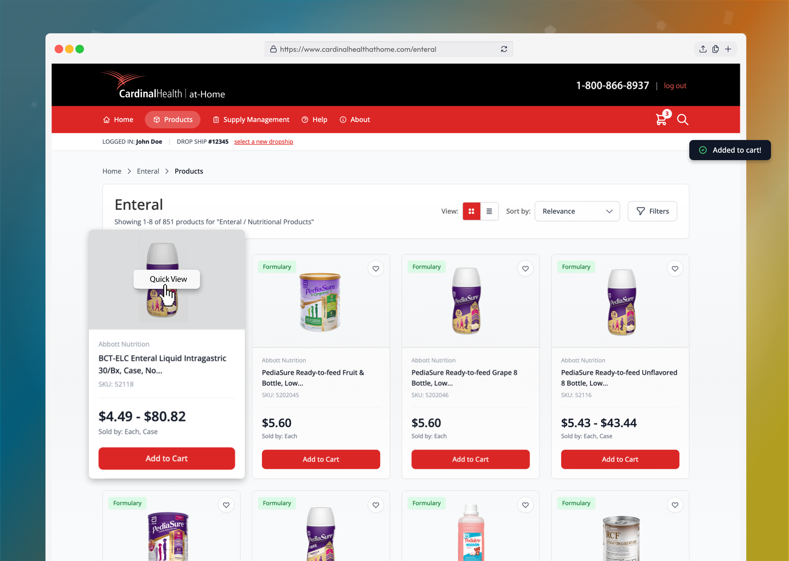
The platform lacked one essential capability: unit of measure selection. Previously, every product size existed as its own standalone SKU, making items difficult to find and the database overloaded with redundant items. To support the new UOM functionality, every screen across the platform had to be systematically redesigned to accommodate both the new interaction model and the modernized UI.
"We prioritized user-centered design backed by research and iteration. We started with a UX audit and conducted user interviews to understand real user needs, pain points, and business requirements. Based on those insights, we moved into rapid prototyping, usability testing, and iterative design."
I worked on a small UX team of two designers, starting as a UX Designer and later being promoted to Senior UX Designer. I led the end-to-end design process, conducting user research sessions, creating wireframes in Axure to define requirements, facilitating stakeholder workshops, and delivering polished, production-ready UI in Figma. I partnered closely with product and engineering to ensure designs were both user-centered and technically feasible.
Our small UX team of advocated for user research and ultimately secured approval to conduct eight in-depth sessions with real users.
We also built and tested a working prototype to observe how users interacted with both the current platform and the proposed UOM-driven design.
These sessions generated critical insights, which were documented in a research report and extremely well-received by leadership.
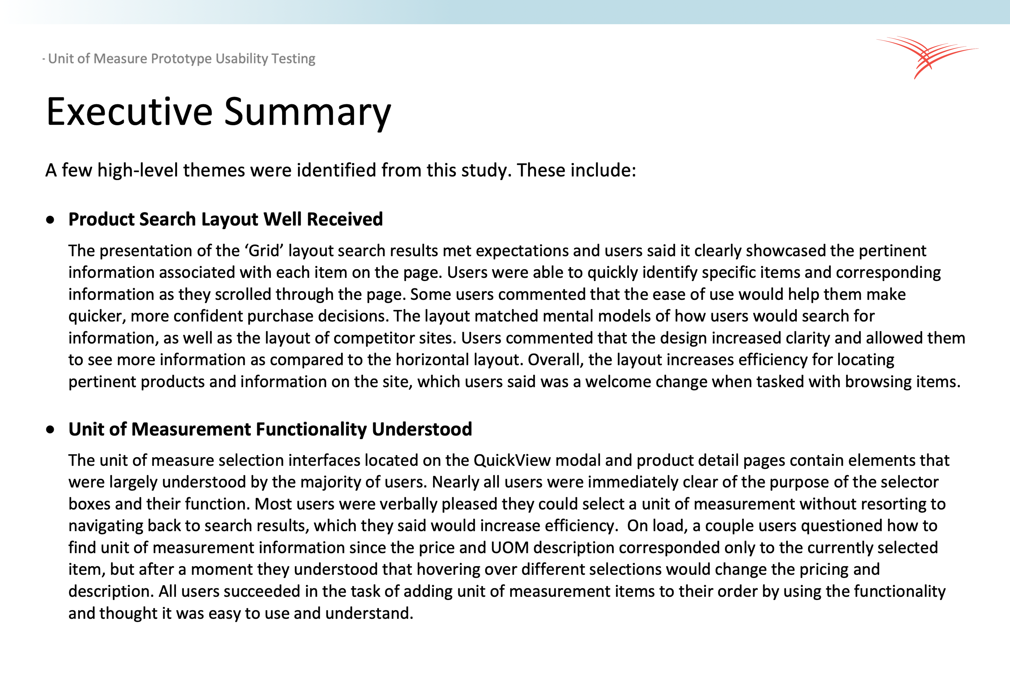
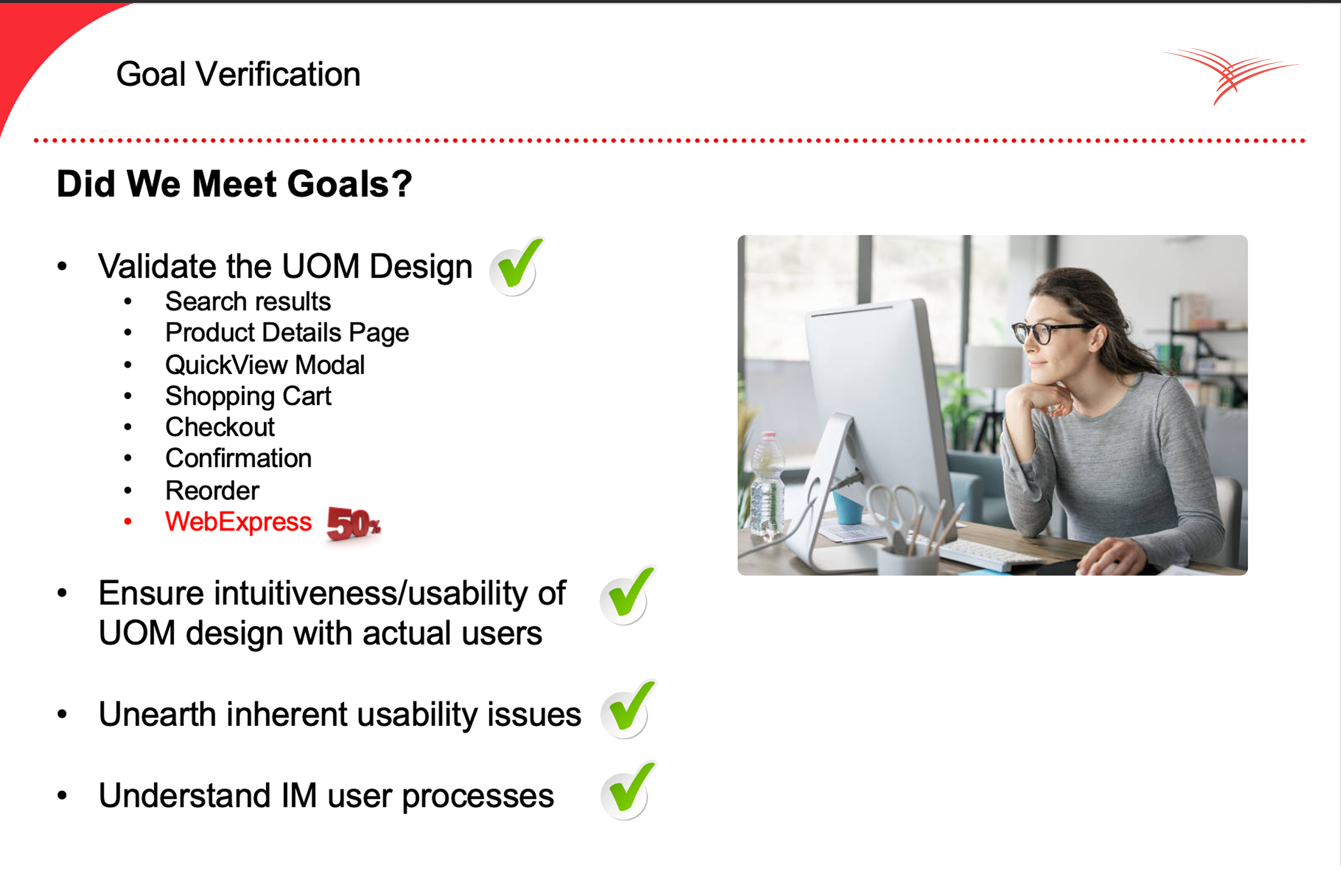
User research and prototype testing revealed that most of the platform’s issues stemmed from outdated interaction patterns and the lack of unit of measure selection. These gaps created unnecessary friction for nurses and supply managers performing everyday ordering tasks. The findings directly guided the redesign priorities.
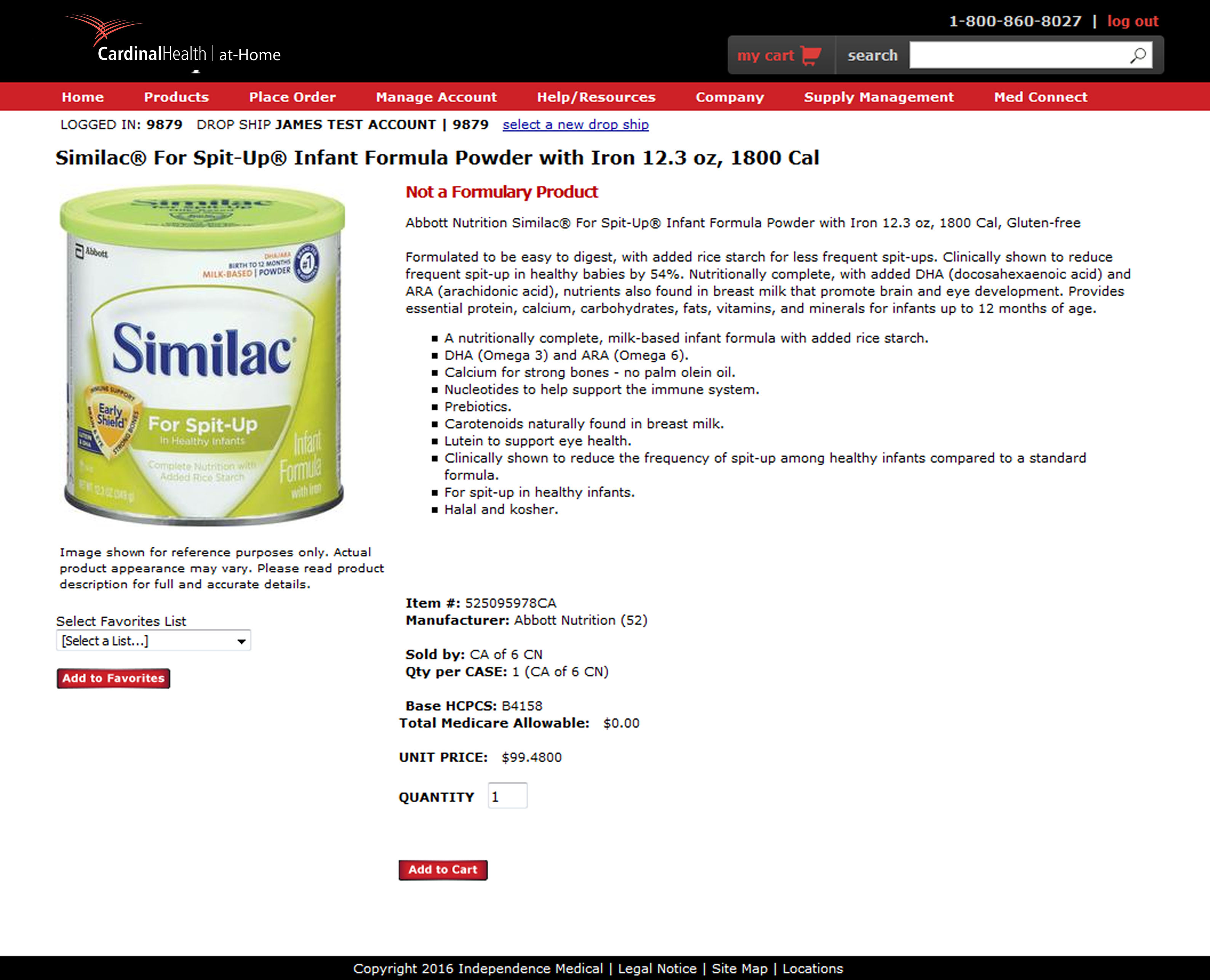
During research, it was shared that the old site while serviceable was in dire need of visual and functional upgrades on the product pages. The images were blurry, the text was very small, buttons were confusing. Participants shared that there was a lot of friction when user's were searching for and purchasing medical products.

During research, we learned that user feedback backed up the main purpose of the project: to consolidate items and add a unit of measure selection to the experience. This would increase the speed of purchase and reduce the dead ends users often found themselves when seeking products.
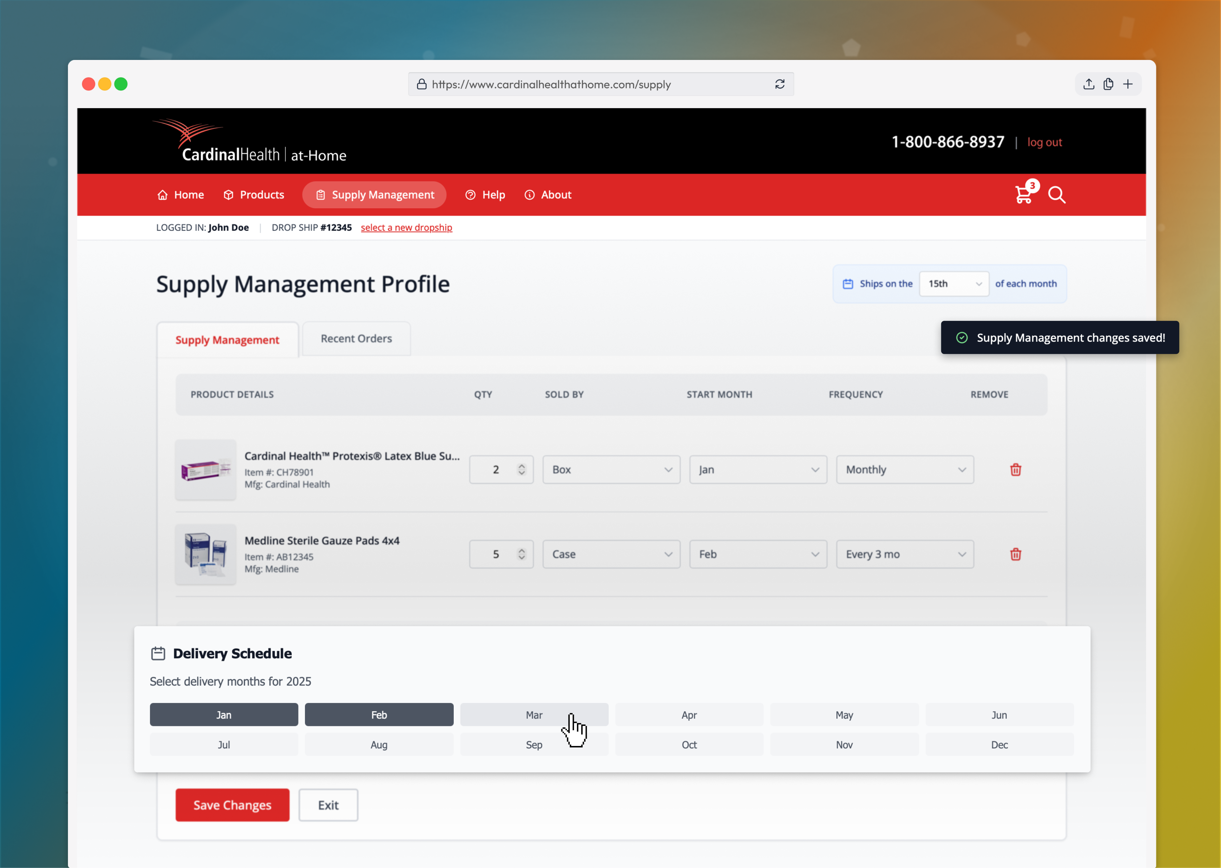
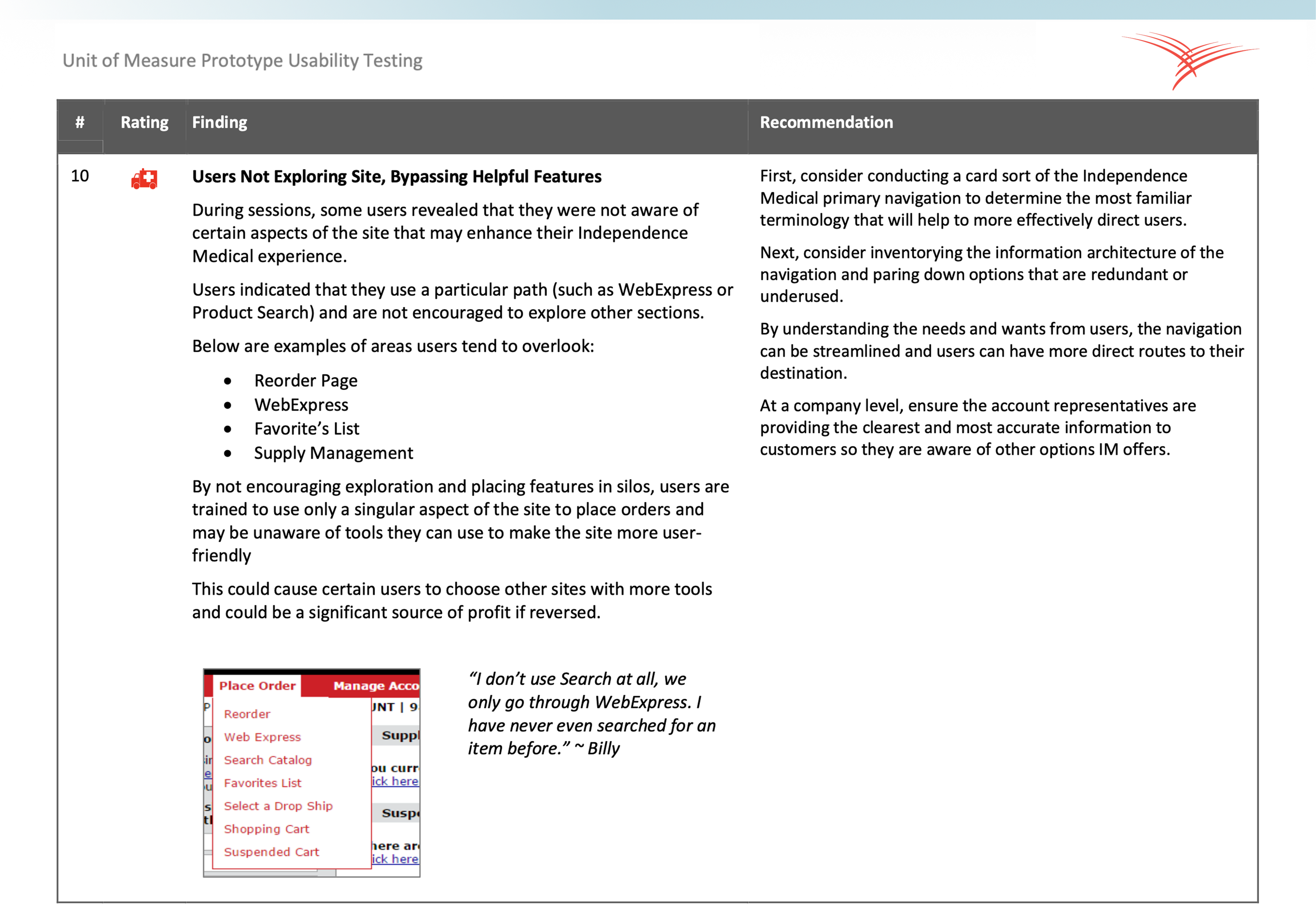
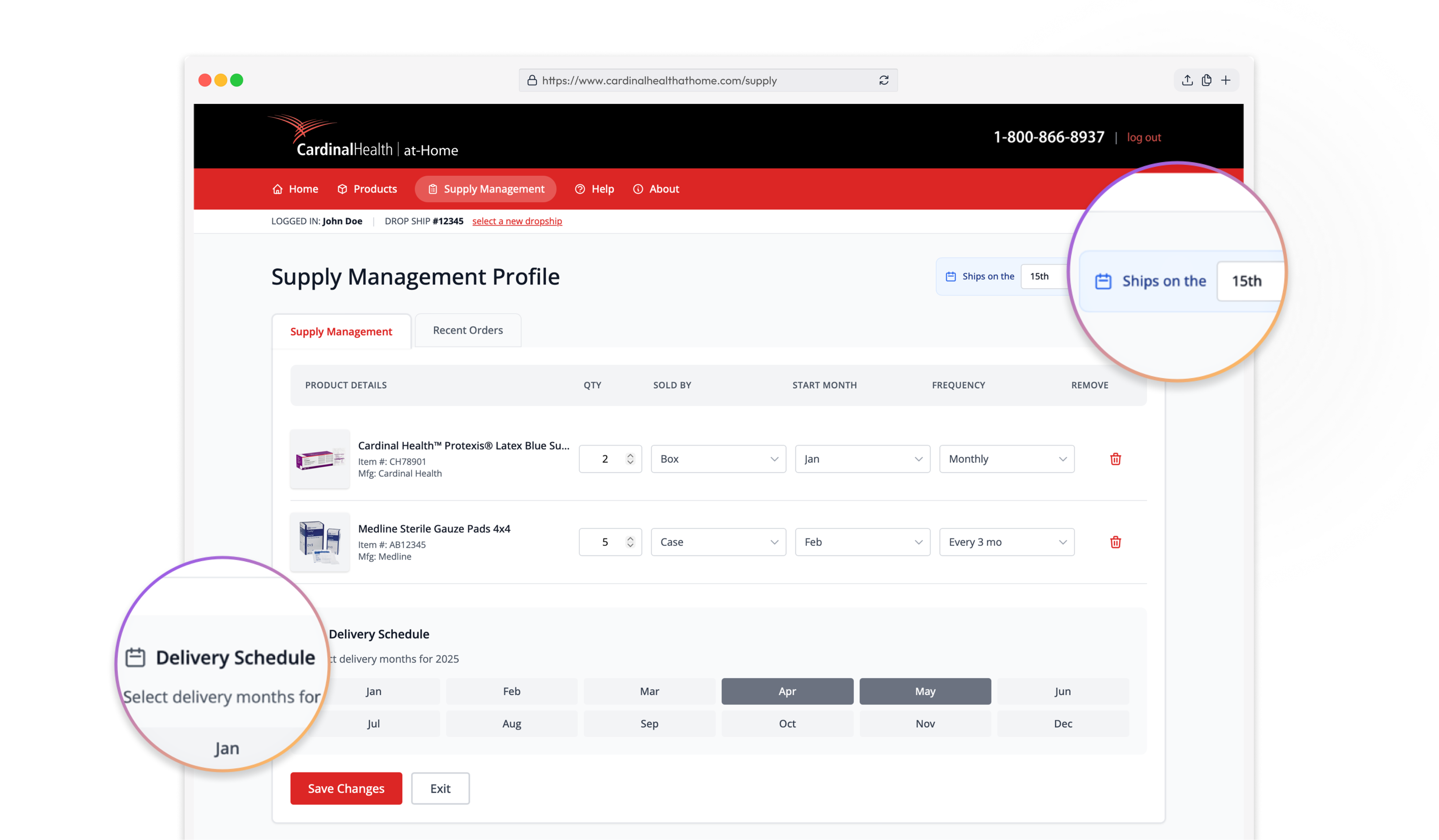
During research, it was shared that one of the main features used was Supply Manager, a tool in which uses could plan their monthly orders for their patients. This tool was outdated and functionally had usability issues.
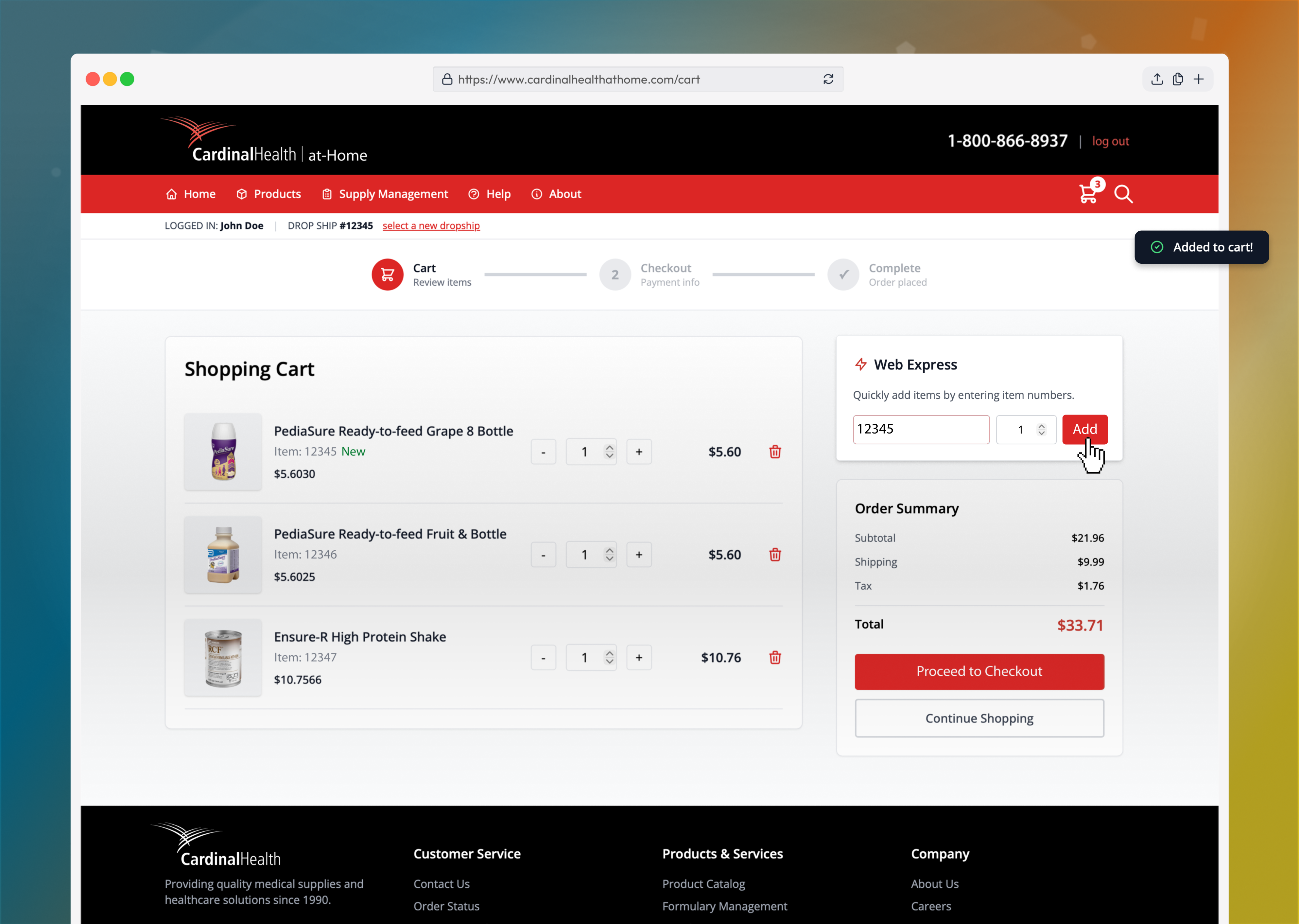
During research, it was shared that the overall shopping experience including the product list, product detail, shopping cart and checkout experiences were all finicky and posed issues for users.

The design phase centered on rebuilding the entire purchasing experience around the new Unit of Measure selector, ensuring it felt native across search, product listing, detail views, and checkout. Low and high-fidelity prototypes were used to test interaction patterns, validate clarity, and reduce friction at every decision point. The goal was to make complex medical ordering feel simple, fast and reliable.
The design solutions focused on translating research insights into practical, high-impact improvements across the ordering experience. Each solution prioritized speed, accuracy, and ease of use for nurses and supply managers, with the Unit of Measure selector serving as the foundation for smarter product selection and streamlined workflows. Together, these changes modernized the platform while directly improving day-to-day usability.
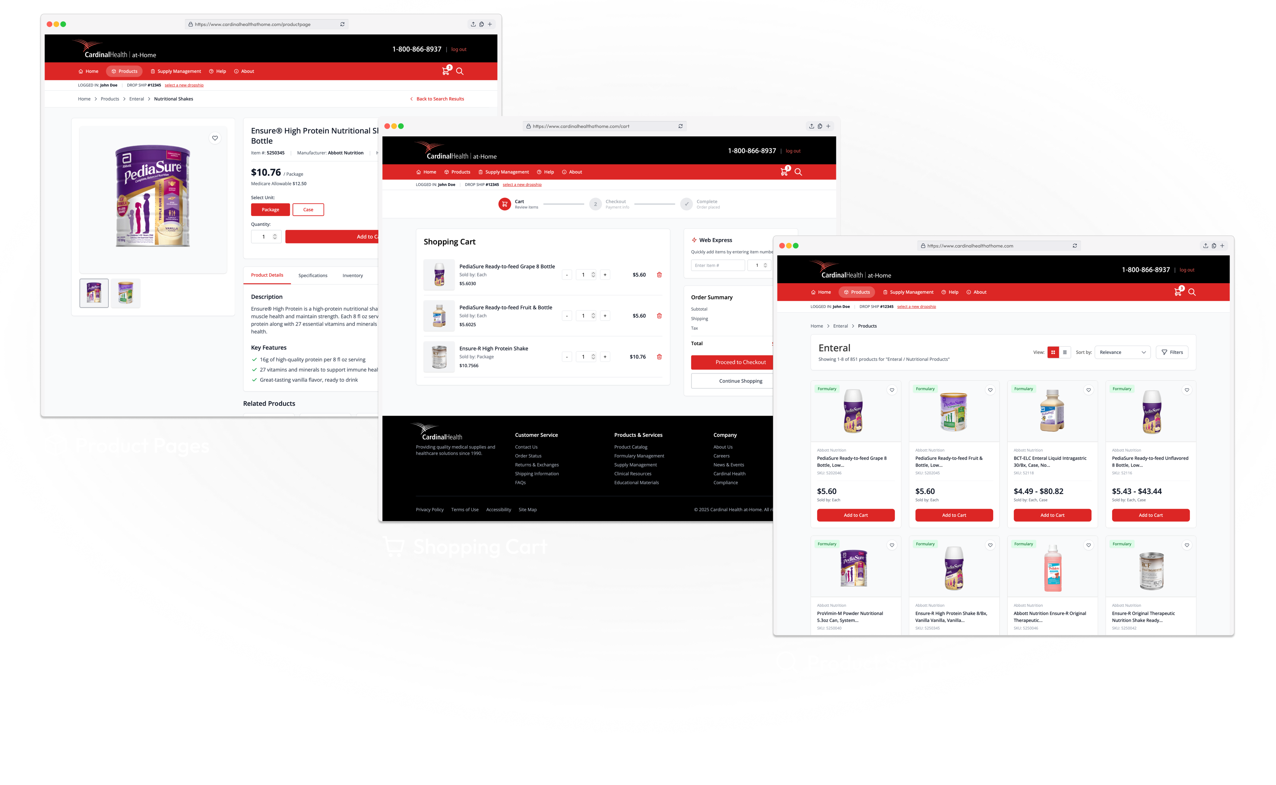
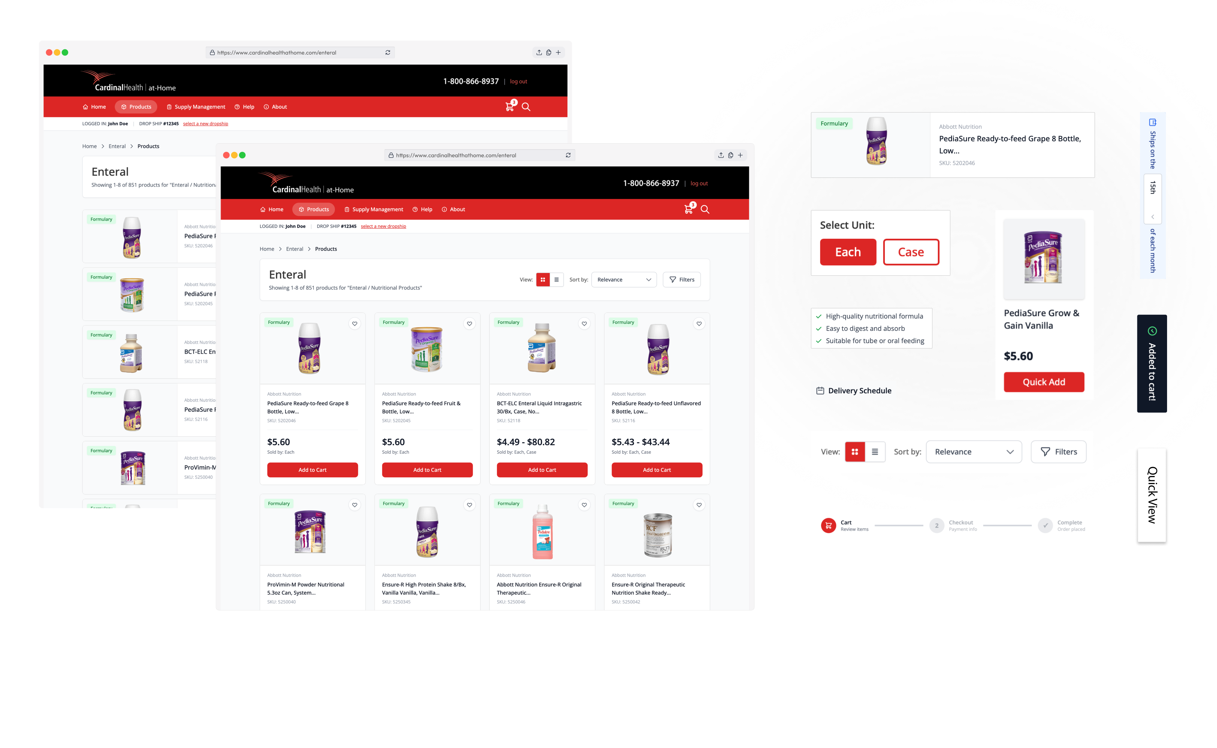
A universal, usability-tested unit selector was implemented across every product touchpoint, consolidating fragmented SKUs into a single, flexible selection experience.
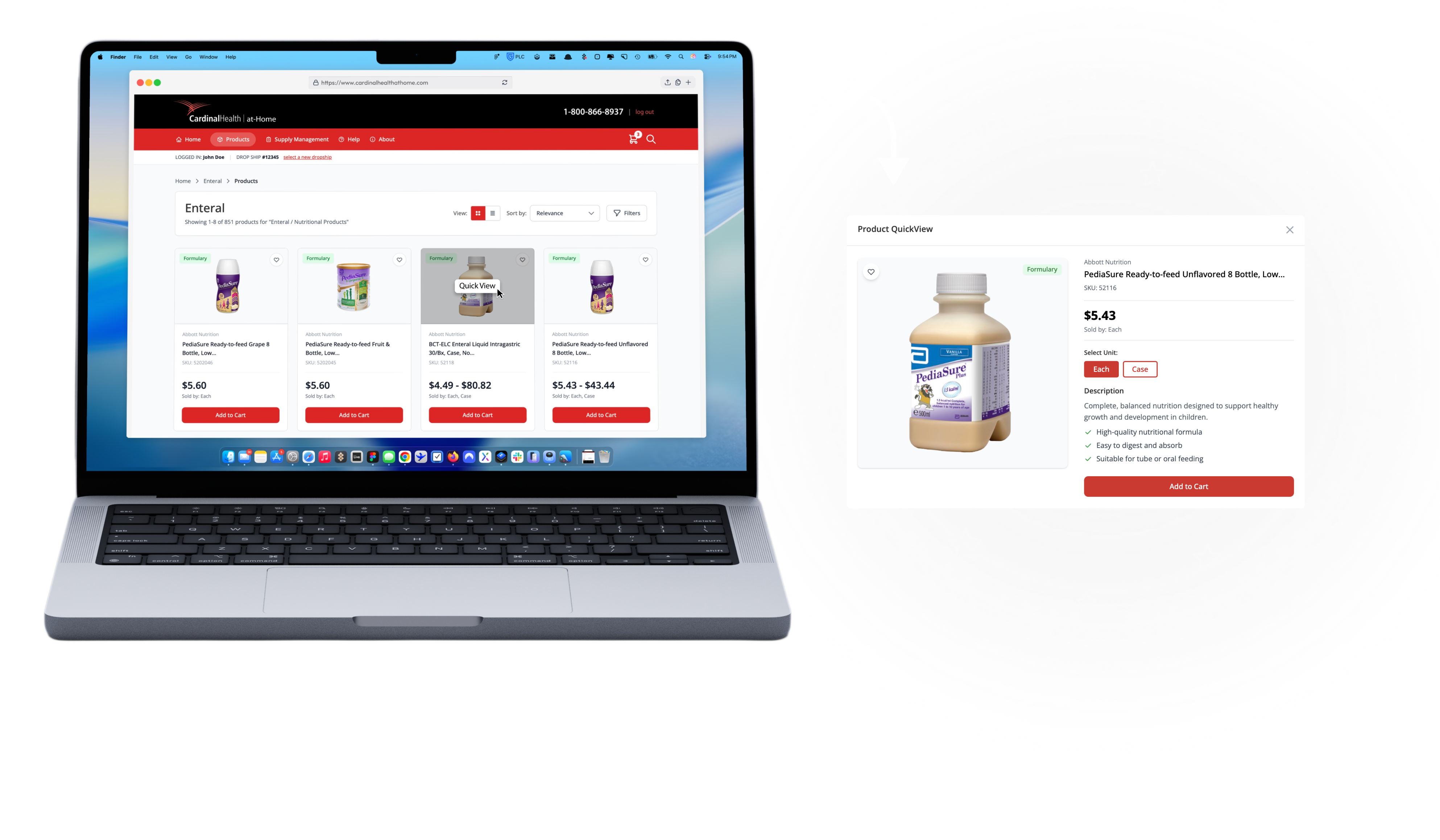
The entire shopping experience was redesigned end-to-end to be faster, cleaner, and more intuitive, reducing friction from product pages through checkout.
Supply manager workflows were rebuilt to support faster bulk ordering, clearer inventory visibility, and more efficient repeat purchasing with fewer manual steps.
The platform was fully modernized with updated navigation, optimized layouts, improved accessibility, and a cleaner visual hierarchy to meet current usability and performance standards.
The Cardinal Health redesign transformed a dated purchasing system into a modern, scalable B2B ordering platform built for speed, accuracy, and daily clinical use. By centering the experience around a universal Unit of Measure selector and modernizing core workflows, the new design reduced friction for nurses and supply managers while laying a strong foundation for future growth.