Revitalized a dated insurance website with a full-scale redesign and rebrand, creating a modern, user-centered digital experience.

Highly regarded northeastern Ohio insurance company Westfield Insurance wanted to redesign their website and brand. The company had always had the same rustic, old-world branding and needed a refresh. I was on a team that was tasked to design the website in six months.

The task was to complete all research, design and complete development in 6 months. The old site was not extremely salvageable so each screen needed to be designed from the ground up on a short timeline.

" The strategy was for the UX team to conducted user research with internal teams and external customers, complete a heuristic evaluation, card sorts and a competitive analysis ahead of digging into design."
First, a heuristic evaluation was completed on the old Westfield website in order to determine how to improve the experience.
Second, user research was conducted with internal and external customers and stickied to the board from which we wrote a report.
Third, a competitor analysis was completed on over 20 competitor companies.


Through user research and discovery it become clear that our team had our work cut out for us. The old site was essentially non-existent and the new site would need to be designed from the ground up. The broad strokes from our research indicated that there was a lot of competition, consumers also had high expectations for the new Westfield and we needed to focus on the areas below.
The previous Westfield site did not have any modern interactive tools. It had information but no Agent Finder, Comparison Tools or any type of way to log in. This frustrated users during our eresearch session and they said it reduced the utility of the site to near nothing.

The old site was archaic by internet standards and ancient by insurance standards. The design patterns and grid-based system was difficult to use and not the prettiest to look at. The Web 1.0 site was admittedly ready for a fresh coat of paint and users were vocal about their desire to see it polished up.
Due to the site being older and using older web conventions, it was essentially desktop-only and not mobile optimized. The usability issues were also far and wide according to users and included aesthetic issues, interaction confusion and an overall lack of clarity.
Insurance is complex and insurance sites need a good, solid information architecture to properly organize each type and product. The navigation of the old site was extremely difficult and had multiple layers which made it very difficult to find specific insurances and services offered by Westfield.
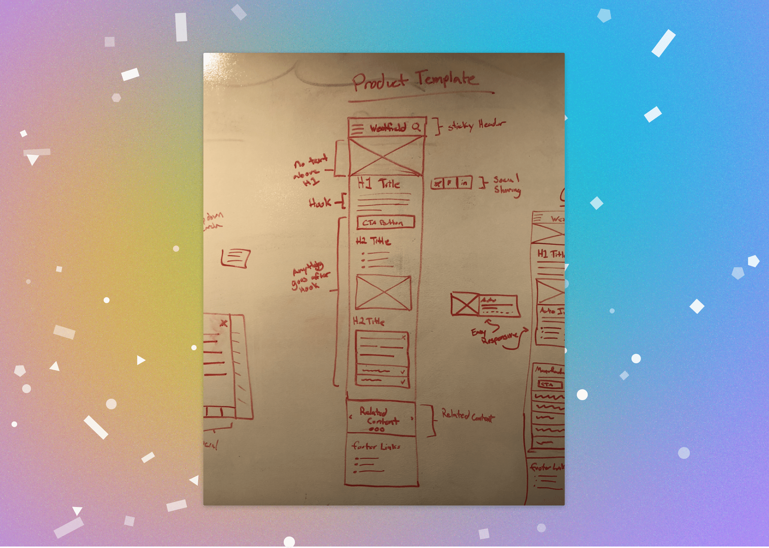
The design strategy was to start with low-fidelity wireframes and nail the structure and interaction design since the information architecture was complex. This was done by designing 16 templates to be used throughout the site and then layering on the new Westfield branding elements as they were completed.
The project itself was tough to complete on a short timeline but yielded a beautifully designed website and refreshed brand. The site had many new-to-Westfield features and was fully-responsive and polished. The new website was designed specifically based on user research and fulfilling the needs of the customer.
A big win for this project was designing informative and helpful product pages for each type of insurance. Each of these 'hubs' contains detailed information about the benefits of each product and allows the user to easily contact an agent.

The UX team was heavily involved in the rebranding efforts for the new site. After some iteration the red-hued, friendly branding was implemented and fully replaced Westfield's older branding throughout all sites and brick-and-mortar locations.
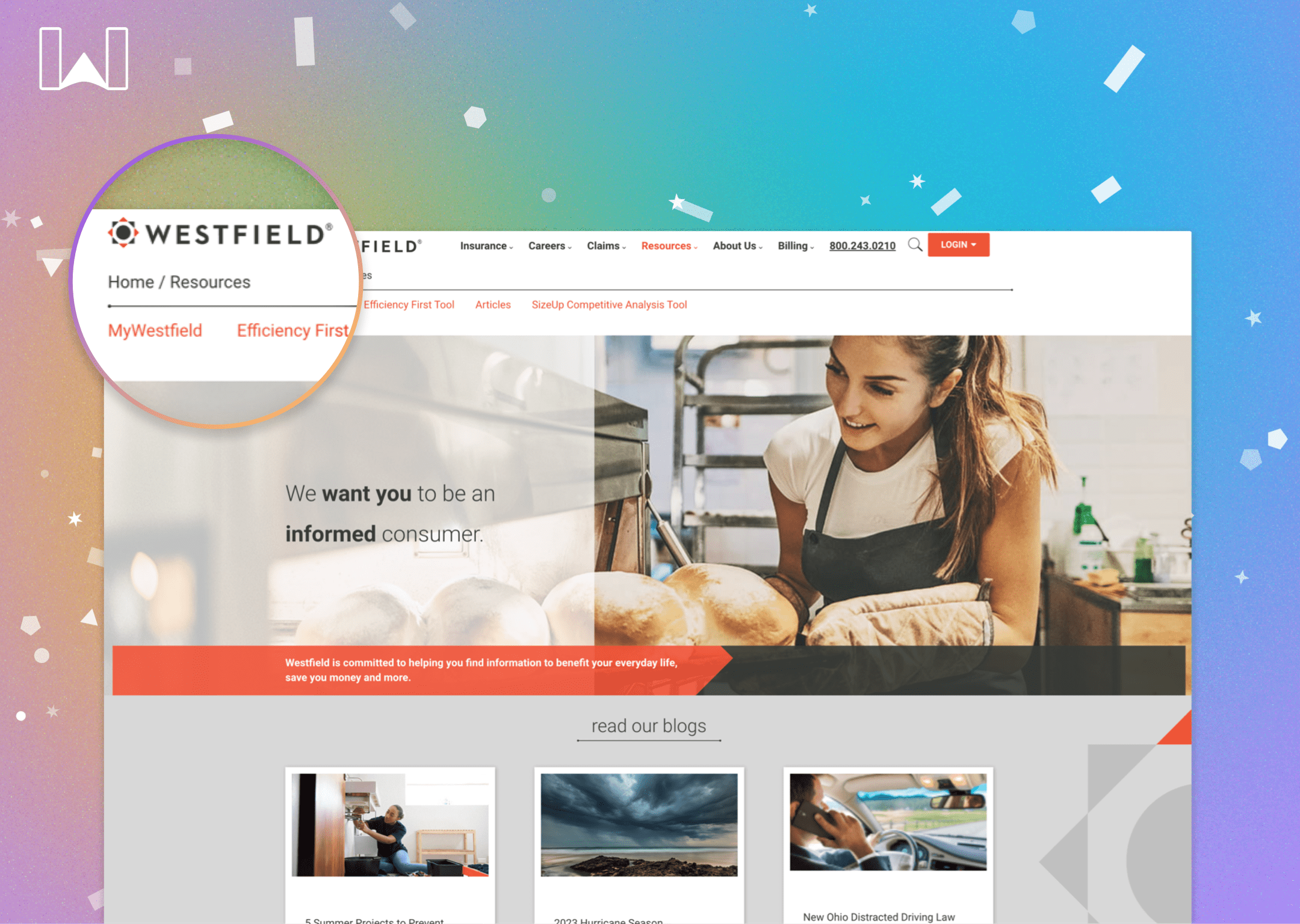
The UX team optimized the navigation and information architecture. The new design allowed for the complexities of insurance while also providing visual affordance to clarify any additional subcategories through text or icons.

In addition to the website design we were tasked with adding some insurance tools to the mix. The purpose of these is to ensure users can get access to agents, quotes and other information via interactive interfaces which we designed and built into the site.

The new website was immediately well-received both internally by our stakeholders and externally from people using the site. The new brand offered a fresh take on Westfield and gave users a breadth of functionality, information and interactive tools.