
A complete website redesign and rebrand that transformed Westfield’s outdated digital experience into a modern, customer-focused platform with clearer navigation, interactive tools, and a stronger visual identity.
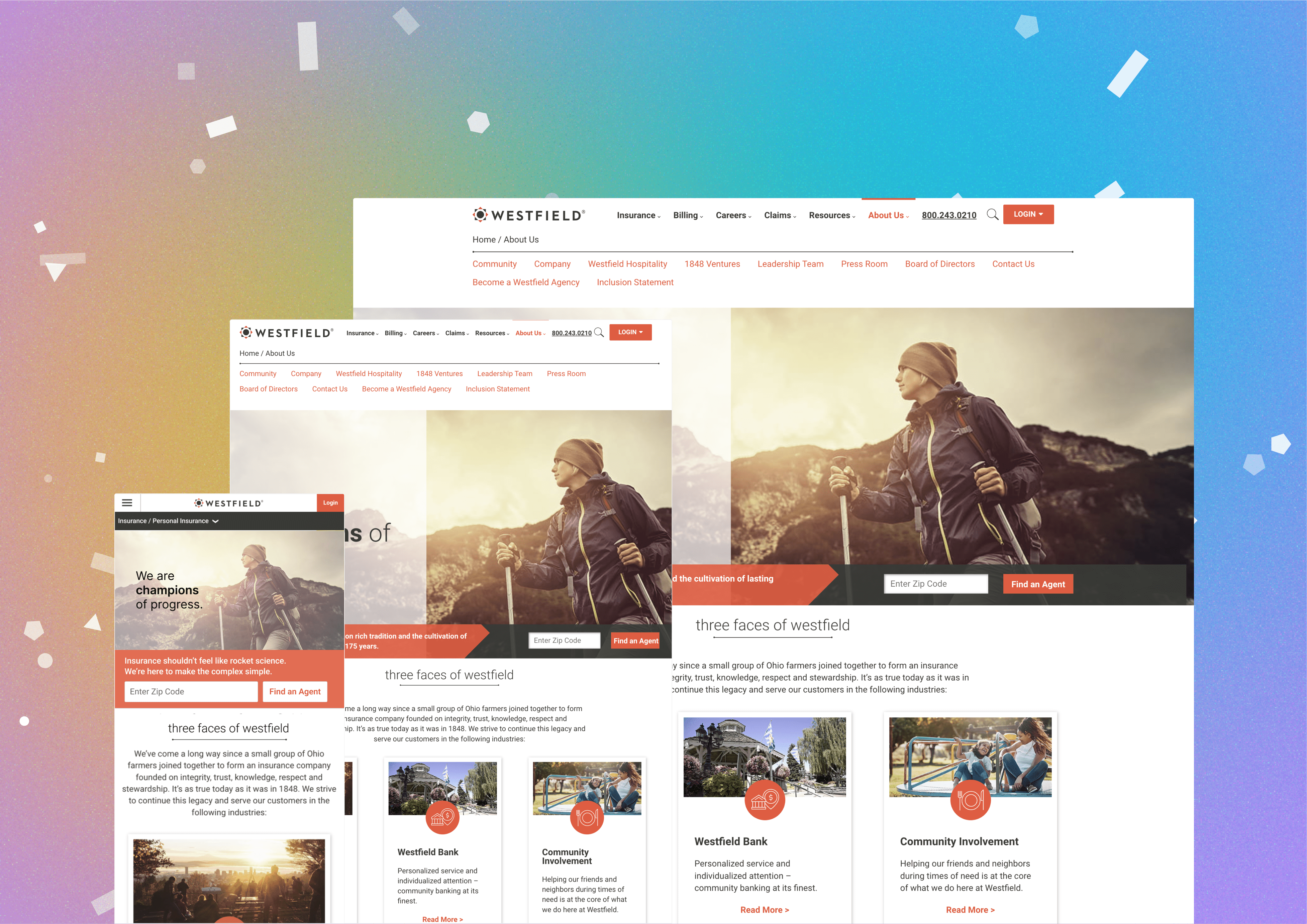
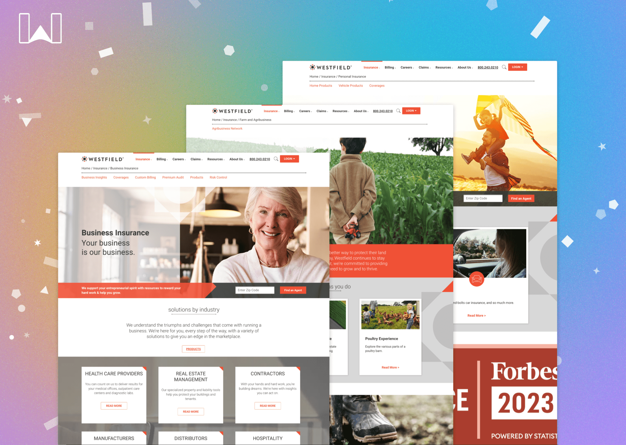
Westfield Insurance wanted to redesign both its website and brand after years of relying on the same rustic, old-world identity. With just six months to complete the research, design, and development, our team had to rethink the experience from the ground up.
Redesigned Westfield’s website and brand from the ground up, creating a more modern, useful, and customer-focused insurance experience.
Served as Senior UX on a team of six, focusing primarily on wireframes, interaction design, and interactive insurance tools.
User research, heuristic evaluation, competitive analysis, card sorting, wireframes, prototypes, usability testing, interactive insurance tools, and a new design system.
The redesigned experience reduced bounce rate by 34%, improved agent findability by 23%, increased average session duration by 3+ minutes, and drove a 62% increase in site events.
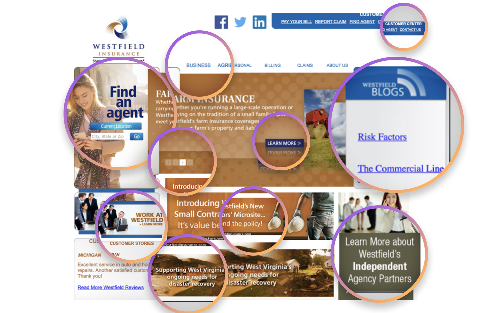
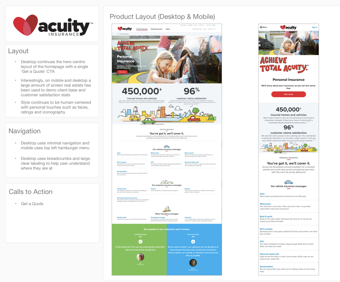
We combined internal and external user research with a heuristic evaluation, card sorting, and competitive analysis to understand where the existing experience was falling short. We spoke with 20 users, reviewed 50+ usability issues, and analyzed 20+ competitor websites to identify patterns and opportunities.
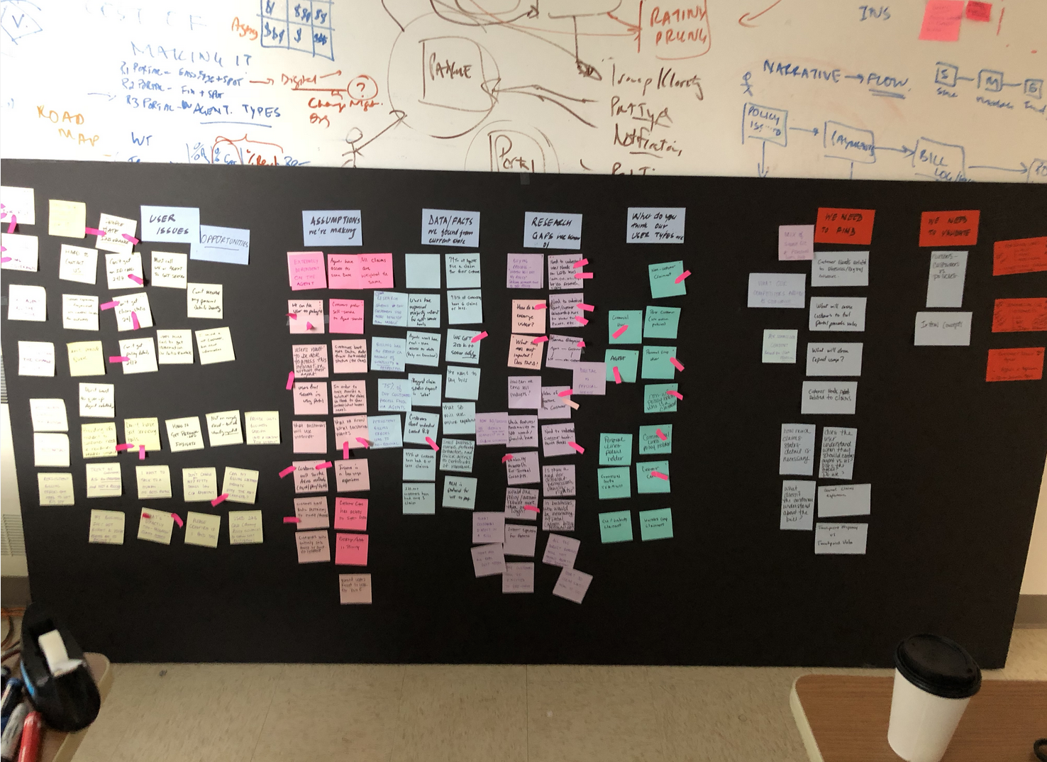
The new experience was designed through rapid iteration, prototyping, and usability testing. We created a living, fully functional prototype of the site and completed two rounds of usability testing before moving from low-fidelity concepts into final UI and the new design system.
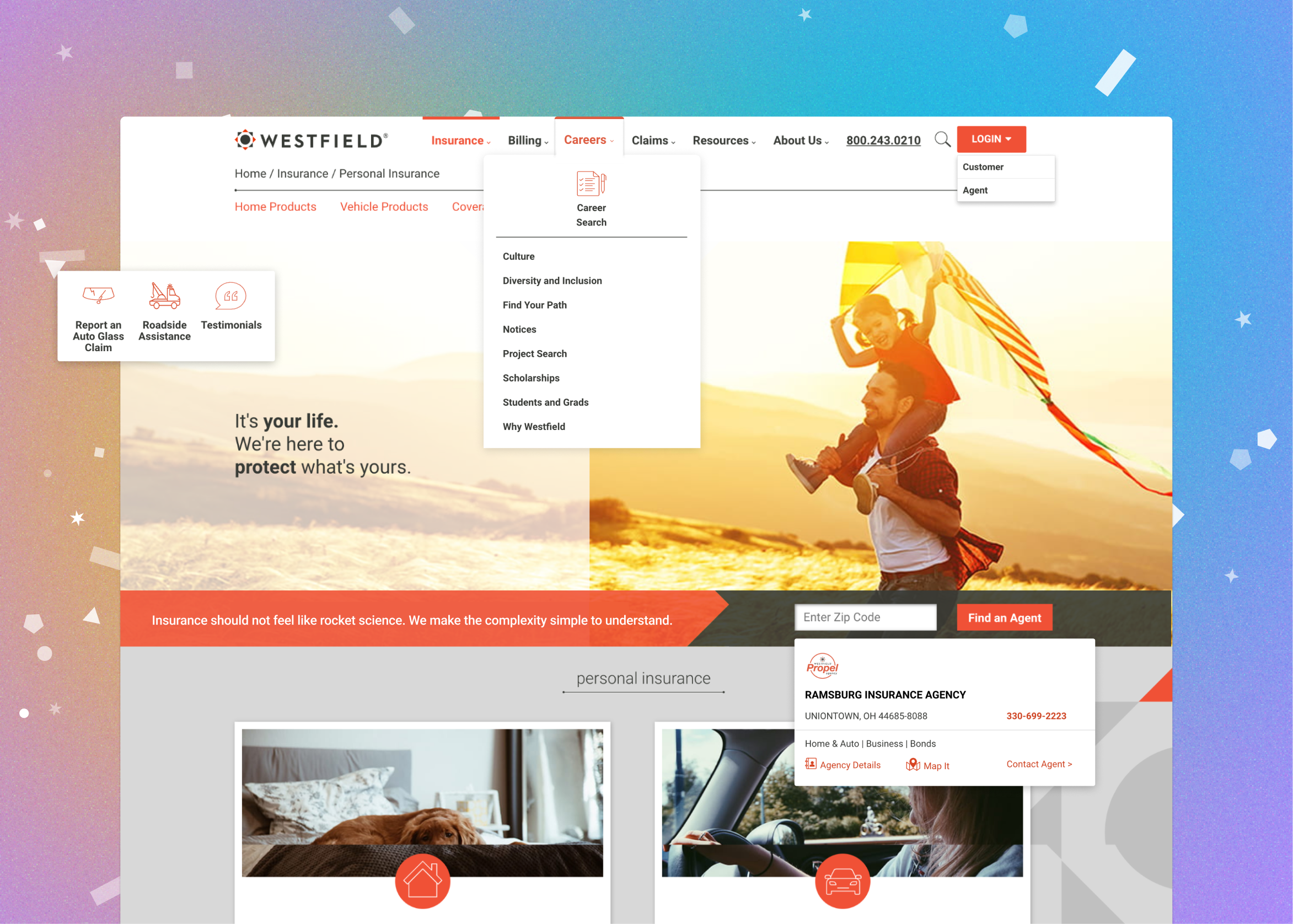
We created dedicated product hubs for each type of insurance, making complex information easier to understand while giving users a clear path to contact an agent.
The UX team played a major role in the rebrand, introducing a friendlier red-hued visual identity that replaced Westfield's older branding across its digital and physical locations.
We introduced interactive tools that allowed customers to find agents, quotes, and other important insurance information directly through the website.
We reworked the information architecture to better support the complexity of insurance while making categories and subcategories easier to understand through clearer hierarchy, text, and visual cues.
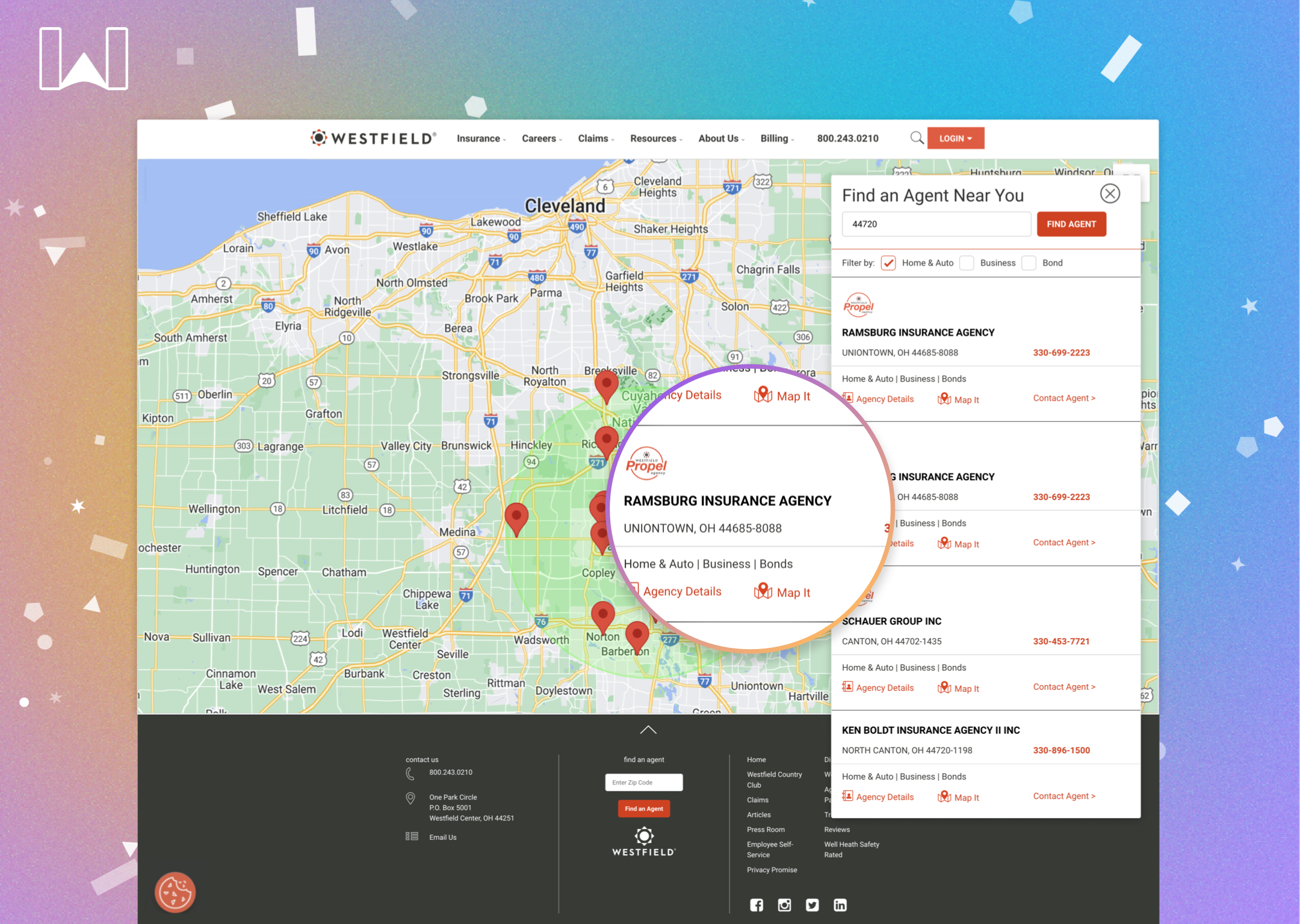
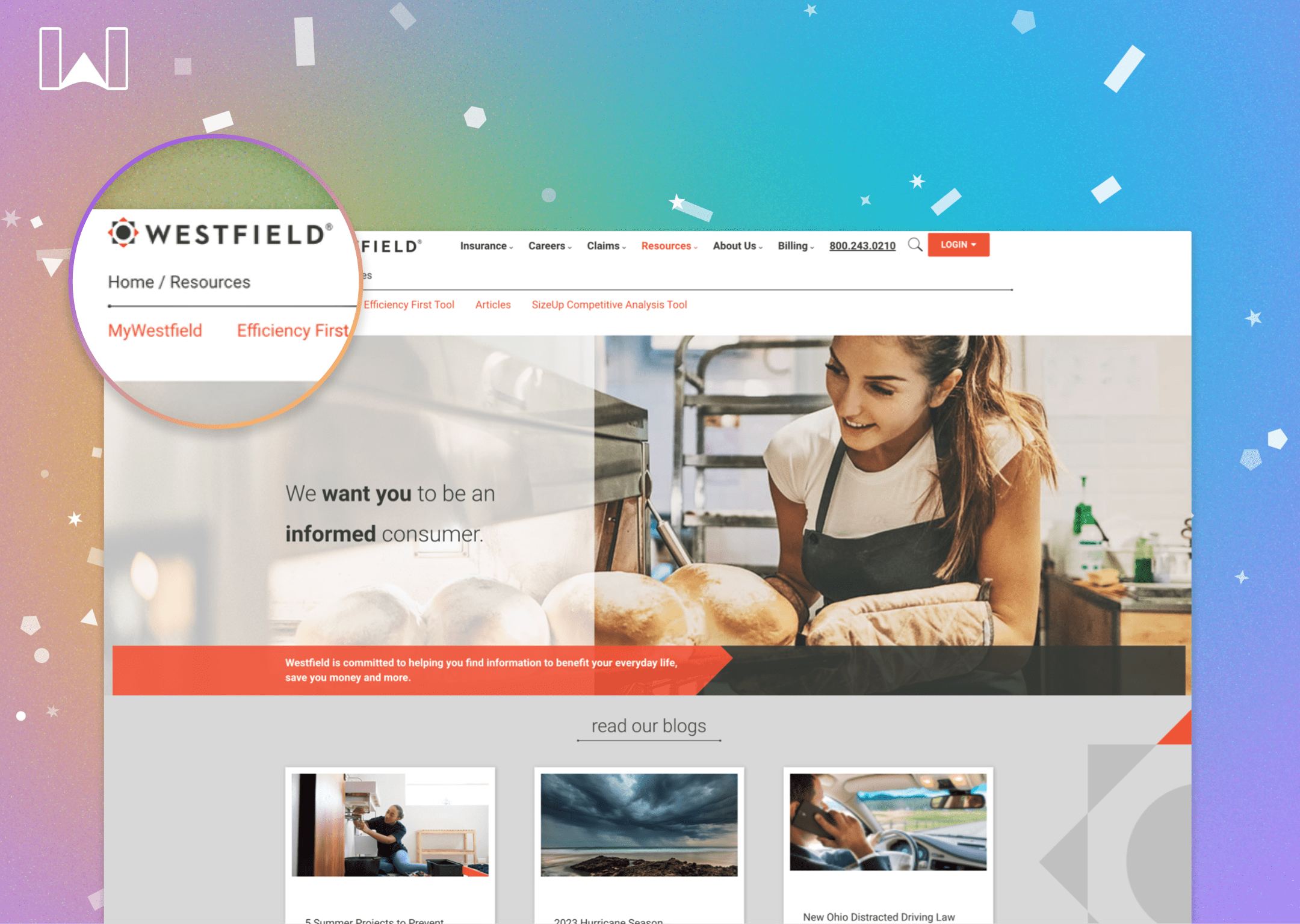
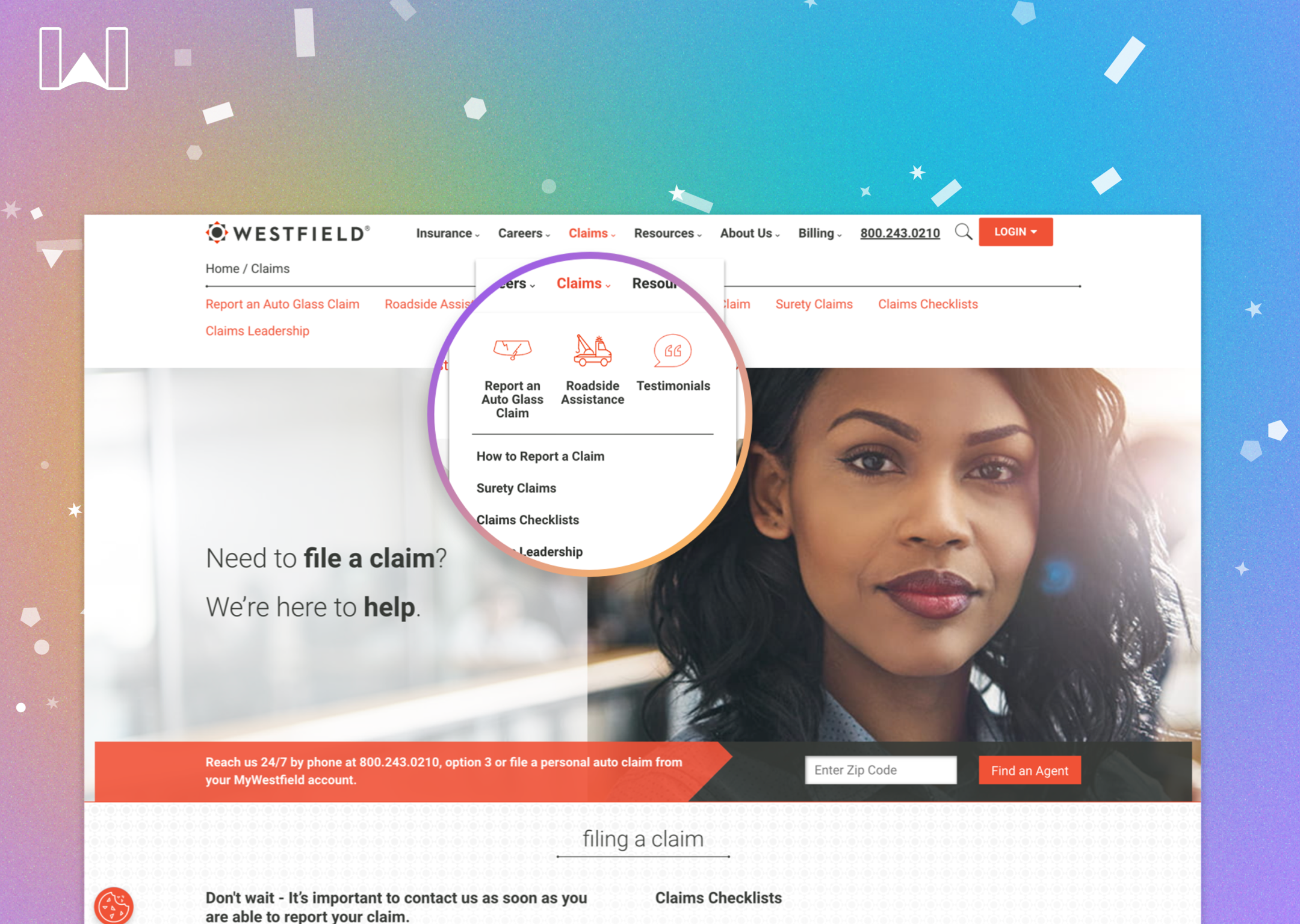
Six intense months later, Westfield launched a completely redesigned website and brand with all new functionality, content, and interactive tools. The new experience was well received internally and externally, giving customers a much more useful way to interact with Westfield.
Reduction in bounce rate across the redesigned site.
Improvement in agent findability and callsthrough new agent finder.
Increase in average session duration after launch.
Increase in overall site activity and events after launch and beyond.