
Redesigned a legacy ordering platform from the ground up, applying product, interaction, and UX design skills to deliver a modern, customizable, feature-rich solution.
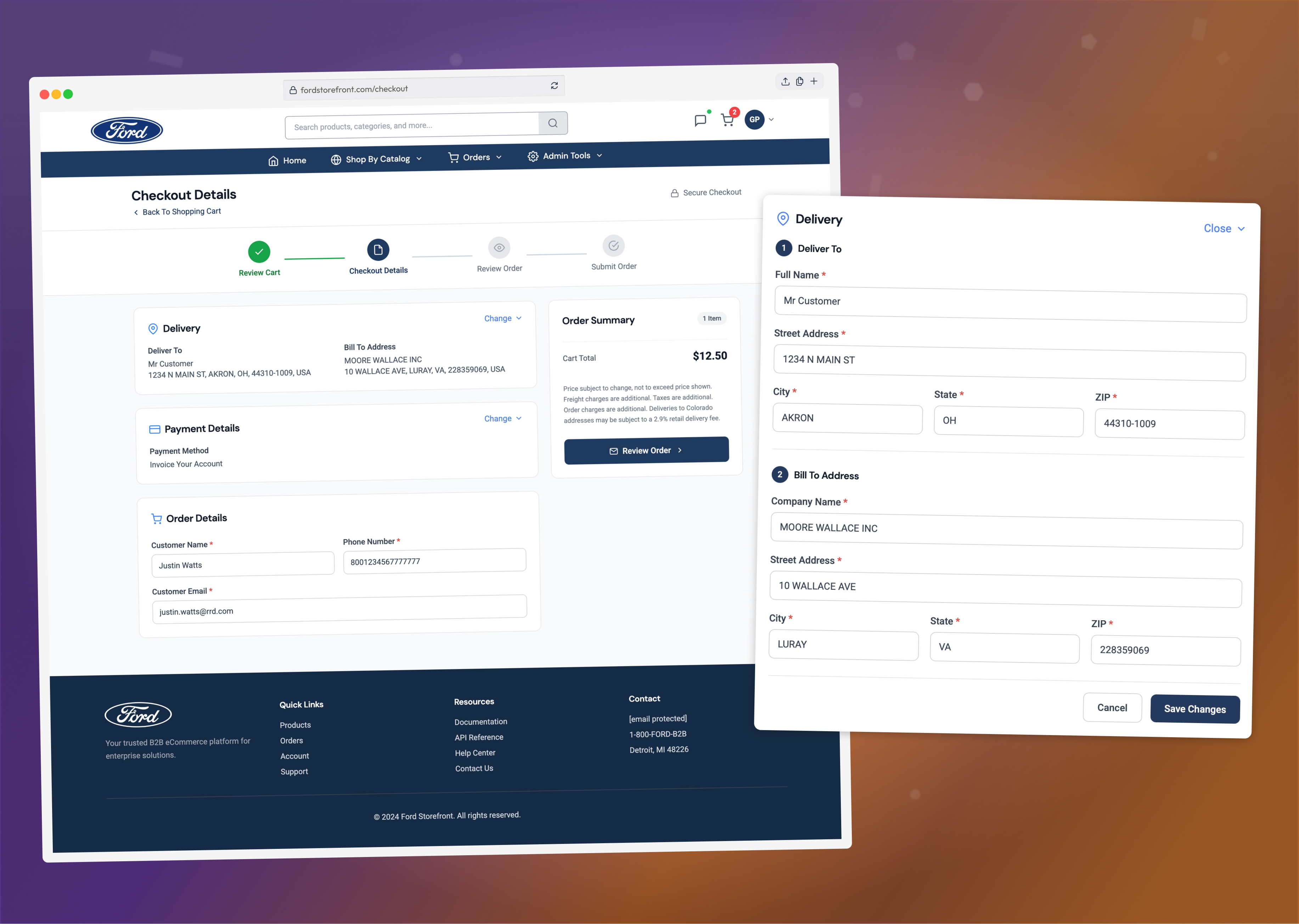
The platform supported more than 200 clients, including Ford, Best Buy, Wendy’s, and Elevance. After years of feature additions and client-specific customization, the experience had become difficult to navigate, inconsistent, and increasingly frustrating for users.
Redesigned a complex legacy ordering platform used by 200+ clients, modernizing the experience from browsing through checkout.
Led UX and interaction design, working closely with stakeholders, product, and engineering to simplify complex workflows.
User research, wireframes, prototypes, usability testing, high-fidelity UI, and a comprehensive design system.
The new platform achieved a 96% SUS score, with 16% faster checkout, 23% faster product findability, and 2 more items purchased per order.
Before redesigning the platform, we needed to understand where users were struggling and, more importantly, why those challenges existed. Because the platform supported more than 200 clients across different industries, each with unique workflows and configurations, we focused our research on identifying common pain points as well as client-specific needs.
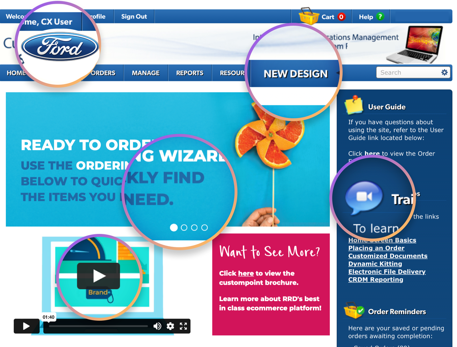
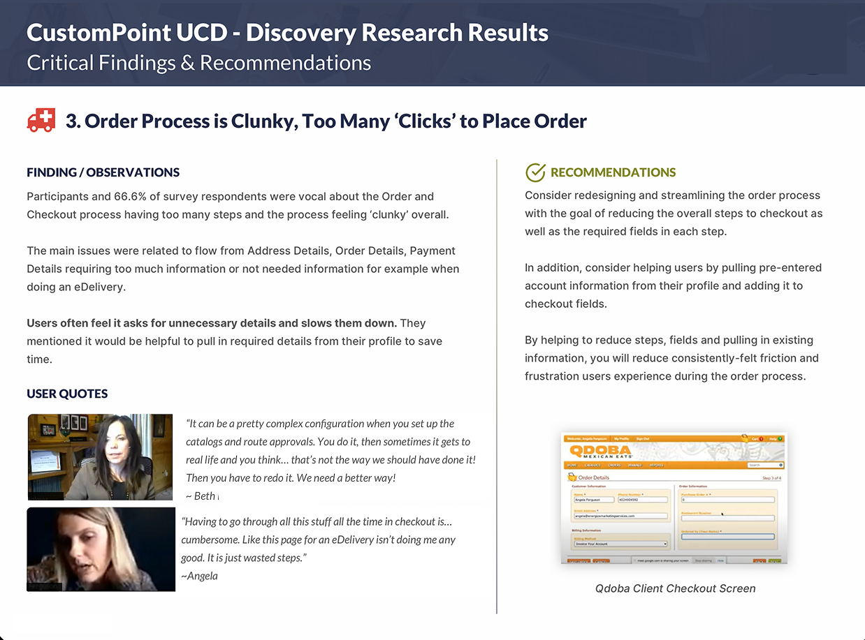
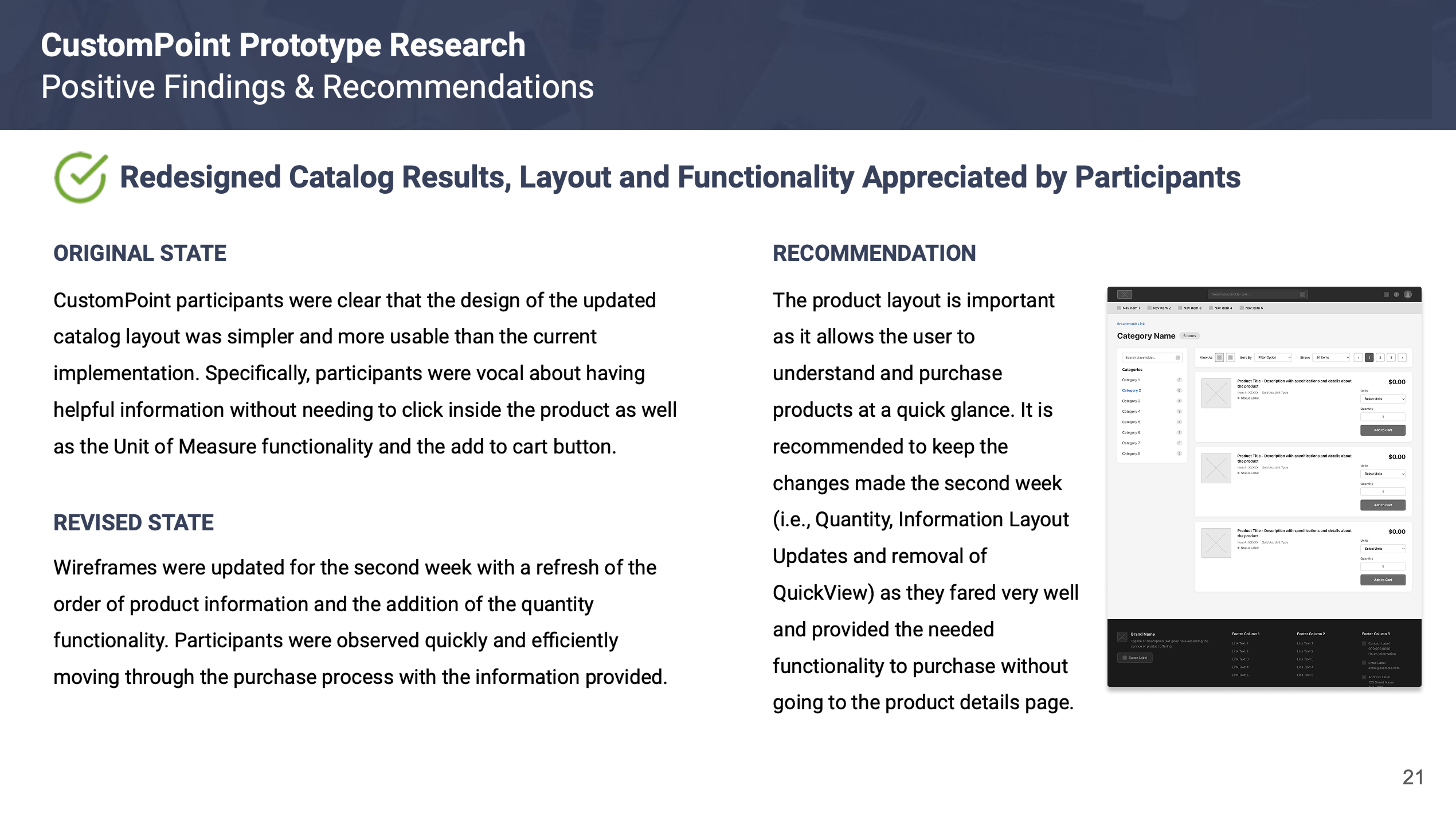
The redesign evolved through rapid prototyping, usability testing, and close collaboration with stakeholders, product, and engineering. The goal was to simplify the experience without losing the flexibility required by a highly customizable platform.
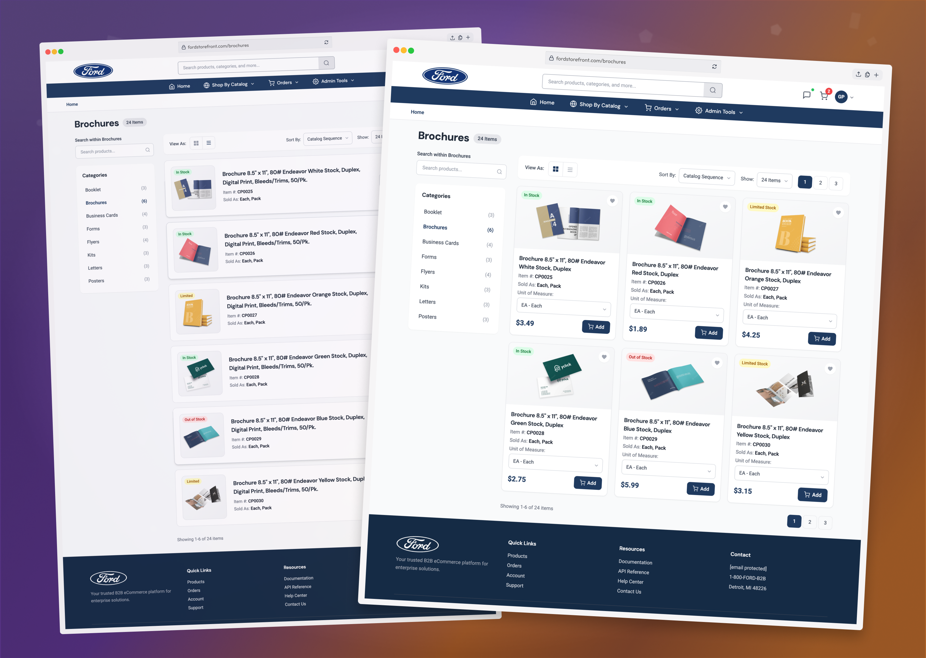
The product catalog was redesigned to make browsing and purchasing faster, surfacing key actions like Add to Cart and Unit of Measure without forcing users through unnecessary product pages.
The multi-page checkout was transformed into a streamlined, one-page experience. Information was pre-filled where possible and complex steps were broken into clear, manageable sections.
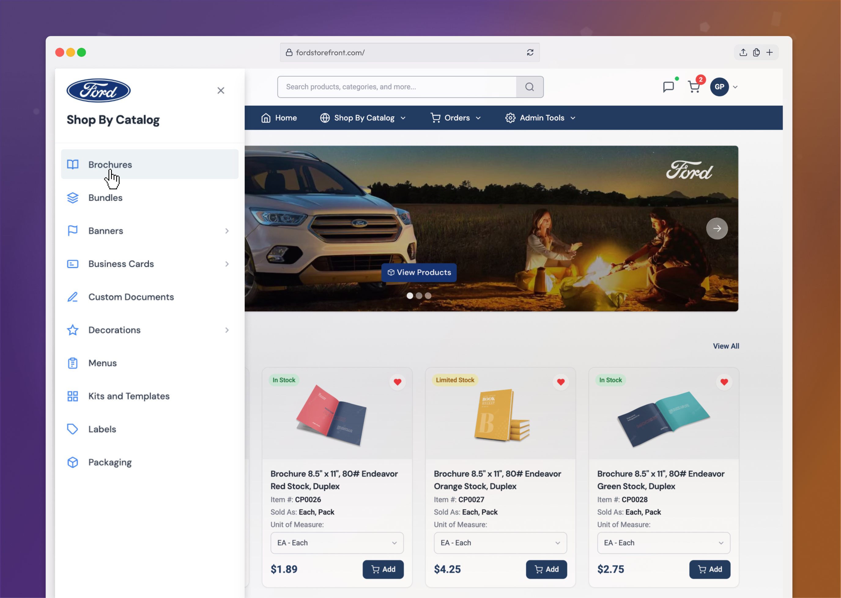
The legacy mega-menu was replaced with a progressive, panel-based navigation system that made it easier to browse categories and move deeper into the catalog without losing context.
A modern design system brought consistency to the experience across colors, typography, components, branding, and interactions while creating a foundation for future product growth.
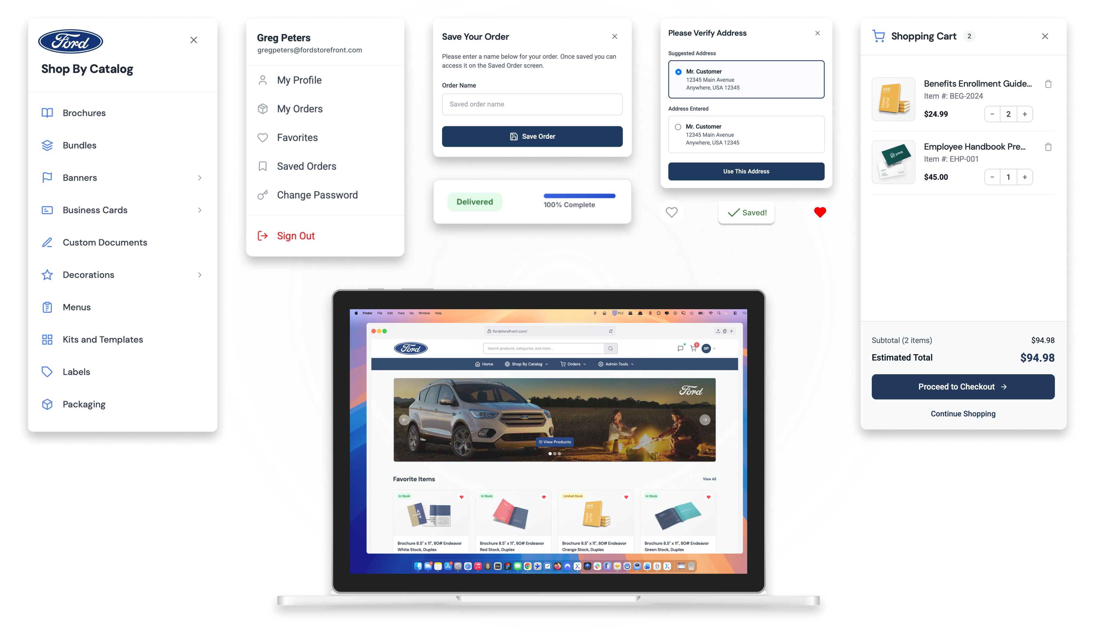
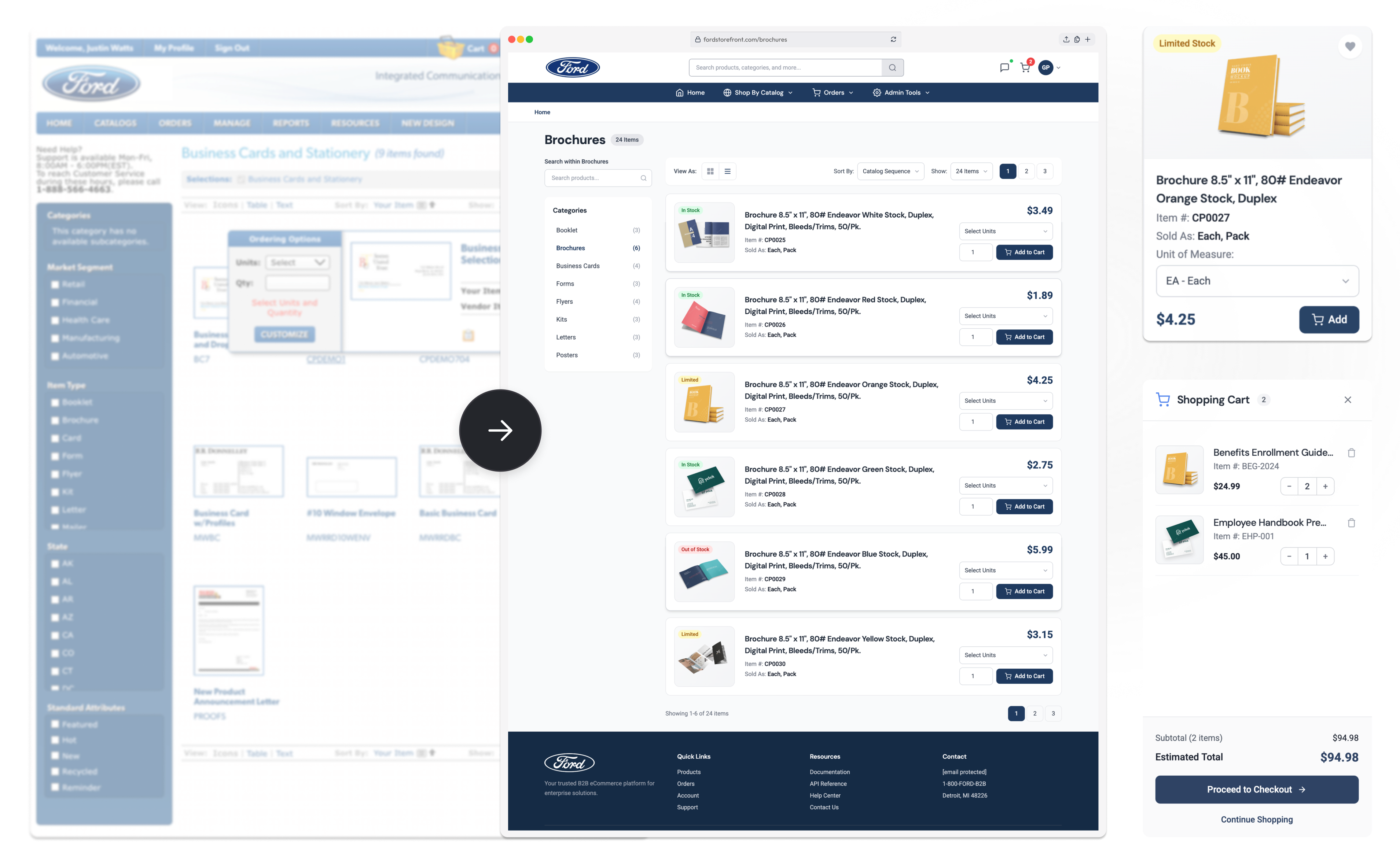
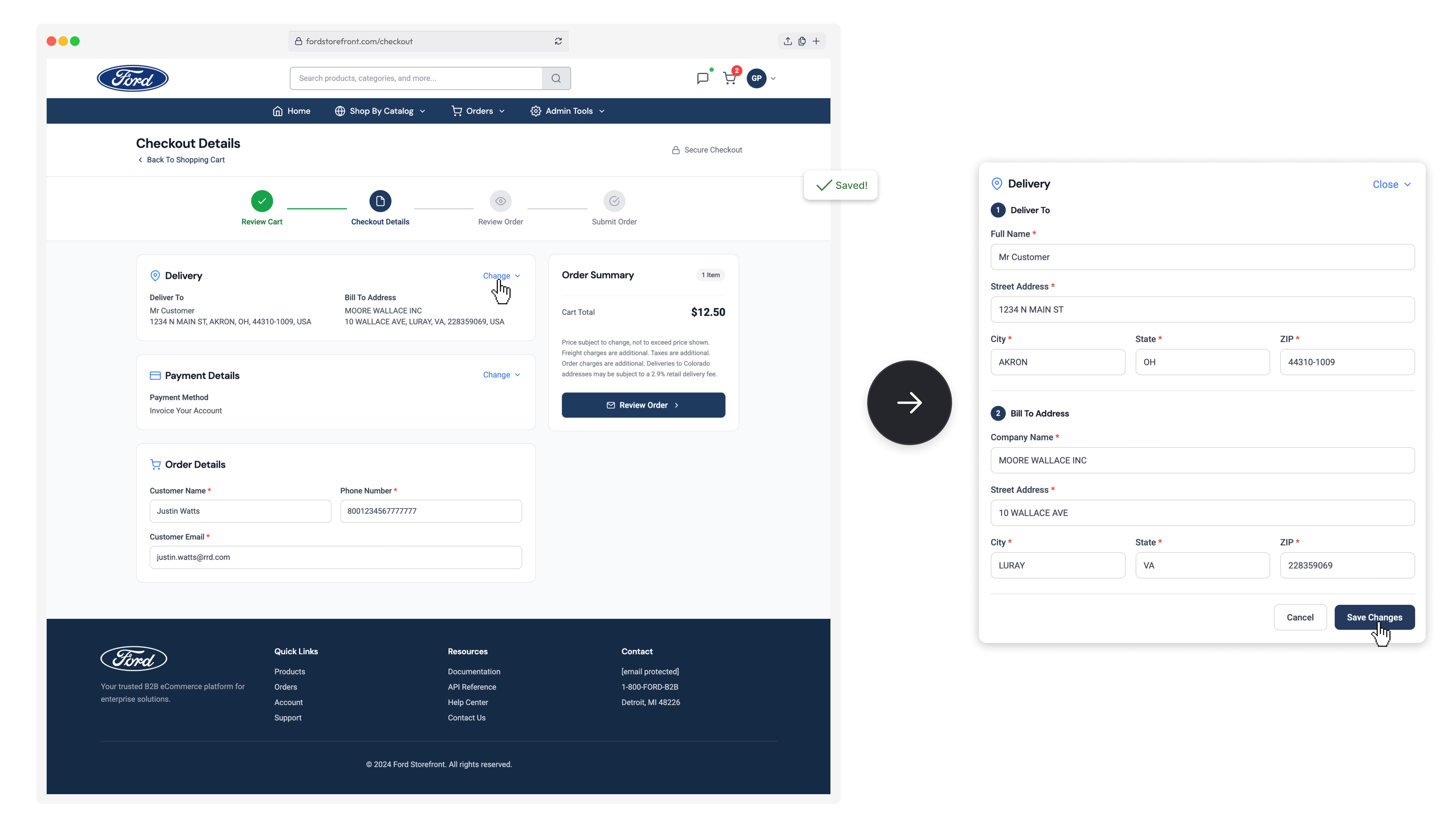
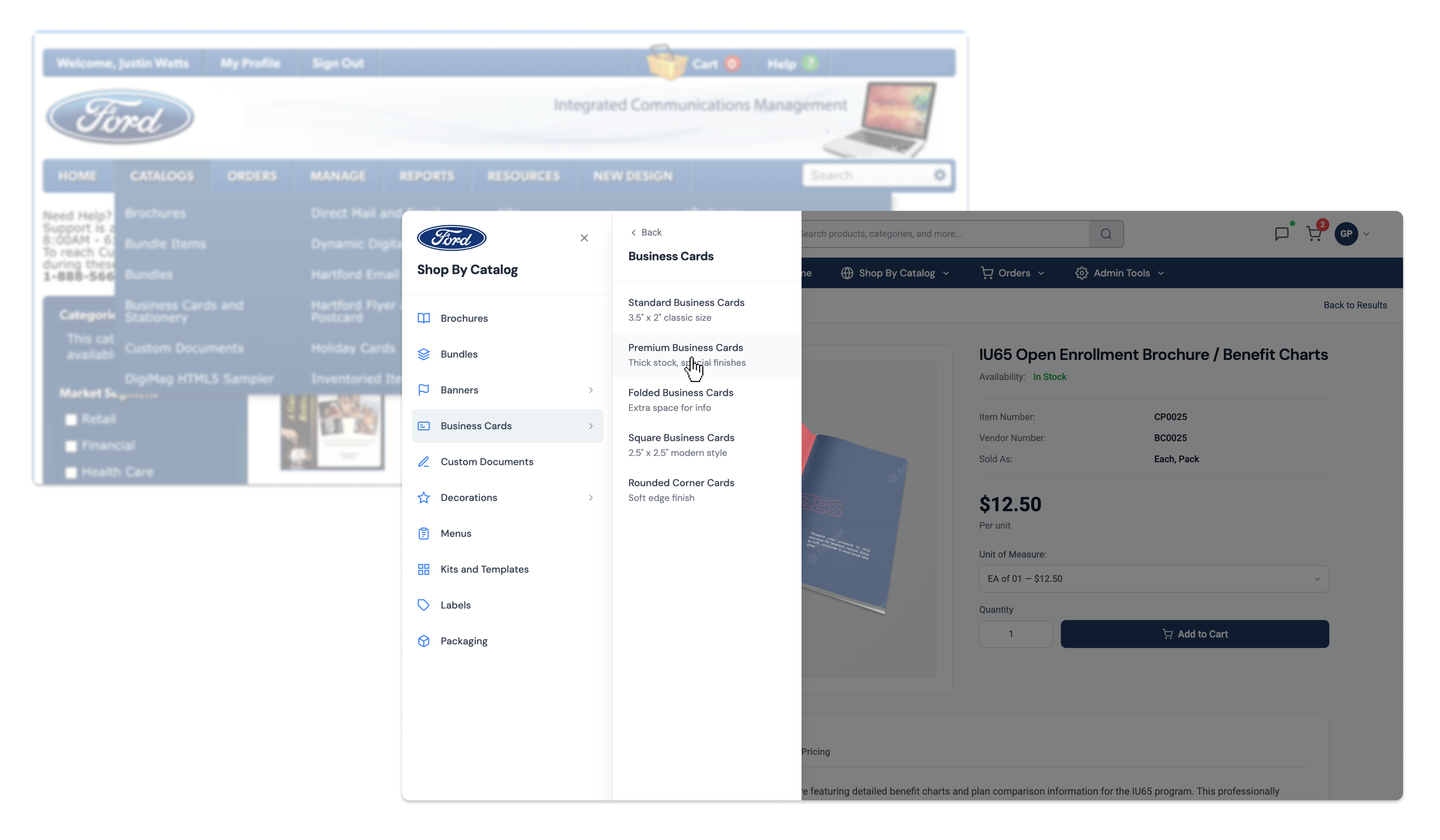
The redesigned platform created a clearer and more efficient experience for customers across more than 200 client organizations. By simplifying navigation, product discovery, and checkout, the new experience reduced friction while improving overall usability. The new platform achieved a 96% System Usability Scale score, with users completing checkout 16% faster and finding products 23% faster. Orders also increased by an average of 2 additional items per purchase.
System Usability Scale score with the new UX.
Faster checkout compared to the legacy system.
Reduction in time spent finding products.
More items purchased per order.