
A redesign of a legacy medical supply ordering platform, rebuilt around unit-of-measure selection and faster ordering for clinical staff.
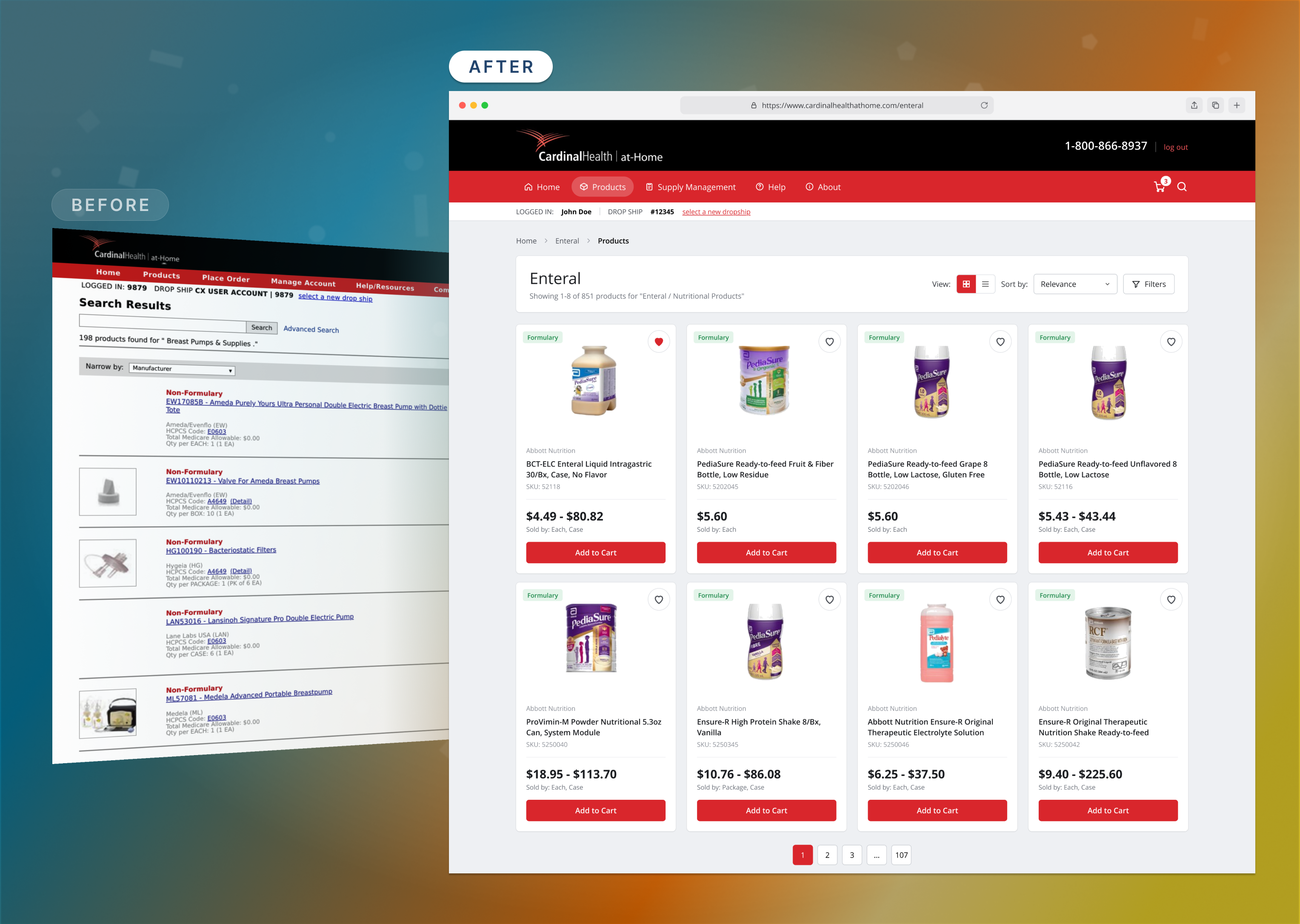
Cardinal Health’s at-Home platform is where nurses, clinical staff and supply managers order the critical medical supplies their patients depend on. Built on outdated technology and left unchanged for years, it had no unit of measure selection, so every product size was its own SKU. Items were hard to find, the catalog was bloated with duplicates, and simple daily orders took far more effort than they should.
Rebuilt the purchasing experience around a single unit selector, and redesigned the full shopping flow, from search through checkout, along with the Supply Manager tool for recurring orders.
Started as UX Designer and was promoted to Senior UX Designer during the project. Led the end-to-end design process and user research on a two-designer team, and partnered with product and engineering on feasibility.
UX audit, user interviews, stakeholder workshops, Axure wireframes, working prototypes, usability testing and production-ready UI in Figma.
55% fewer redundant SKUs, 34% faster supply manager tasks, 26% more first-time orders completed and 18% more repeat ordering.
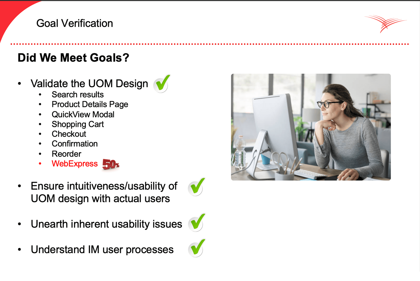
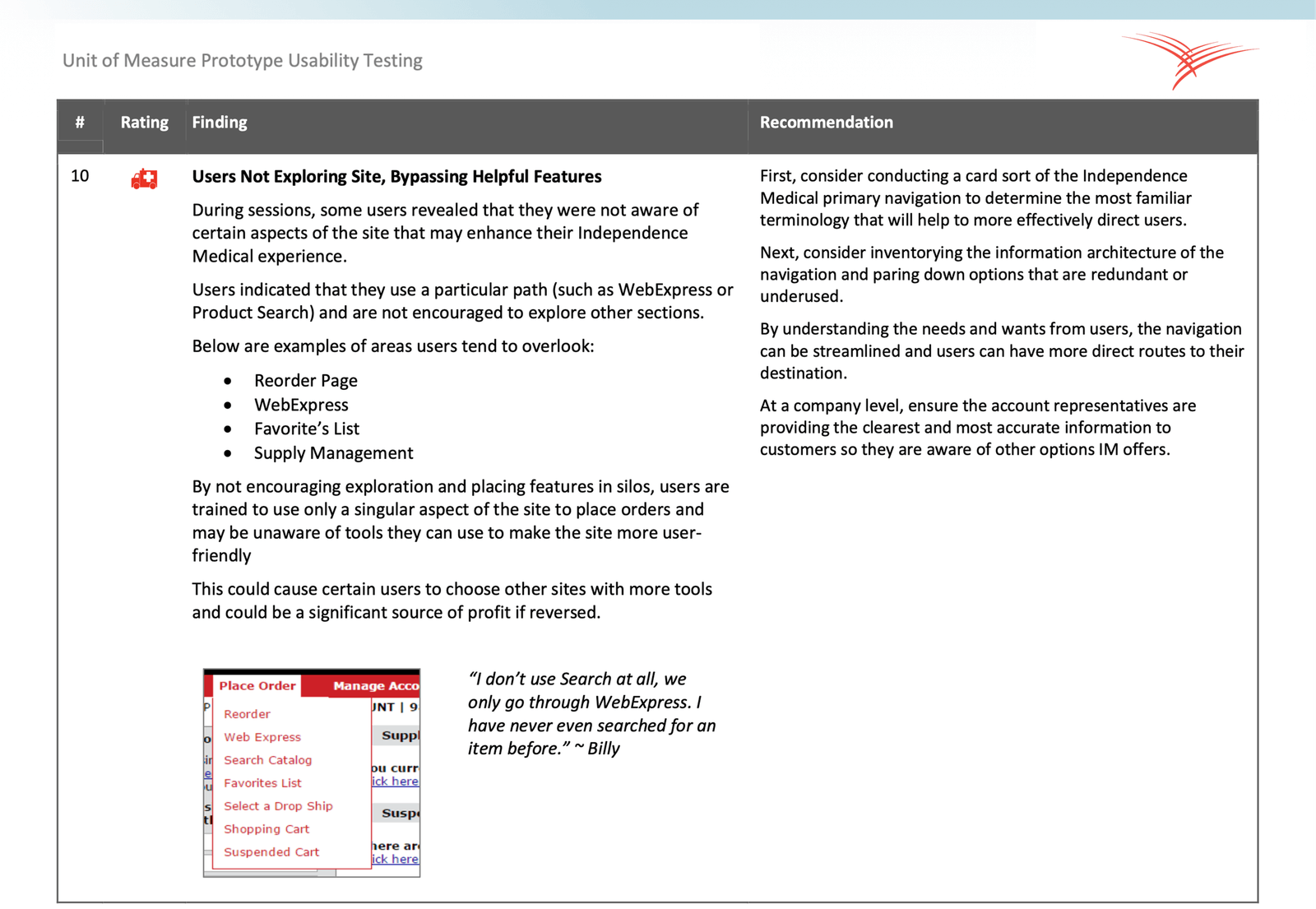
We pushed for real user research and were approved for eight in-depth sessions with clinical staff and supply managers. Alongside a UX audit, we built a working prototype that compared the current platform with the proposed unit-of-measure design. The findings pointed to four core problems: dated, hard-to-read product pages; no unit selectors, which led to dead-end searches; a Supply Manager tool that made monthly planning difficult; and friction at every step from product list to checkout. Our research report gave leadership a clear case for the redesign.
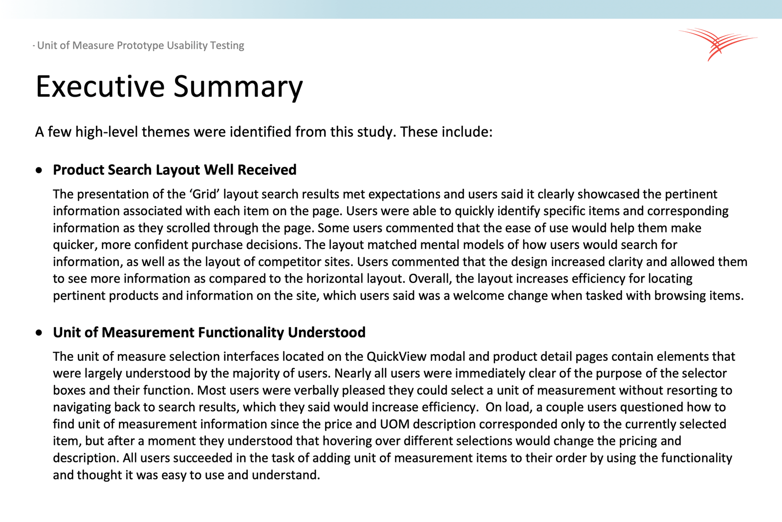
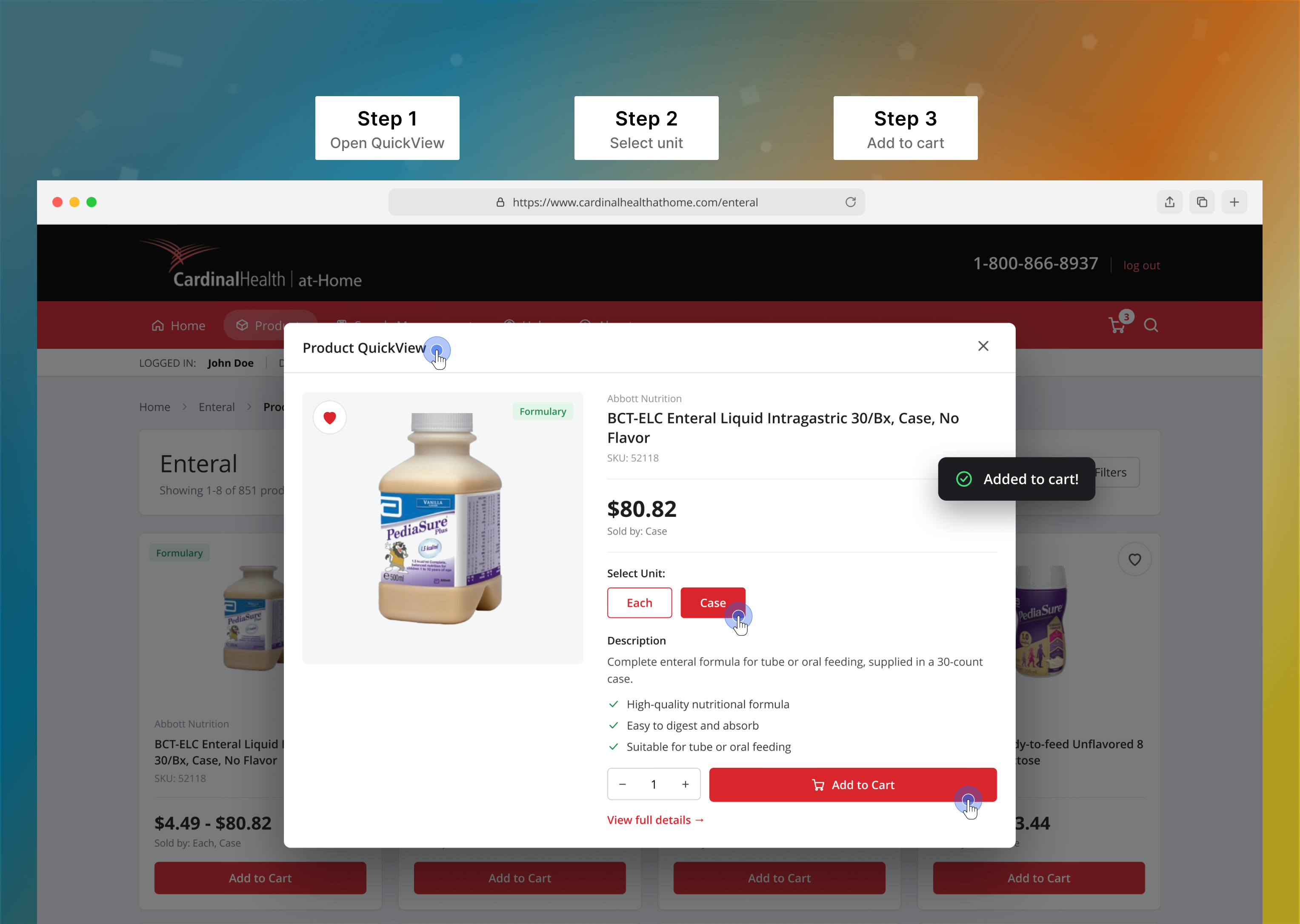
The redesign centered on one new pattern: a unit of measure selector that had to feel native everywhere someone shops, from search results and product listings to product pages, Quick View and checkout. We started in Axure with low-fidelity wireframes to map where units appear and how prices change. Then we moved to high-fidelity prototypes in Figma to test the interaction patterns with real users. Every round of testing refined the selector’s placement, labels and pricing feedback until choosing Each or Case felt instant and obvious.
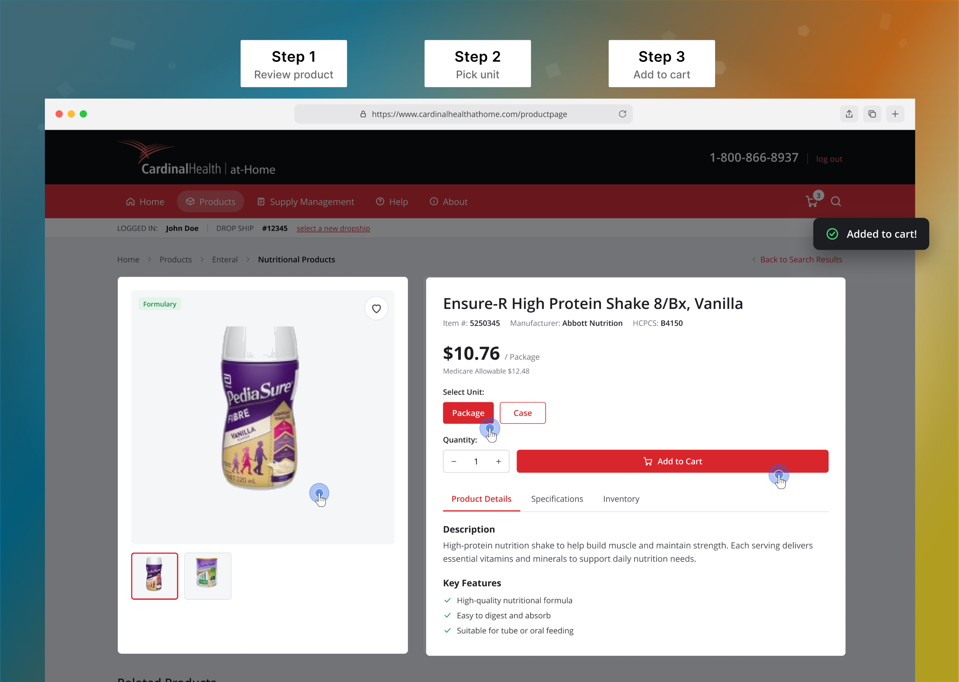
Quick View opens any product right from search results, with Each and Case buttons that update the price instantly. Clinicians pick the right unit and add it to the cart in one place, without hunting through near-identical SKUs.
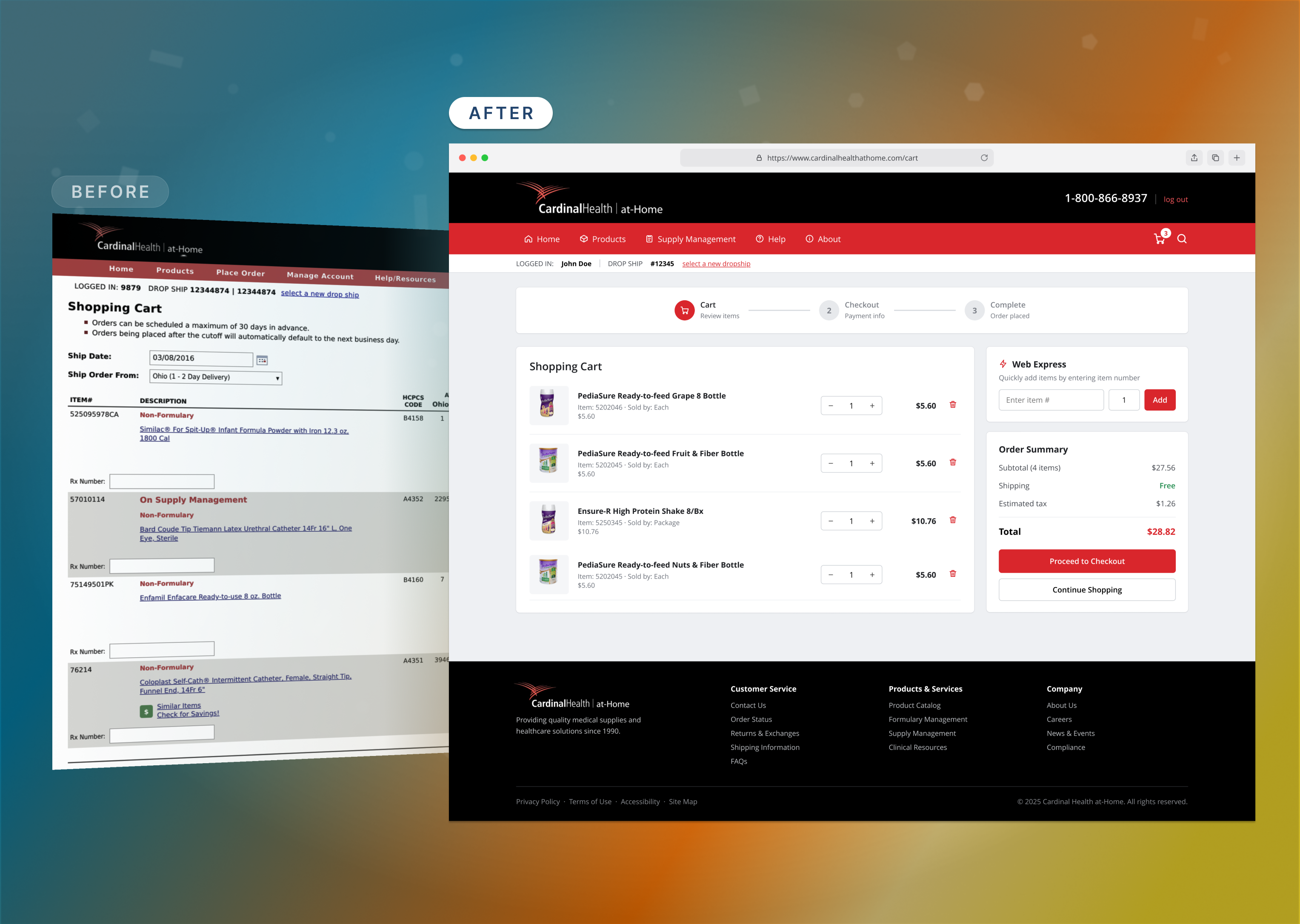
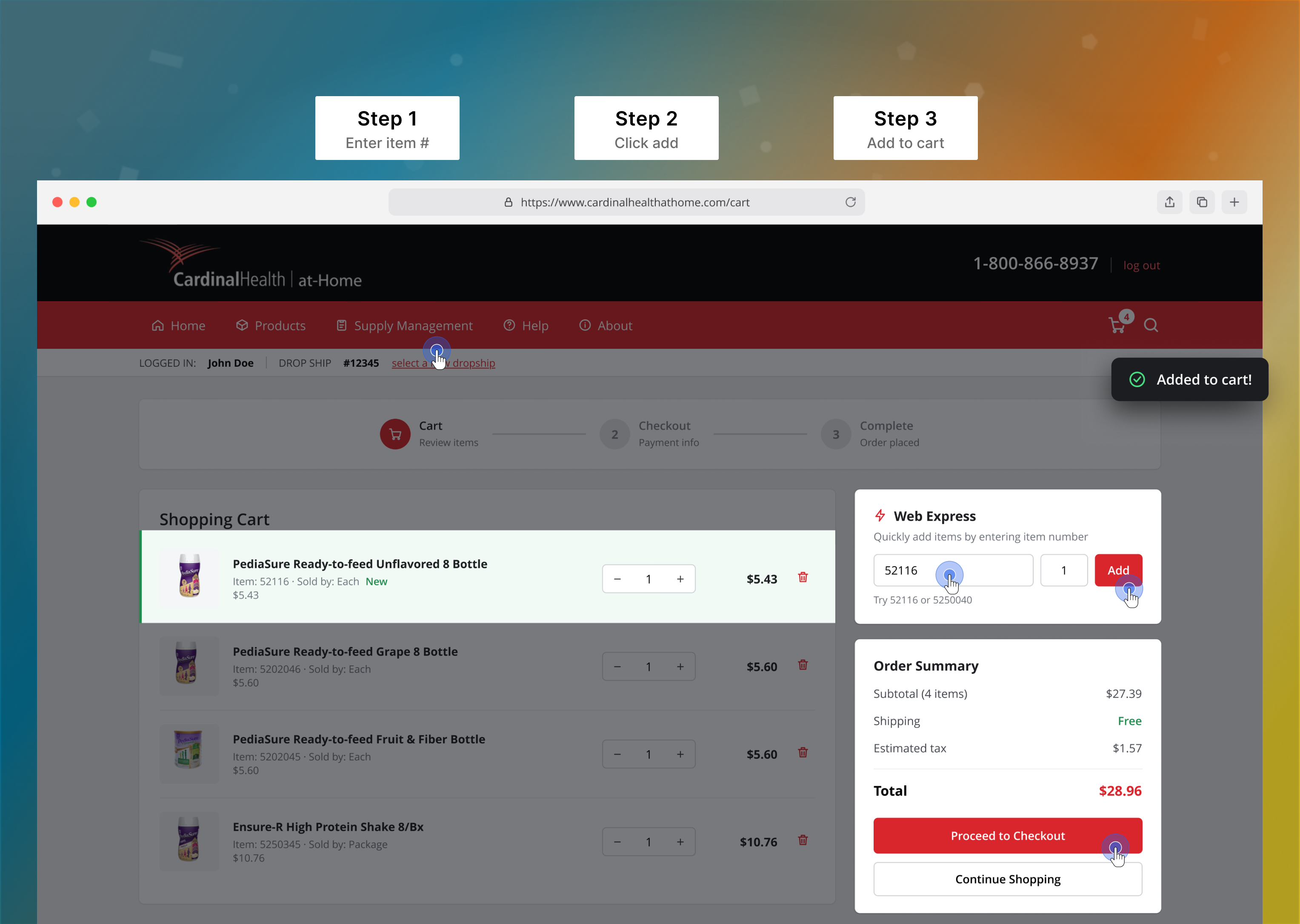
Web Express lets staff type an item number and quantity right in the cart. The item drops in at the top with a green “New” tag, so experienced users can rebuild an order straight from their order sheet without searching.
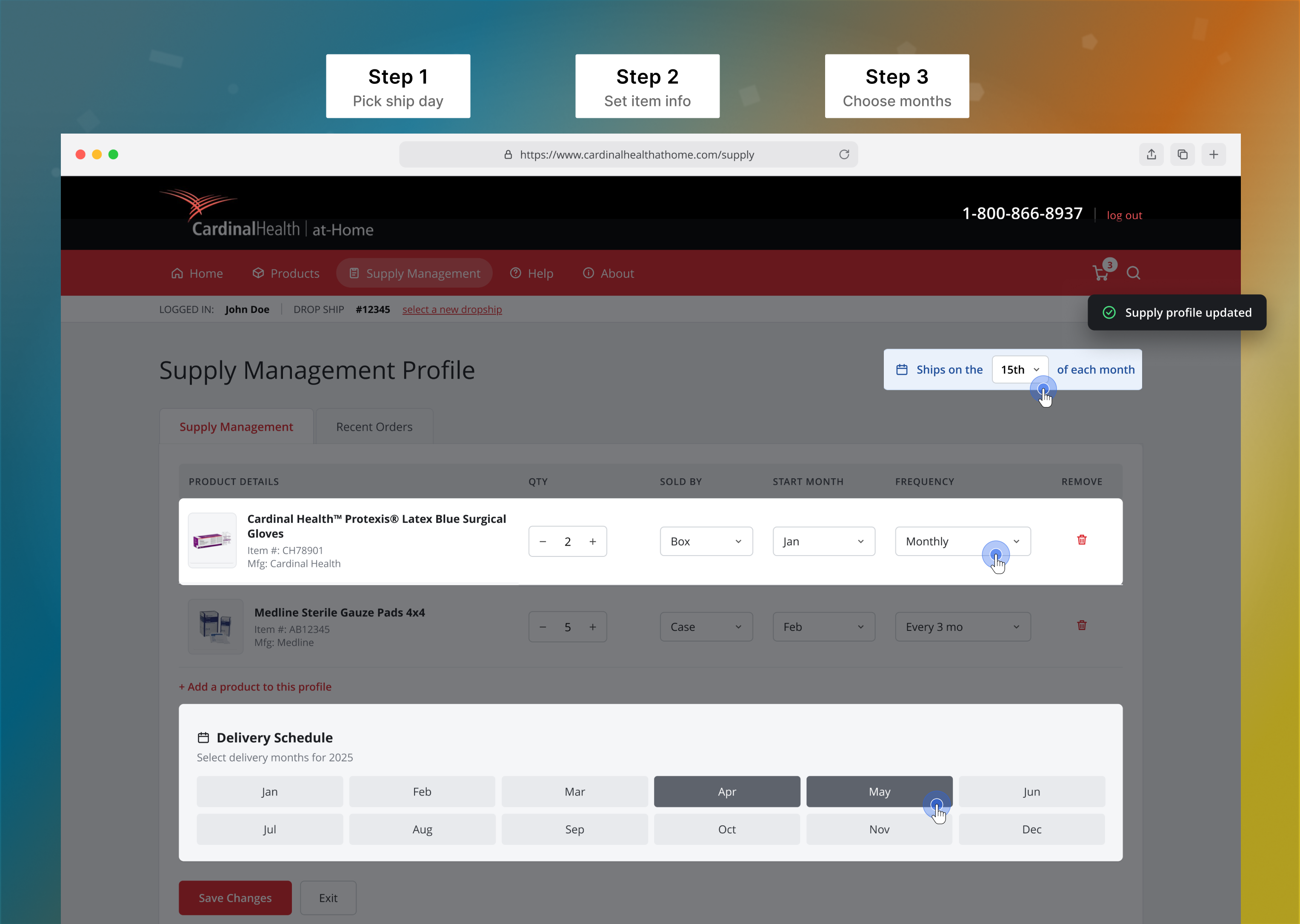
Supply managers set one ship day, give each item its own quantity, unit, start month and frequency, then tap the months to schedule deliveries. Recurring orders that used to be rebuilt each month now run on their own.
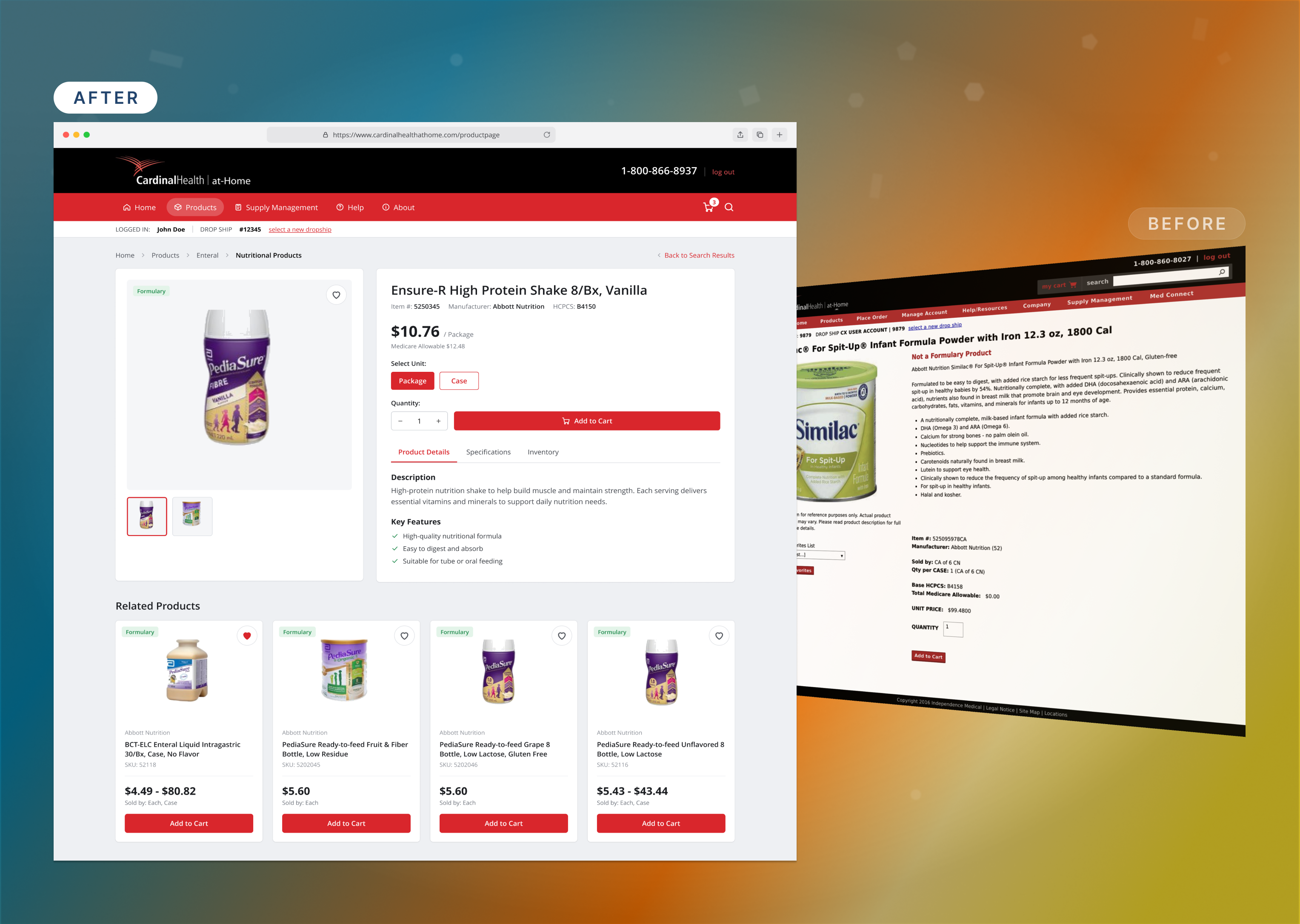
Large, crisp product photos sit next to the price, item details and HCPCS code. The unit selector updates the price as clinicians switch between Package and Case, and one Add to Cart button finishes the order, with no dead ends or duplicate listings.
Consolidating SKUs under one unit selector and redesigning the shopping and Supply Manager flows gave clinical staff a faster, more reliable way to get supplies to their patients.
Reduction in redundant SKUs after unit of measure consolidation
Improvement in supply manager task completion speed
Increase in successful first-time order completion
Increase in repeat ordering frequency