Ordering Platform Redesign

Product, Interaction and UX design skills used to redesign an outdated, customizable, feature-rich ordering platform from the ground up.


Type
Client
Industry
Year

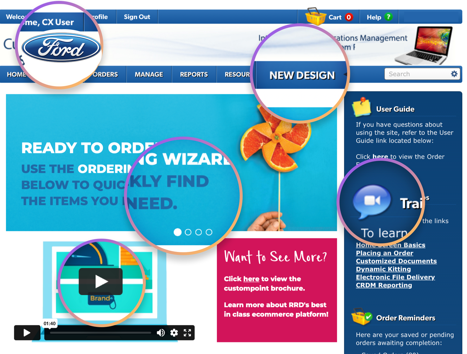
An outdated eCommerce platform.
This project was to redesign an entirely customizable eCommerce platform which 200+ clients such as Ford, Best Buy, and Wendy's use to purchase and customize documents and marketing collateral.
Note: Since the ordering platform is fully customizable, I used Ford to illustrate my designs rather than the site owner / operator.


A tangled web of complexity.
The site had never been updated or modernized so it suffered from poor usability. Due to customization, every client experiences UX issues in a different way. The website's functionality is also complex and deep. Research and iterative design helped forge a path forward and make sense of redesigning it's complexity into simple interfaces.

Simplified, optimized for the now.
The entire website and ordering platform was redesigned from the ground up. This included the ordering, customization, and checkout experiences. The redesign was completed with user input infusing each step of design.

A Full-Stack of UX fun.
I was responsible for strategy and end-to-end design including requirements, wireframes and fully interactive prototypes and a design system to tie everything together.
Wireframes, Prototypes, Design system, User research
UX strategy, team LEAD, interaction design
Your Vision, Our Expertise
Learning About Users
Preparations for design began with interviews with both internal and external users of the site. In addition to a deep usability evaluation we recruited 10 internal stakeholders and 20 external clients for user research.


Usability Evaluation. Reviewed the old site and found numerous usability issues. Wrote and delivered a report to stakeholders with 75 UX issues. There were many issues with the site stemming from it's age and intensive bolstering of features and functionality over the years.

User Research. Interviews with 20 external client users of the site to learn about their needs. Since the site is very customizable it was helpful to learn about specific issues, pain points and requests. Over 100 insights gleaned from these sessions.
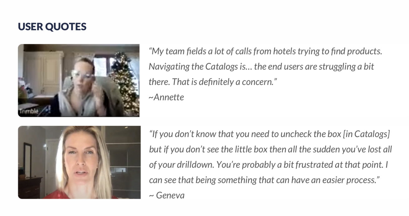
Stakeholder Interviews. Discussed pros and cons with 10 internal users to learn about known issues with the site. It was very helpful to learn about client issues from an internal perspective.
Summary of Findings
Though it had not been updated in years, users were clear that the functionality of the old site was not terrible. The design was outdated, most of the functionality needed refinement but overall it was serviceable.
Navigation Issues
Shopping and Browsing Slowness
Findability Issues
Numerous Checkout Issues
Usability Issue Navigation was nightmarish due to the finicky, floating nature of the fabled 'Mega Menu' outdated design.
Shopping Issue The previous site used a 'pop out' type of modal to surface functionality. This was, for obvious reasons, bad.
Checkout Issue The checkout was extensive and riddled with a ton of different options and configurations, slowing the user down from that very important part of the process.
Wireframes, prototypes, iteration.
The design strategy was to create a living, fully-functional prototype of the entire site. This worked very well since each page had specific requirements and scenarios that needed prototyped. We did two rounds of usability testing during design. As things were finalized, we worked from low to high fidelity to generate the UI and the Design System for the new website.


The redesigned site. Modern and efficient.
I worked with engineers to ensure the intended UX carried through development. Below are a handful of features which show some of the drastic improvements over the old site.
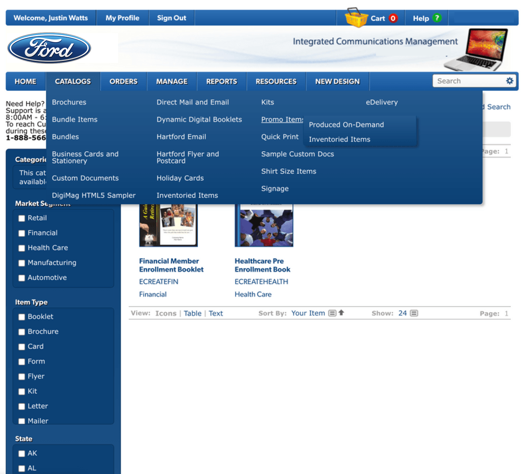
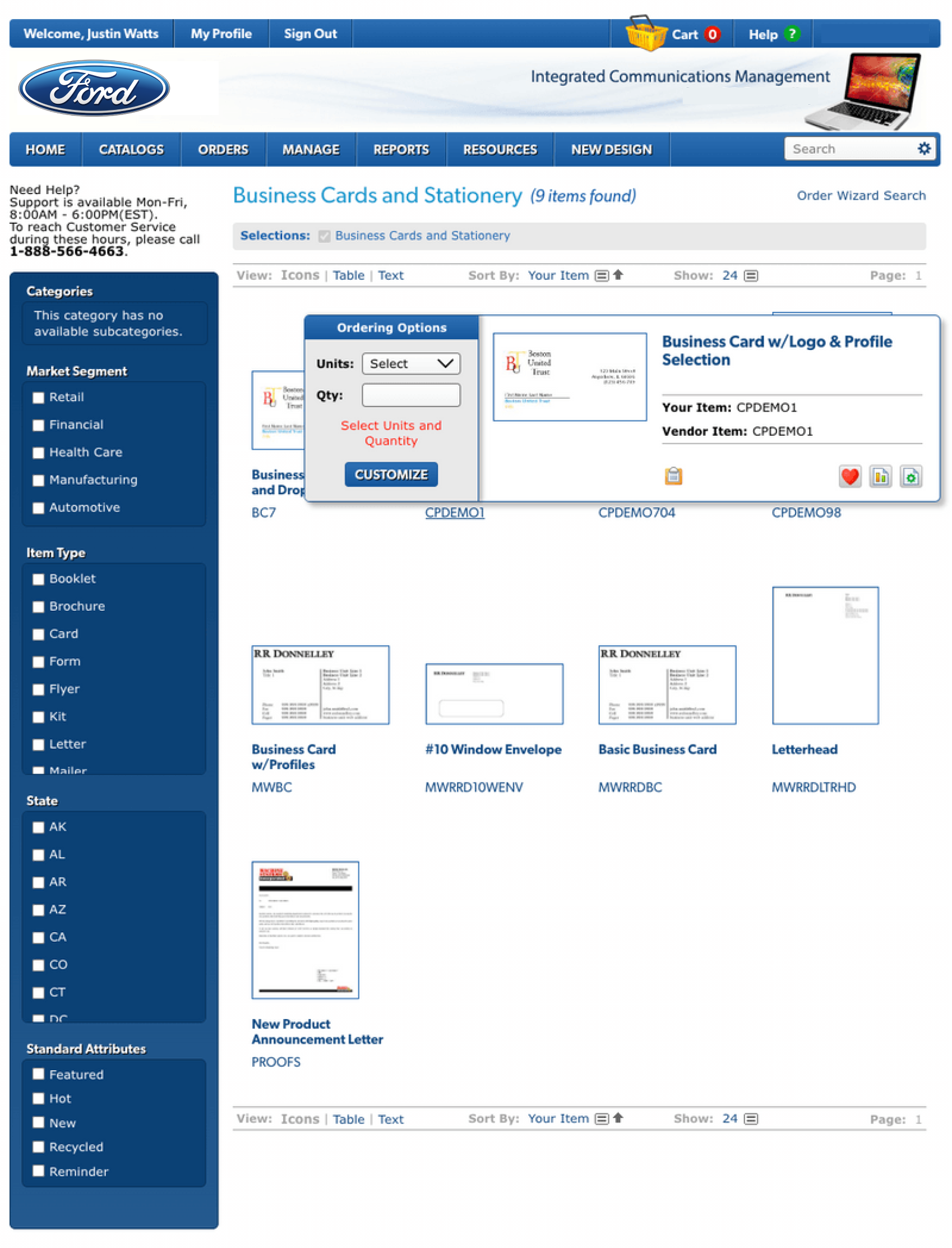
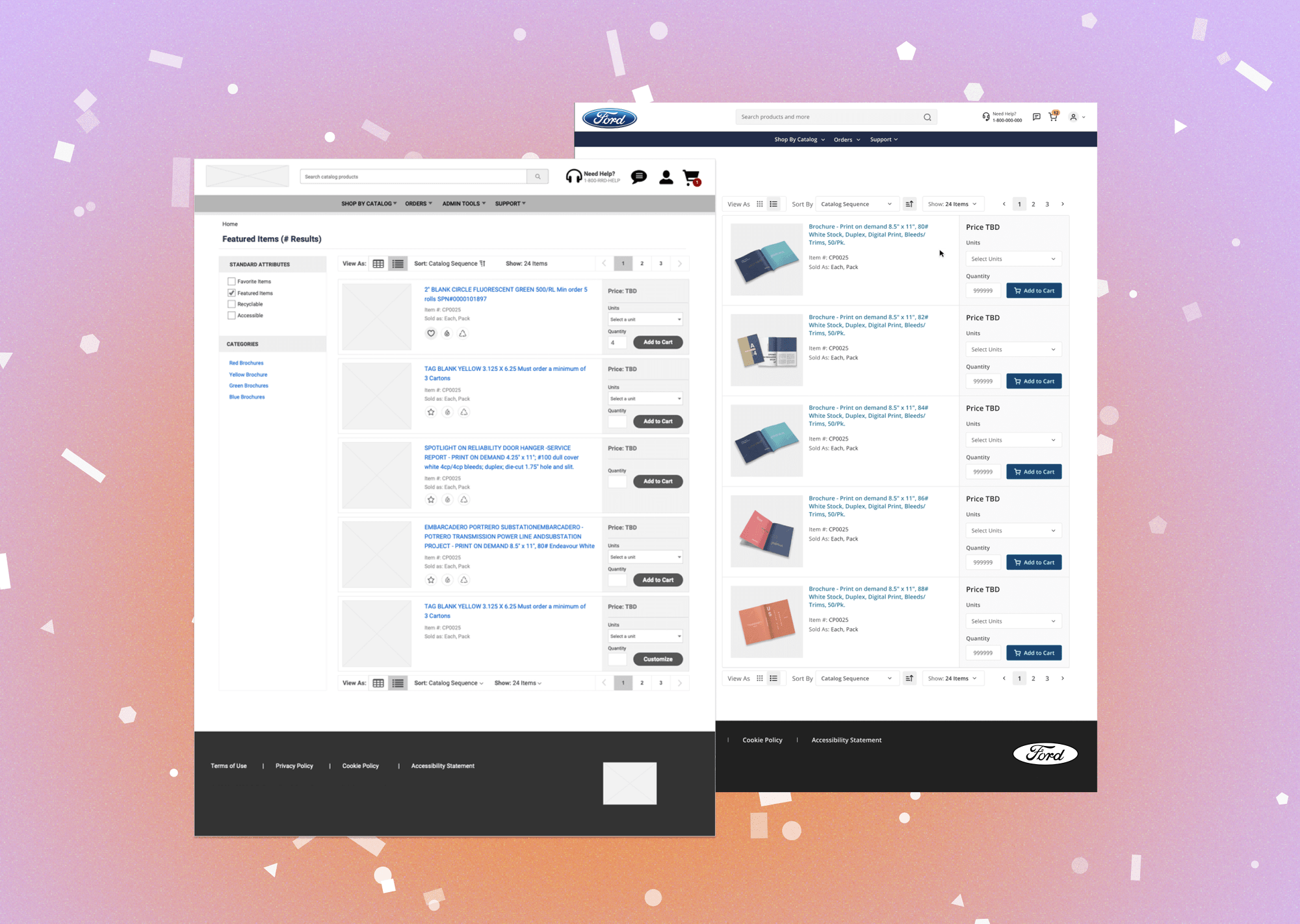
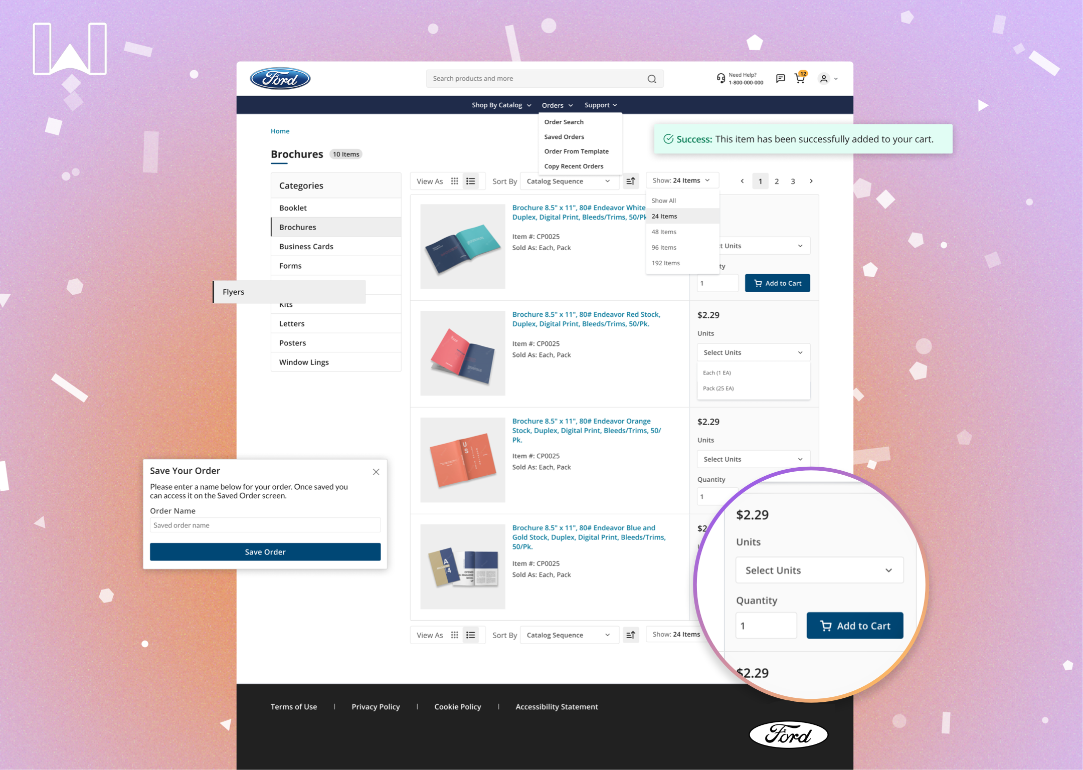
Product Catalog Redesign
The Product Catalog was redesigned from the ground up. The updated design included improvements such as an 'Add to Cart' button and unit of measure selectors for quick and easy purchasing. Prior to this, users had to use a modal window or drill into the product detail page.
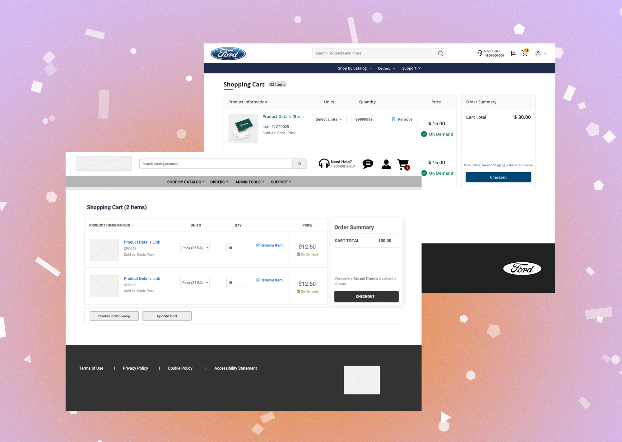
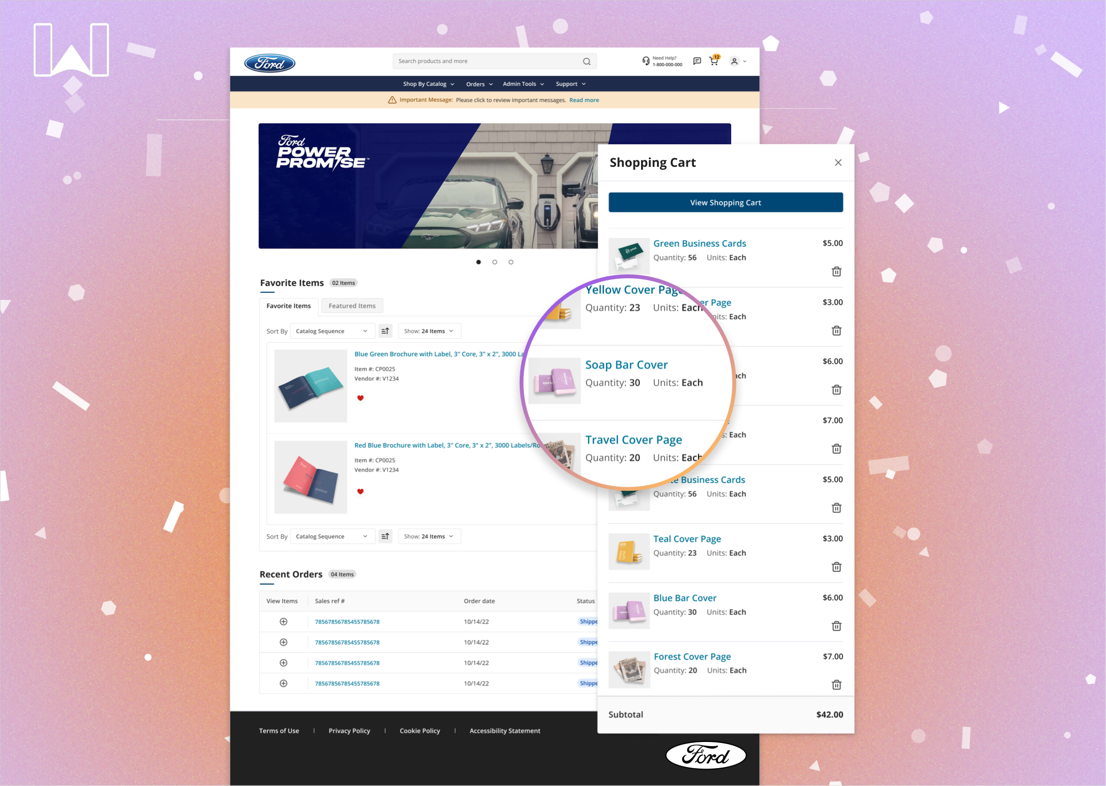
Pop Up Shopping Cart
To reduce user back and forth from the shopping cart page we included a Pop Up Shopping Cart similar to Instacart. This works to reduce friction by providing access to the shopping cart without leaving the page.

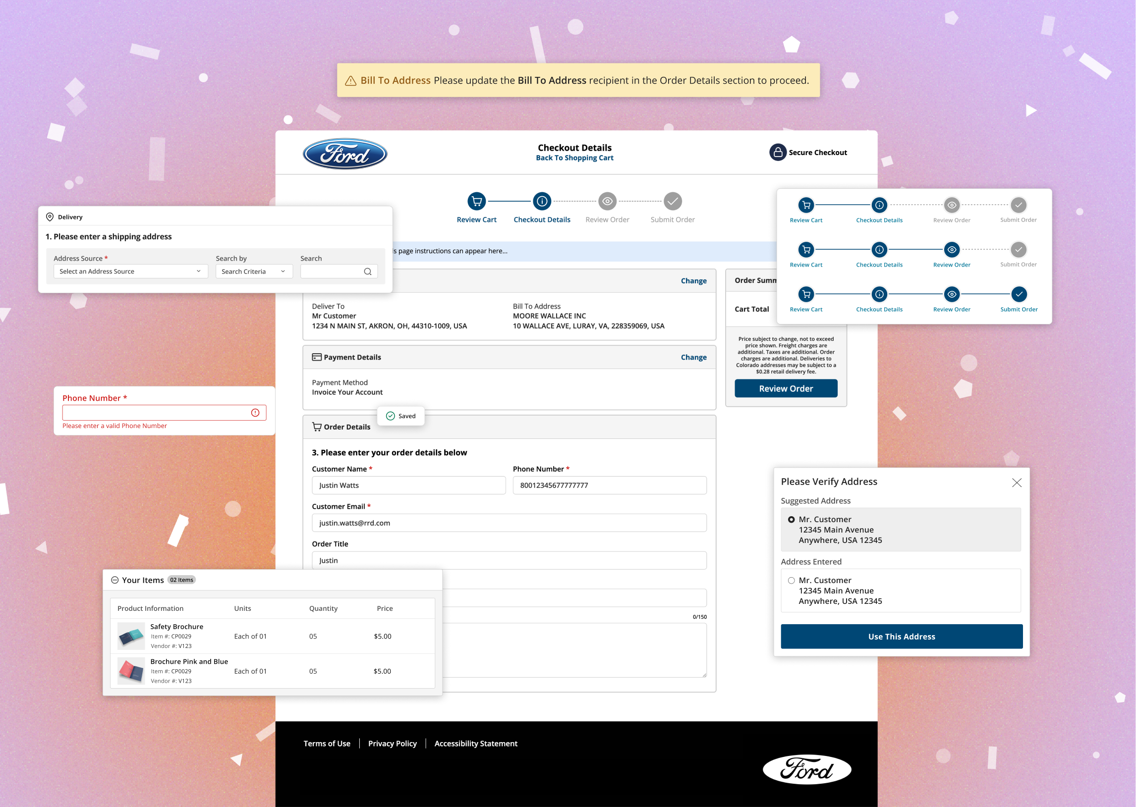
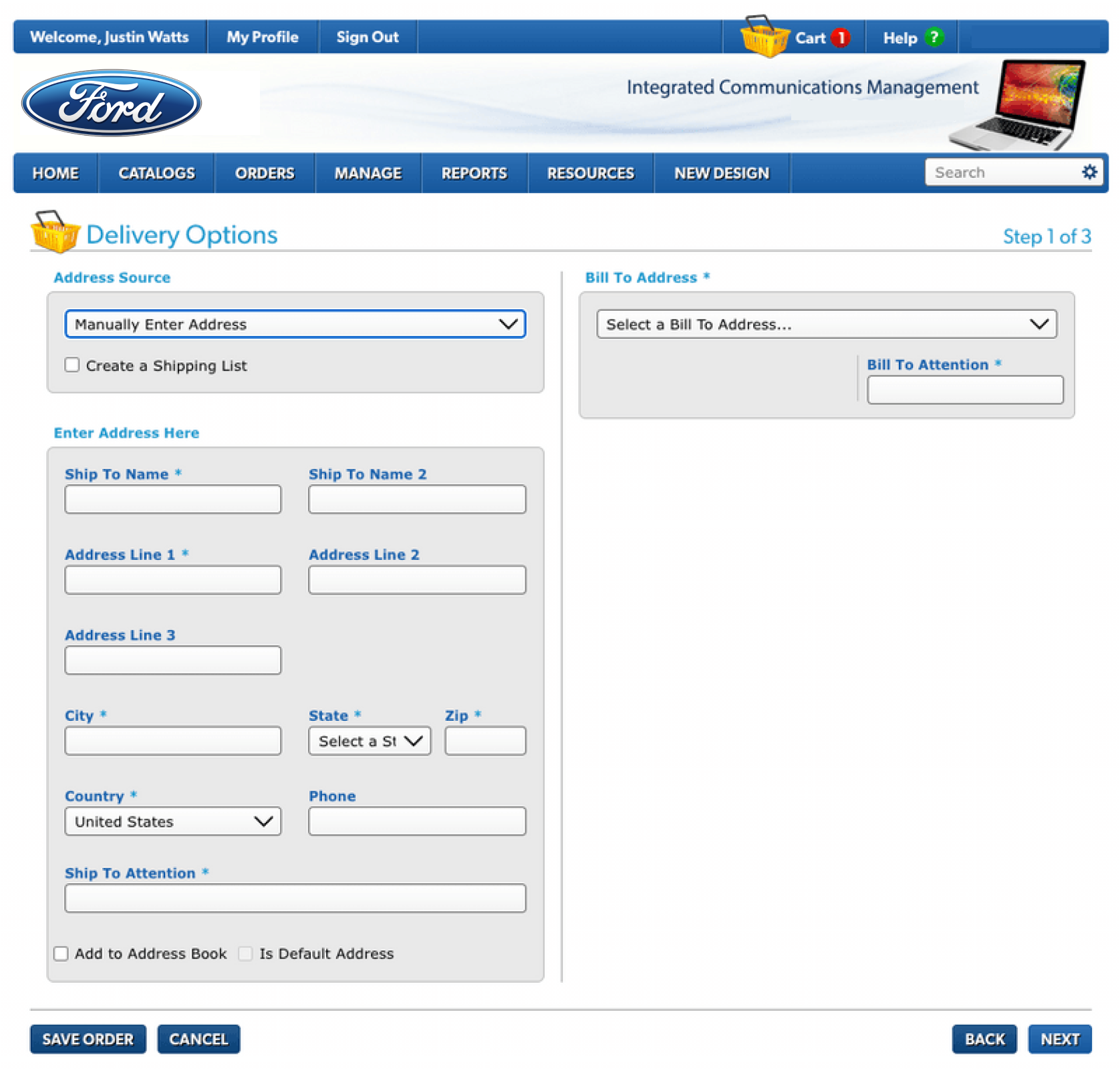
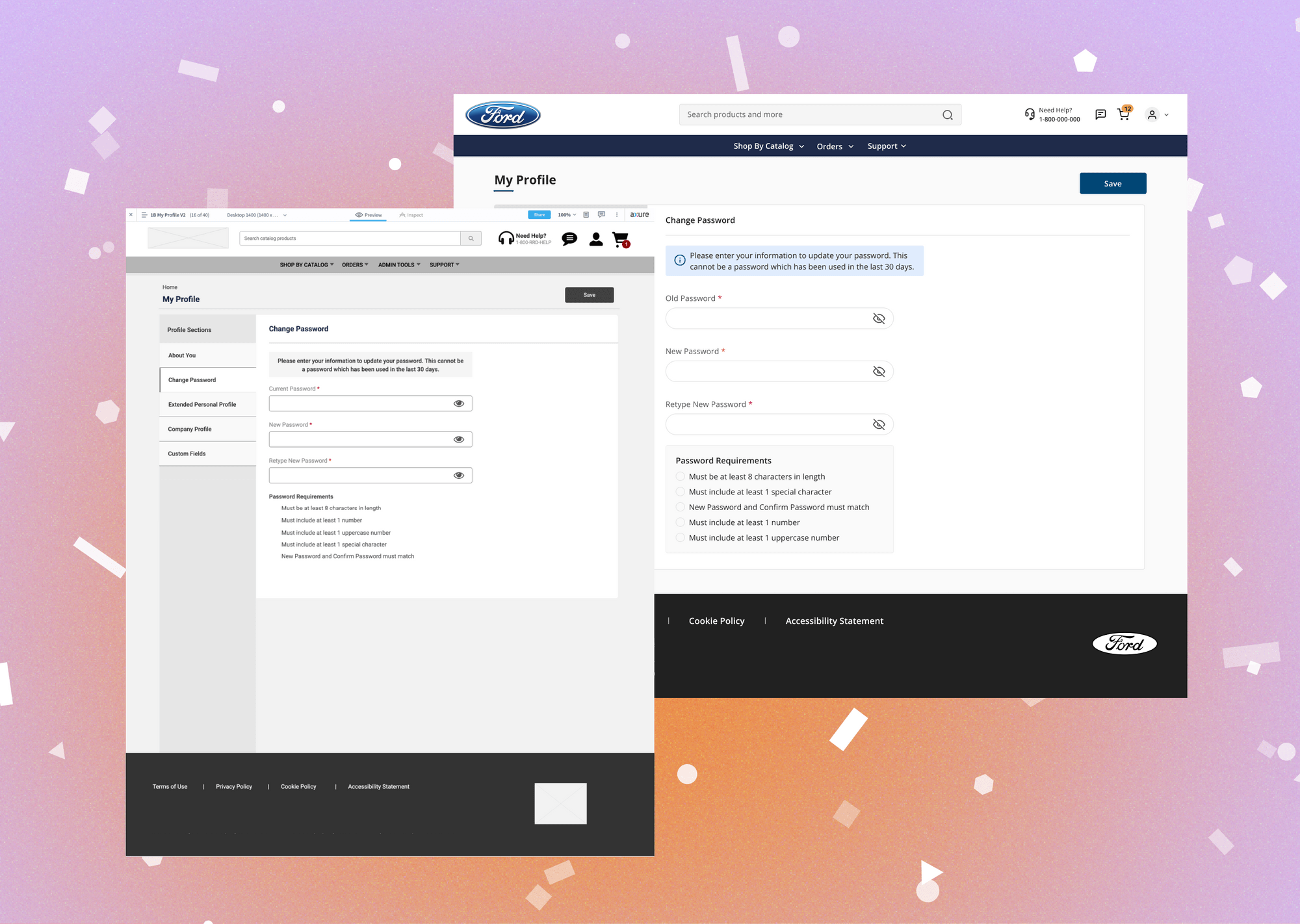
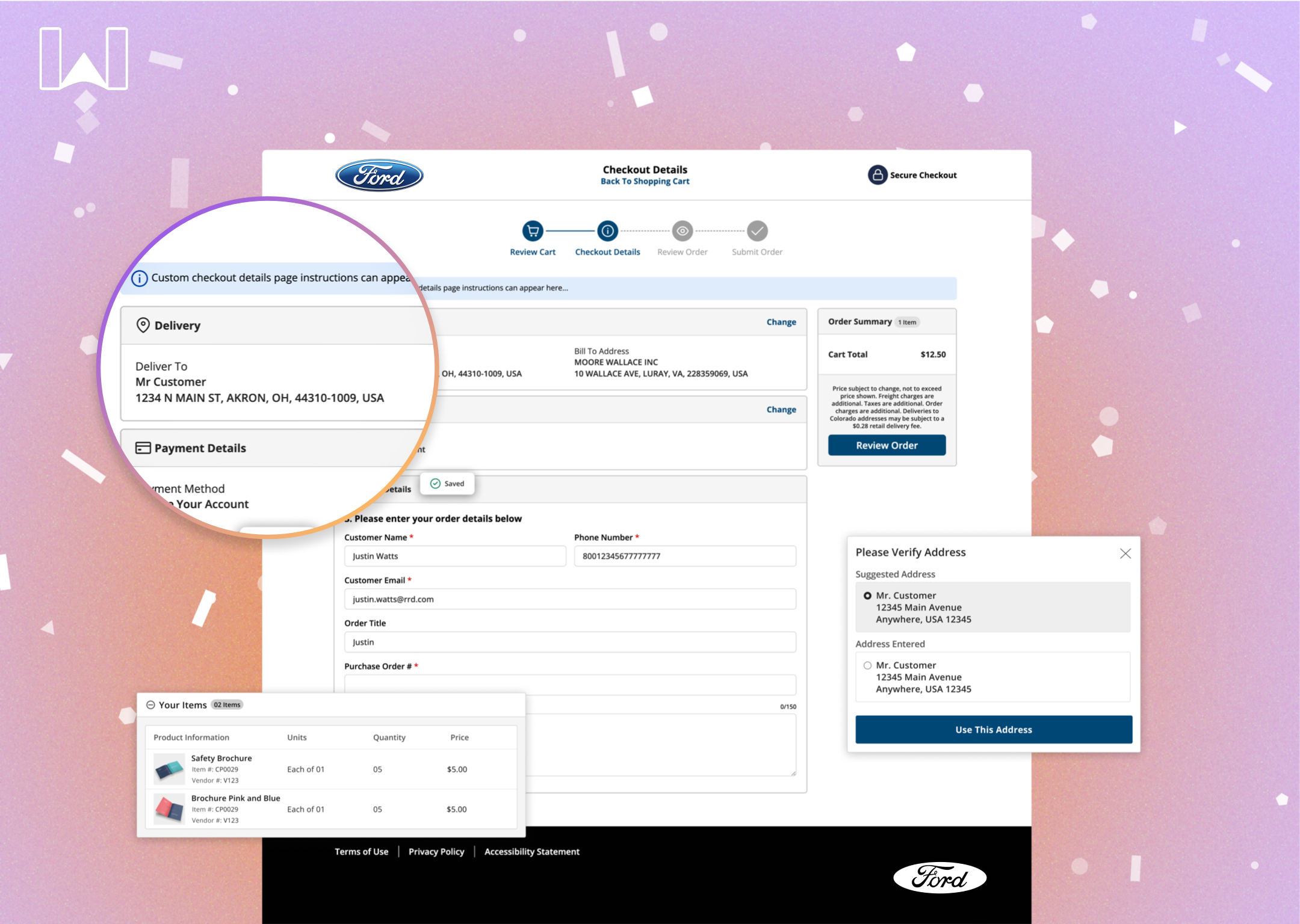
Checkout Redesign
Designed a one-page simplified checkout experience. This simplified approach uses a modern checkout flow similar to Amazon where delivery, order and payment information is on one page making checkout a breeze.

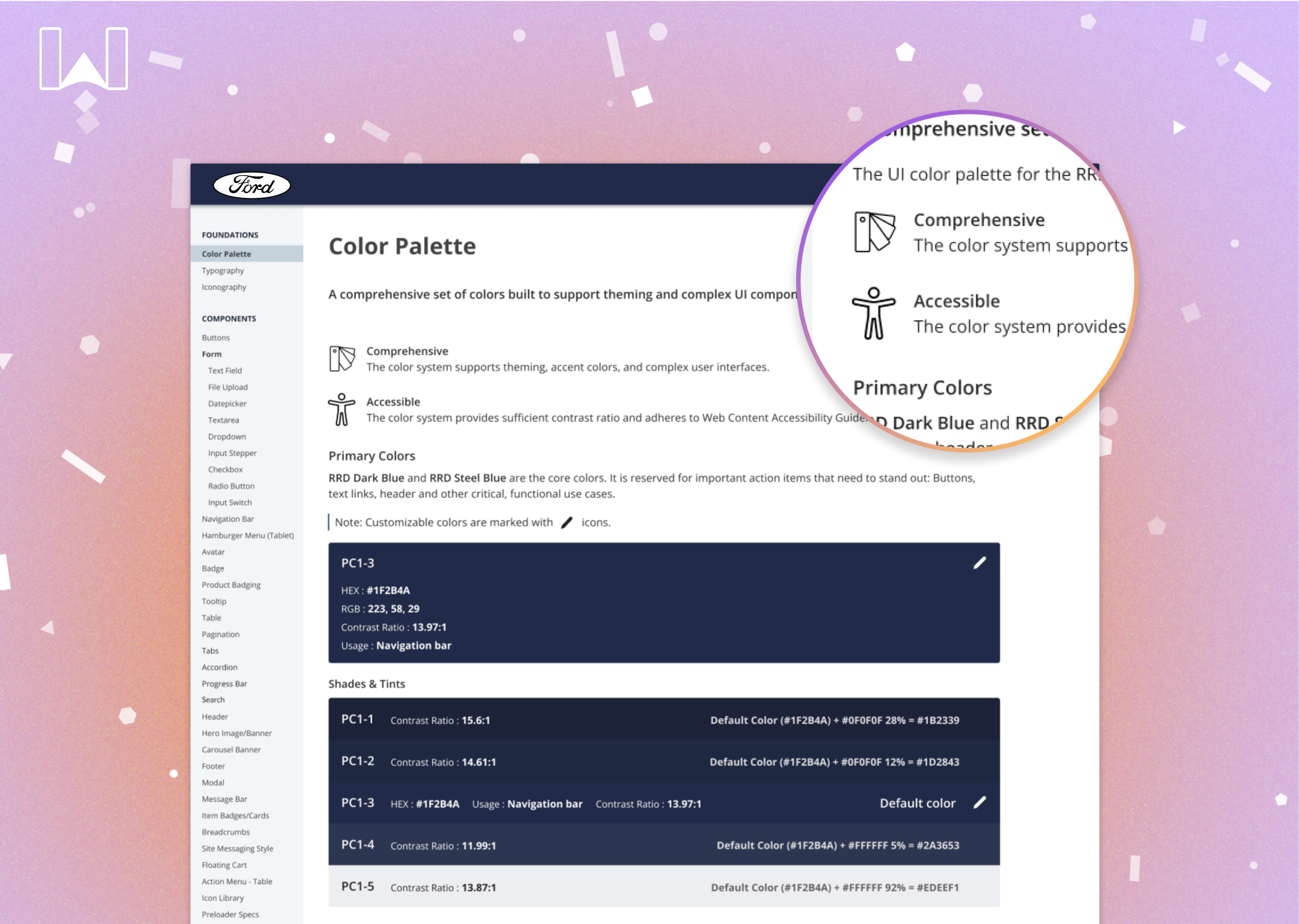
New Branding and Design System
A full rebranding of the product and an accompanying design system with robust documentation was also created for this project. The redesign was fully mapping out with all color tokens, specs, interactions as a deliverable.

Stats and figures.
Measurable results and figures trended very positively throughout the project. Below are a few examples of efficiencies that were created as a result of the newly designed website.
96% System Usability Scale (SUS) score with new UX.
16% Faster rate of purchase checkout compared to old system.
23% Reduction in time to in find items via the new navigation menu.
+2 More items purchased per each order with the new system.

